Huge strides in the value proposition of BI will come by jumping the chasm from simply reporting on data provided by the integrated view of our enterprise to discovering novel and perhaps counter-intuitive relationships hidden in that data. With the discovery of such relationships, we can burst outside of the box with novel strategies for growth and novel resolutions of problems. Many of my blogs have stressed this notion, a good example being, Bridging Predictive Analytics and Performance Management.
The focus on relationships will further bridge human and machine intelligence towards smarter systems. As a predictive analytics practitioner, I see the level of the intelligence of a system roughly as the quality of a web of cause and effect or correlated relationships. “Quality” refers to both:
- The extent and number of relationships. The more relationships that are included, the more “experience” from which we can draw upon.
- The tidyness and structure. Is there a balance between the expunging of obsolete or useless relationships and the redundancy that allows us to think outside of the box?
Similar to how part of the job of a good data warehouse is to present data in a coherent manner (easily understood and cleansed dimensions, friendly table and field names, etc), the end product of a data mining endeavor should be a graph of cause and effect relationships. That graph is the “documentation” of the mechanics of a system, whether an enterprise, an ecosystem, or the knowledge within our brains.
Ultimately, intelligence guides us towards actions, which are engaged through decisions, which are made through conclusions reached via our knowledge of cause and effect. What motivates us to make decisions, the reason why we look at data, whether in reports or browsing OLAP cubes, is that we have a problem we’re attempting to resolve. Resolving problems is an iterative approach that from a very high level involves:
- Gathering the symptoms of the problem. One or more of the symptoms may be the “chief complaint”.
- Attempting to match those symptoms known diagnoses. If there are no known diagnoses, we at least know that the symptoms need to be remedied.
- Prescribing a treatment. If we didn’t find a known diagnosis in Step 2, we need to invent a solution.
Gathering symptoms is by far the easiest of the steps. Some of the data points may be painfully (no pun intended for medical problem solving) obvious. But much of the data needed to diagnose and treat a problem requires the expertise of a subject matter expert (SME) to target what is relevant to the situation, otherwise we would be awash in an ocean of information overload.
Indeed, predictive analytics is really about discovering and measuring relationships through data mining models. Data mining algorithms result in the discovery and measurement of factors that show us how things are grouped, what events occur together, and what leads to certain results. However, the OLAP cubes currently in our possession could become much better at providing such information.
It’s a huge subject for which I think I’ve engineered a fairly simple place to start. The application I’m presenting here is an OLAP measure that displays the correlation between month to month changes of any two members of any dimension. F1, which begins my example, shows an OLAP grid view from the AdventureWorks sample OLAP cube. The measure shown ([r]) is a value that measures the correlation between the Reseller Sales for sales regions and the Internet Sales for product subcategories.

That measure, called the Pearson product-moment correlation coefficient, is a value from -1 through +1 that denotes the strength of a relationship. Values towards -1 indicates a strong inverse correlation, around 0, no correlation, and towards +1, strong direct correlation. The value is calculated using this ugly thing:
Actually, it’s not nearly as ugly as it looks. In fact, the OLAP user doesn’t need to worry about it at all since MDX has a CORRELATION function that makes this easy. The view shown in F1 can be implemented with a calculated measure such as this one (and a couple of supporting objects):
There are a number of MDX functions geared towards such statistical matters. Another great example is the LINREGPOINT function, described by Mosha (someday I hope to have “no last name needed” status). But with all the OLAP engagements I’ve been on, I haven’t yet encountered anyone using these capabilities; which is why I’m writing this blog.
[MEASURES].[x] and [MEASURES].[y] could be any measure that we wish to correlate. In the example shown in F1, as I’ve mentioned, I’m correlating the Reseller Sales Amount for each sales region to the Internet Sales Amount for each product subcategory. The CORRELATE function “plots” the two values for a range of months, specified by the named set [Month Range]. F2 shows the MDX for the supporting elements in the above CORRELATION sample:

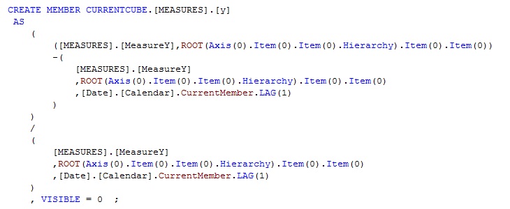
Although the syntax used in F2 is intended for the MDX script, the objects can be overridden using a different range of months or xy measures in the session (CREATE SESSION MEMBER) or query scope (WITH). However, I’ve actually made [x] and [y] a little more complex. I’m not correlating the raw measure values. I’ve actually implemented [x] and [y] to be the percentage change from the previous month as F3 shows for the [x] measure:

It’s a simple “percentage over last month” calculation. There are a few peculiarites to note:
- Notice the ROOT function. It gets the [All] member of the opposite axis; for x (sales regions) it refers to the product subcategory [All] member, and vice-versa. The ROOT function will also protect us in cases where the [All] member is renamed.
- The use of the Axis function in the ROOT function soft-codes the hierarchies we are comparing. This way, we can compare any two hierarchies on ROWS and COLUMNS.
- I’ve hidden the calculated measure (VISIBLE = 0). This measure is used solely by the [r] calculated measure, although I suppose it would be nice to see on its own.
F4 shows a similar calcuation for the [y] measure:
Now that we see all the calculations involved, let’s look at the highlighted cells from F1. The cell highlighted in red shows the correlation between the Reseller Sales amount in the Northeast and the Internet Sales amount for Fenders. The correlation of .036346, which is close to 0 suggests there is no correlation. F5 shows both a table for the respective x and y measures’ month to month percentage change for this cell as well as a graph plotting the xy pairs:
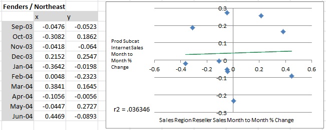
See how the xy coordinates are scattered around, as opposed to clustering around the green trend line? Contrast Fenders/Northeast to Shorts/Northeast:

The graph illustrates tighter cohesion among the plotted coordinates for Shorts/Northeast, which corresponds to a PPMCC closer to 1 of .630043.
Vests/Northeast demonstrates yet another type of PPMCC. The first two values we’ve seen are positive numbers, stating that the x and y values go up and down together. However, the negative number of -.787172 suggests a rather high correlation, but an inverse relationship:
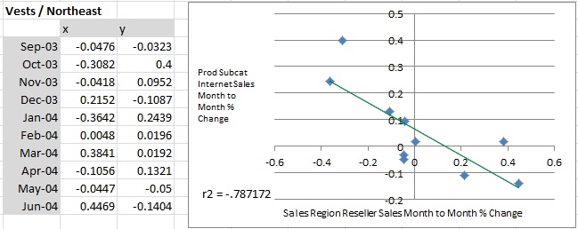
Notice the line points downwards. This means that when the Internet sales for Vests goes up, the Reseller sales for the Northeast goes down, and vice-versa. These relationships can be much more interesting than the ones where the trend lines goes up, sort of like a lever.
So what’s the big deal? The ideal end product is a “correlation web”, if you will, of any relationship in our cube. What are the levers we can pull that could result in a certain effect? How does one’s good fortune mean another’s bad fortune? This correlation web is the intelligence that can lead to applications providing novel solutions to problems. F8 shows an example of a correlation web that can help to troubleshoot poorly performing cubes:
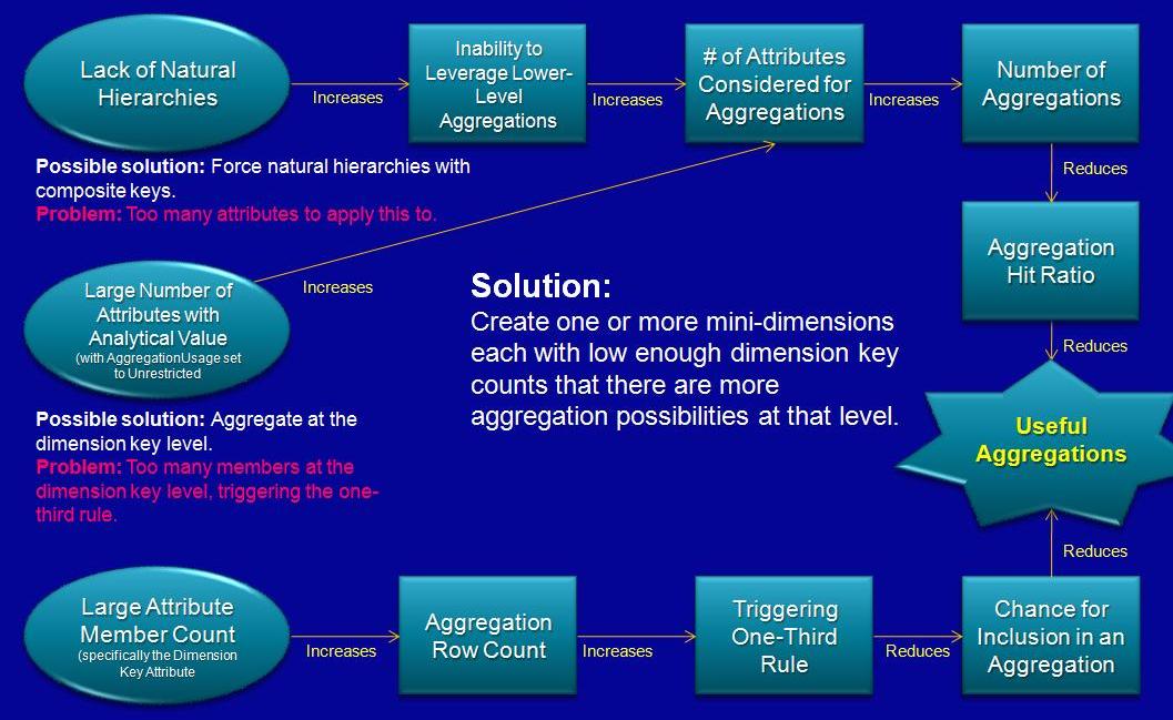
Think of a correlation web as the logical brain and a data warehouse as the data gathered from a wide range of senses. Without the logical cause and effect capabilities of the brain, data is just data.
Note on correlation versus cause and effect: Strictly speaking, all of the relationships discovered in this manner are correlations. This technique simply points out values that seem to behave similarly over time, but no causation has been proven.
Implementation
Implementing this ability to discover correlations begins with downloading this MDX and pasting it into a cube’s MDX script. The [Month Range] set and the [MEASURES].[MeasureX] and [MEASURES].[MeasureY] objects need to be set too the appropriate equivalents in your cube.
The calculations are designed for 2-dimensional analysis; no more, no less. Meaning, if you’re using the BIDS/SSMS cube browser, you’ll get errors when only one Axis has been specified. But it should work once you specify both the ROWS and COLUMNS axis.
Also please be wary of pushing the boundaries. There are a lot of things that can cause it to not work. For example, removing the [All] member. In the example I used simple attribute hierarchies and SUM measures.
The MDX script also includes my attempts to recreate the CORRELATE function. The reason I did this is because we’re really scratching the surface of what we can do to find relationships in our data. I wanted to do a little proof of concept to test the performance and feasibility of implementing other correlation techniques.
As for performance, naturally the native CORRELATE function is faster, but the manual approach isn’t too bad. The slew of sigmas (Σ – ie sums) in the PPMCC formula is sort of a signal that this is a job for OLAP. F9 shows the factors for that PPMCC equation:
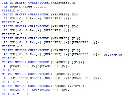
Notice that the measures in F9 are hidden as well as those in F2 and F3. These calculated measures are irrelevant outside the use of the [r] measure. I also use an “E” in place of the Σ character.
F10 shows the “maual” [r] calculation:

That doesn’t look so bad, does it? I hope the notion of looking at correlation measures is at least intriguing and leads you to think about moving beyond just measuring figures and using OLAP to spell out relationships for you.
Lastly, I’d like to insert one sort of related piece of advice. Run as fast as you can when someone tells you something isn’t valid because no one has ever asked for it. I don’t think there are many BI people who find that sentiment very attractive.

