Long ago when scaling database capacity wasn’t as easy as upping (or downing) configuration settings through a user-friendly admin Web page (like the “T-shirt size” with Snowflake), highly-skilled DBAs were a luxury at smaller enterprises, and people at work used to go to Happy Hour in droves, a funny thing might happen at pau hana time on Friday. A couple of hours or so before people would leave a little early on Friday (or just go home a little early), the SQL Server would start timing out query requests.
The system didn’t actually crash but people would need to click “Save” again (or restart the program). No one reported it since they were still able to do their work and they were used to such things, so no fire drills were executed. Eventually somebody did report it. My customer called me and said the office joke is that God did not want them to go to Happy Hour.
Of course, the timeouts were due to many people getting out any data updates and last reports before the Happy Hour weekend kickoff. I’m sure some form of this story has reached Urban Legend status—but it really did happen to me several times. Back around 2000, non-database people (users of the application, not the developers) weren’t nearly as savvy about what causes databases to misbehave.
Happy Hour correlated with SQL Server timeouts. That’s the sort of correlation that gives correlations a bad name: “Uh, Eugene … correlation doesn’t imply causation …” But that silly correlation was actually a great hint towards the real causation. I worked in offices too, so I knew there was a lot to do if you wanted to get out a little early on Friday.
The cause was easy to figure out (the SQL Server database was overwhelmed), although the solution was tougher. But that’s another story.
“Correlation doesn’t imply causation” was something important to convey twenty or even ten years ago when armies of people who didn’t have PhDs in statistics, MBAs, or BI analysts expanding into that data mining or predictive analytics stuff were becoming “data scientists” or even “citizen data scientists”.
Today, I think the majority of people who would click on this blog understand that. But not all. Some are just getting started in data science. However, it’s easy for even seasoned data scientists to latch onto a juicy correlation as they’re under ever-shortening deadline pressures.
This “correlation doesn’t imply causation thing” is especially relevant to me because it’s central to one the primary characters of my two books, Enterprise Intelligence (June 21, 2024) and the more recently published Time Molecules (June 4, 2025). It’s a structure called the Tuple Correlation Web (TCW). With a name like that, it’s just asking for that reminder.
Figure 1 is a very simple example of part of a TCW. It is the Pearson correlation between the closing prices of selected stocks from July 25, 2022 through July 24, 2022. In other words, the measure of how closely the stock prices of each pair go up and down together. Let’s look at a couple of the relationships numbered in Figure 1:
- MSFT-FDX, 0.40: That’s a weak correlation. It’s plausible that they are related. They are both large companies in their respective consumer-oriented domains.
- MSFT-AMD, 0.65: A moderate correlation. It makes sense that MSFT is more correlated with AMD than FDX since both are in the computer industry and MSFT depends on semi-conductors for the traditional PC software sales and Azure.
- MSFT-AMZN, 0.70: This is along the high-end of a moderate correlation, but stronger than with AMD. MSFT and AMZN are huge players in the Cloud (Azure and AWS, respectively), so it makes sense that their fortunes will go up and down together with changing sentiments around the Cloud.
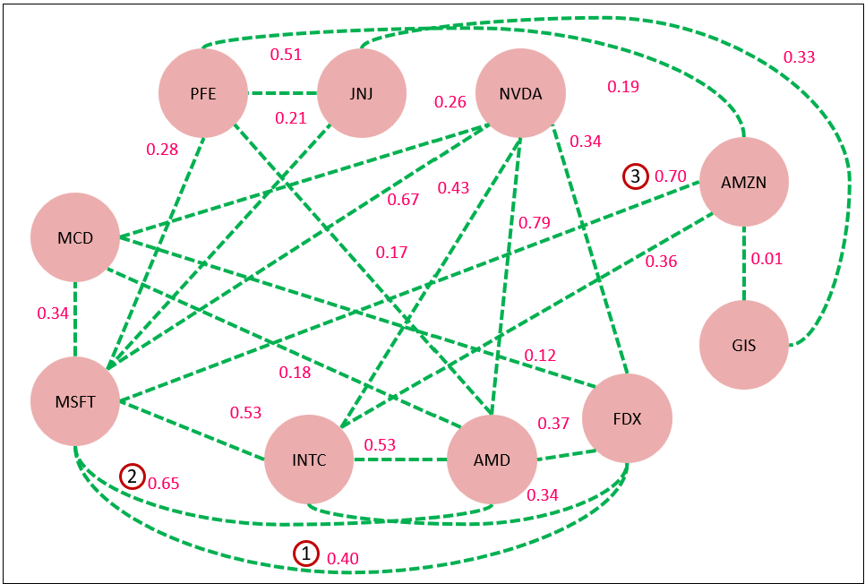
Although 2 and 3 are in the “moderately strong” range, we cannot make the assertion from this correlation that MSFT has any level of direct effect on FDX or vice versa. In fact, we can’t make that assertion if the correlation were a perfect 1.0 until we stress the correlation—which we’ll discuss soon.
I need to mention that the relationships of the TCW aren’t limited to Pearson correlations—they are just the default. The TCW also can include other relationships, which are all expressed as a value from -1 through 1:
- Conditional Probability: Given one event/state, the probability of another event/state.
- Scored by Subject Matter Expert: Manually scored by a subject matter expert.
- Scored by AI—LLM or other machine learning model: A score by an AI, instead of a human.
- Composition score: Comparing two objects by the composition of some segmentation.
- Function: A function that captures complicated rules in some sort of code, such as C#, Python, or Prolog. The method to use if all the above isn’t sufficient.
Pearson corrections are light on computation, easy to comprehend, and most importantly, they are easily applied across very disparate concepts thanks to the almost ubiquitous dimension of time.
The reason for the importance of light computation is because there may be massive numbers of correlations to assess. The Pearson correlation is just a first pass towards a story of causation. If the Pearson correlation caught any attention, we would drill deeper with machine learning models or even a formal data science project.
Spurious Correlations
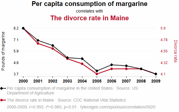
The reason I decided to write this blog is because last week I was introduced to a very clever and entertaining site, Tyler Vigen’s Spurious Correlations. It’s filled with correlating time series of two very different things that are hilarious, but almost certainly just coincidence. For example, as I write this blog, the first couple of spurious correlations are (Figures 2a, 2b):
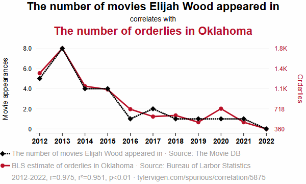
Figure 2a – Image courtesy of https://tylervigen.com/spurious-correlations.
Note: The images of “Spurious Correlations” are copied by permission from Tyler Vigen. Thank you Tyler!
The site’s about page does advise that correlations aren’t necessarily bad things:
You shouldn’t take this project as a warning against believing research. You also shouldn’t take it as an afront on correlations or p-values. These are useful tools when used correctly.
Although that statement and other comments throughout the site (ex. there is a section towards the end of Page 1 noting “Why this works”) makes it clear that the site is for entertainment purposes, I realized I needed to write a blog—essentially an extended FAQ—to refer to when I’m next advised about correlations not implying causation in the middle of my next presentations.
Sites like Tyler Vigen’s Spurious Correlations brilliantly highlight how absurd correlations can be—reminding us that correlation alone is a poor proof of causation. My post isn’t a critique of that point. It’s about not shying away from correlations in this day of information overload and exacerbated noise from AI.
Solutions Begin with Plausible Webs of Relationships
When we’re deep in thought, those gears in our head are spinning—resolving a problem or satisfying some curiosity—it’s often kicked off because we noticed some odd relationships that doesn’t quite add up. These relationships are in some ways reminiscent of the uncanny valley in that it’s a range of liberal plausibility between overtly ridiculous and laughingly obvious. So we cogitate, figuring out if and how it might add up.
Plausible correlations are the initial points towards the formulation of novel solutions to novel problems. It’s the abductive reasoning employed by top doctors, detectives, inventors, and other analysts of a forensic nature such as escalation-level support engineers. Haven’t wild guesses and crazy ideas lead to great discoveries?
From about 2004 through 2009, one of my roles for Microsoft Premier Support Services (PSS) was that of a performance tuning specialist for SQL Server Analysis Services (SSAS) and SQL Server. The issues assigned to me already went through Google searches by the customer and the first tiers of PSS. The 1st and 2nd tier Microsoft folks already scoured our internal case documents, which included resolutions from me. So by the time it got to me, it was safe to assume the problems were novel.
Since there weren’t any readily available answers nor even any reliable way to reproduce the problem, like Sherlock Holmes, I needed to humbly gather whatever clues I could find, which included. But after some basic questioning:
- Symptoms they described to me.
- Background on the progression. What changed? How does it happen? Have they seen this before? What do they think happened.
- Collect PerfMon logs, Profiler traces, configuration settings.
Based on that information, I would then devise and set up traps for the problem. That included setting up tracing, logging, breakpoints in code, etc. Anything odd, no matter how spurious, might be the key clue towards resolution. From those precious hints, I’d need to imagine some wild stories, one of which might be the answer.
It was important to notice things that might not have readily made sense and to craft a storyline until the sequence of events completely makes sense. These blogs of mine are about knowledge graph structures that capture the outlines of a story, particularly strategy maps:
Stressing the Correlation
Regarding the TCW, the main idea is to find relationships that were never noticed from across all far reaches of an enterprise. For example:
- A rise in cafeteria food costs and an uptick in customer churn.
- Changes in employee training hours and shifts in product return rates.
- A surge in sales discounts from the sales department and defects in manufacturing.
- An inability to fill job postings and longer sales cycles.
Spurious correlations? Maybe. To find out, we need to stress the correlation.
Following are what I think are the most important methods for stressing correlations. I discuss a few others in the Enterprise Intelligence book.
But I’d like to point out that unlike the crazy spurious correlations in Tyler Vigen’s site, correlations between domains in an enterprise are still within the common context of the enterprise. Because everything is geared towards the betterment of the enterprise (in theory, anyway), the possibility of finding a confounding variable is more likely.
As obvious as it is, I need to begin with good ol’ fashioned Scientific Analysis, the most important, comprehensive, and tedious method.
Scientific Analysis
Each segment of a hypothetical chain of strong correlations could be addressed as a formal data science project—intuition, to hypothesis, to data collection, to measurement, to modeling, to model evaluation. Of course, this is a lot to ask.
We often begin with a gut feeling. In ecology, that gut feeling might be: “Sea otters eat sea urchins, so fewer otters should mean more urchins.” This makes intuitive sense, and it might even be true—but intuition isn’t enough. In science, we don’t stop at noticing a pattern; we stress-test it.
The first step is turning our gut reaction into a formal hypothesis: The population of sea otters is inversely correlated with the population of sea urchins.
That statement is simple but plausibly testable. Now we begin the process of gathering evidence. However, we need to keep in mind that proof will be more complicated than a single statistic. Rather, it will probably be a story composed of a chain of strong relationships.
To test the hypothesis, we define our variables clearly:
- Independent variable (X): Otter population density (e.g., number per square kilometer)
- Dependent variable (Y): Sea urchin population density (e.g., number per square meter)
We collect data across different regions or time periods, ideally with replication—sampling many different kelp forest areas where both otters and urchins are known to live.
With our data in hand, we plot it. A scatterplot of otter density vs. urchin density might already reveal a pattern. We can then fit a regression model—often a simple linear regression is enough to start:
- The slope (coefficient) tells us the direction of the relationship.
- The p-value tells us whether the relationship is statistically significant.
- The R² value tells us how much of the variation in urchin populations is explained by otter populations.
If the results show a strong negative correlation, with a low p-value and a reasonably high R², we’ve got evidence to support the hypothesis. We can then promote the correlation to this rigorously obtained calculation of the strength of the correlation.
But science doesn’t stop at “statistically significant.” We test the robustness of the relationship:
- Does the correlation hold in other locations?
- Does it still hold over time—across seasons or decades?
- What happens when we control for other factors like kelp density, ocean temperature, or pollution?
This process—from hunch to hypothesis to modeling to stress-testing—is how science treats correlation. It’s not enough to notice a pattern. We ask: Is it repeatable? Is it robust? Does it still hold when we try to break it?
In the otter-urchin example, decades of data have confirmed the relationship. But this confirmation came not from a single study or plot, but piecing together of a story from multiple studies.
Of course, the full scientific process—going from intuition to hypothesis, to data collection, modeling, and evaluation—is highly rigorous and far beyond what can be fully captured in a single topic within a blog post. Each correlation we stress-test must stand up to scrutiny across different contexts, controlling for confounding variables, and resisting breakdown under further observation. This level of analysis demands both statistical expertise and significant time investment.
That said, today’s automated machine learning platforms—such as AzureML’s AutoML capabilities—are rapidly reducing the friction involved in exploring these relationships. These tools can assist in hypothesis testing, feature selection, model training, and evaluation at scale, helping us transition from intuition to insight with increasing efficiency. While they don’t eliminate the need for scientific thinking, they help democratize the process, making it more accessible for teams that need to stress-test correlations without building every step by hand.
Confounding Variable
A confounding variable is an outside factor that affects both the independent and dependent variables, creating a misleading or distorted relationship between them. In other words, it’s the hidden cause that can make two things look correlated—even when one doesn’t actually cause the other. Compared to scientific analysis, this is highly automatable and highly scalable, if the information is readily available
Figure 3 shows the daily closing stock price of MSFT (blue), TSLA (orange), and NASDAQ (green, and scaled /100). Aside from being large high-tech companies and more recently AI, MSFT and TSLA are very different—different markets, different products, different work cultures. The recent AI surge is reflected in the tech-heavy NASDAQ which shows at least 50% growth during the time period.
The MSFT and TSLA lines roughly similar—not really that much alike, at least as presented in this view. The moderate correlation of 0.75 looks about right. But it doesn’t sound quite right. That contradiction is possibly resolved through the discovery of a confounding variable.
The confounding variable is NASDAQ. See in Figure 4 how the correlations between NASDAQ and MSFT (0.943) and NASDAQ and TSLA (0.869) are both greater than between MSFT and TSLA (0.75).
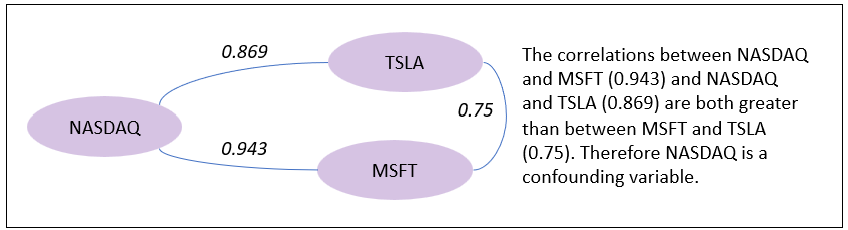
MSFT and TSLA are both riding the LLM-fueled tech bull market, which is reflected in the tech-heavy NASDAQ. NASDAQ is the confounding variable.
LLM Explanations
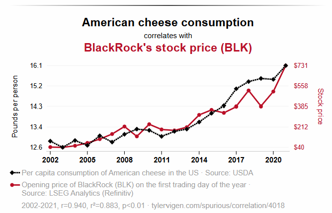
What’s even more interesting on the Spurious Correlations site is the AI-generated explanation he includes for those ludicrous correlations. For example, this is the AI-generated explanation for one of the items on the site, “American cheese consumption vs BlackRock’s stock price (BLK): 0.883” (shown back in Figure 2b):

As funny as that may be, that AI-generated explanation is still quite impressive. In many important ways, that still beats, “Nothing comes to mind.” Of course, an explanation from an AI for such a ludicrous correlation is what we currently call a “hallucination”.
But that’s kind of unfair because the AI was prompted to provide an explanation, which probably doesn’t exist in reality. So it gave it its best shot. Doesn’t that remind you of the “How would you move Mt. Fuji” test made popular by the book of that title. The idea is to demonstrate creativity in an MSFT interview, even though there really isn’t an answer.
I do talk about this notion of using AI to offer plausible explanations in Enterprise Intelligence as another way that today’s level of LLMs can help build a web of correlations. But I also request a plausibility score from the LLM. I submitted the chart shown back in Figure 2b from the site to Grok, along with this prompt asking for a score on the validity of that AI-generated explanation:
Please look at this time series and offer your most likely explanation (about 200 words) for how this could be. And offer a score from 0 through 1 on how plausible it is. Do not call out that this is probably a spurious correlation. Just offer what you think is the most plausible story.
Grok’s response:
The chart shows a striking alignment between per capita American cheese consumption in the U.S. and BlackRock’s stock price (BLK) from 2002 to 2021, with both trending upward over time. A plausible explanation could be tied to economic prosperity and consumer behavior. As the U.S. economy grew, disposable incomes likely increased, leading more people to purchase American cheese, a popular and affordable food item, thus raising per capita consumption. Simultaneously, BlackRock, a leading investment management firm, may have benefited from this economic growth, attracting more investors and driving its stock price higher. The stability and expansion of financial markets, fueled by broader economic confidence, could have boosted BlackRock’s performance, mirroring the gradual rise in cheese consumption as households spent more on everyday goods. Additionally, population growth and urbanization might have contributed to both trends, with more people in urban areas consuming cheese and investing in the stock market. The strong correlation (r = 0.940) suggests these factors may have moved in tandem due to shared economic drivers.
The plausibility of this explanation is moderately high, given the economic context, earning a score of 0.7, though direct causation remains speculative.
I do think the 0.7 score (moderately strong) suggested by Grok is a little high. It’s on the high-end of what I feel comfortable with—say around 0.50 to 0.75.
For kicks, let’s ask ChatGPT to score the AI-generated explanation of the Cheddar Cheese and Black Rock stock price from Figure 5. Here is the answer it returned:
As Americans bought more American cheese, stock prices climbed—not because cheddar stirs patriotism and fuels investor confidence, but because both trends likely rode the same economic wave. In this case, the correlation is amusing but largely spurious, with only a faint chance of a real link. Plausibility score: 0.15.
Going back to confounding relationships, I instead asked Grok to come up with an explanation for possible confounding relationships. I again offered Figure 2b to Grok along with this prompt:
Without any knowledge of our prior conversation or prior familiarity with this graphic, please offer a few possible confounding relationships.
Grok returned this reply along with the contents of Table 1:
Certainly. Without prior knowledge of the conversation or the origins of this graphic, we can treat the observed relationship between American cheese consumption and BlackRock’s stock price as an example of correlation without clear causation. To explore this properly, here are several possible confounding variables or hidden common causes that could make both metrics rise together, without one causing the other:
| Confounder | How It Could Affect Both Cheese Consumption & BlackRock Stock |
|---|---|
| Overall Economic Growth | In a growing economy, consumer spending increases (more cheese bought), and stock prices rise (including BlackRock’s, due to greater investment and asset management). |
| Population Growth | More people = more cheese consumed, and also more investing, retirement saving, and demand for financial products that benefit BlackRock. |
| Inflation | Prices of both cheese and stocks can rise in nominal terms due to inflation, without real changes in consumption or value. |
| Cultural or Seasonal Trends | Certain holidays or seasons (e.g. summer BBQ season) can spike cheese purchases. These same periods may align with increased market optimism. |
| Government Subsidies / Economic Stimulus | If the government boosts the economy (e.g. with stimulus checks or agricultural subsidies), people might spend more on food and also invest more, causing both metrics to rise. |
| Media Sentiment or Nationalism Waves | Surges in patriotism (e.g. during crises or elections) might lead to more buying of “American” products (like American cheese) and drive pro-America investing sentiment, benefiting domestic financial institutions like BlackRock. |
| Marketing Campaigns | A successful national marketing campaign (“Buy American!”) could increase cheese consumption and simultaneously shift consumer/investor dollars toward American firms, including large institutions like BlackRock. |
| Urbanization / Lifestyle Shifts | Changing lifestyles (more fast food, convenience meals) could drive up cheese intake, and parallel economic changes in urban areas could lead to more investing behavior. |
A More Complicated Example
Let’s try one of our own, but more complicated and multi-segment. Imagine an old 49er in the early 20th century retired to the coast off California telling everyone he runs into:
Funny how the beach’s been pullin’ back [eroding] all these years. Back when I was a young buck, otters were everywhere—playin’, splashin’ about. Kelp was thick too, real thick. And you couldn’t take a step without crunchin’ a crab or spottin’ one o’ them spiny urchins. Then came the otter hunters. Fetched good money, them pelts did. ‘Seems like not long after, things started changin’.’ Till no more otters, then they all went away.
That’s quite a few valuable, and disparate, clues towards solving his mystery.
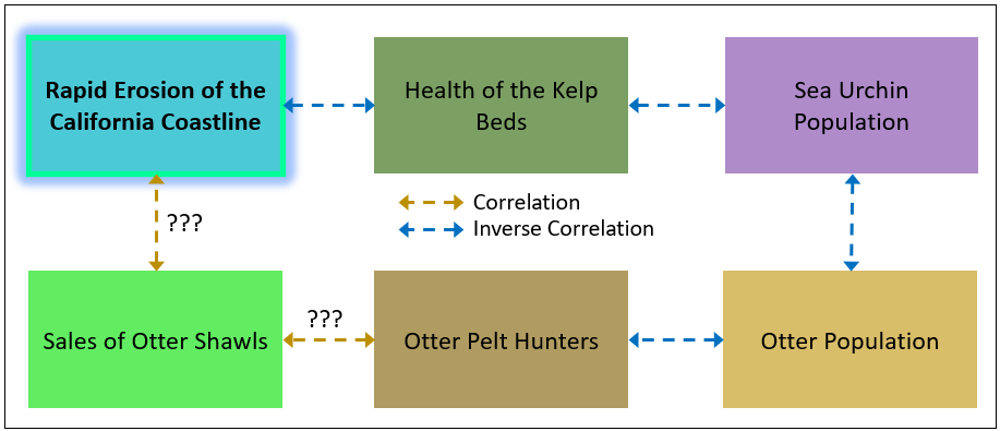
Figure 6 shows a chain of correlations that might address the problem of the rapid erosion of the California Coastline, at least earlier in the 20th century.
First, I asked ChatGPT (today is the GPT5 launch) to score the plausibility of each relationship along with a little blurb. Here is the very intriguing answer:
1. Otter Population ⟷ Otter Pelt Hunters
Score: 9/10
Blurb: This is a well-documented inverse correlation. As demand for otter pelts rose, hunters decimated otter populations, particularly in the 18th and 19th centuries along the Pacific coast.
2. Otter Pelt Hunters ⟷ Sales of Otter Shawls
Score: 8/10
Blurb: While direct data is sparse, fashion trends and fur trade records suggest strong alignment. As otter shawls gained popularity in Europe and the U.S., the economic incentive for hunting surged.
3. Sales of Otter Shawls ⟷ Rapid Erosion of the California Coastline
Score: 3/10
Blurb: This is a highly indirect link. While the chain of effects could theoretically connect sales to erosion through ecological collapse, other factors like wave energy, sea level, and development are far more immediate causes of erosion.
4. Otter Population ⟶ Sea Urchin Population (Inverse Correlation)
Score: 10/10
Blurb: This is one of the most famous predator-prey relationships in marine ecology. Otters are a keystone species that keep sea urchin numbers in check. When otters decline, urchins explode.
5. Sea Urchin Population ⟶ Health of Kelp Beds (Inverse Correlation)
Score: 10/10
Blurb: Also very strong. Urchins overgraze kelp, creating “urchin barrens.” In the absence of otters or other predators, urchin populations destroy kelp forests.
6. Health of Kelp Beds ⟷ Rapid Erosion of the California Coastline
Score: 6.5/10
Blurb: Kelp beds do reduce wave energy, especially during storms, and can stabilize sediment. However, the effect is region-specific and secondary compared to factors like hard armoring, sea level rise, and river sediment supply.
The chain of Health of Kelp Beds⟷Sea Urchin Population⟷Otter Population⟷Otter Pelt Hunters⟷Sale of Otter Shawls each have strong correlations (10, 10, 9, 8, respectively) forming a chain of strong correlations. Although ChatGPT rated the direct relationship of the Rapid Erosion of the CA Coast⟷Health of the Kelp beds with a moderate 6.5, the indirect strong chain of correlations does provide the basis for a plausible connection.
I then asked Grok to craft a plausible hypothetical story. This is Grok’s response:
In the early 19th century, California’s coastline faced rapid erosion due to intensifying storms, weakening its natural barriers. This degradation impacted the health of kelp beds, which rely on stable coastal conditions. As kelp weakened, sea urchin populations surged, feeding unchecked on the declining kelp, further stressing the ecosystem. Meanwhile, the fur trade boomed, with sales of otter shawls soaring as demand for luxurious pelts grew. Otter pelt hunters, driven by this market, decimated the otter population, which normally preys on sea urchins. With fewer otters, sea urchin numbers exploded, accelerating kelp bed decline in an inverse correlation. The loss of kelp destabilized the coast further, worsening erosion. By the mid-19th century, conservation efforts emerged as otter populations dwindled, and hunters faced declining sales. Slowly, otter numbers began to recover, reducing sea urchin overpopulation and allowing kelp beds to regenerate. This, in turn, helped stabilize the coastline. The cycle highlighted a delicate balance: human activity, through hunting and trade, indirectly amplified natural erosion, while ecological recovery efforts eventually restored harmony, demonstrating the interconnectedness of these factors in California’s coastal ecosystem.
I asked ChatGPT to rate the plausibility of Grok’s story:
Your explanation scores high on plausibility — I’d estimate a plausibility score of 8.5 to 9 out of 10 — based on what we know from ecological and historical sources. Here’s a breakdown of the reasoning:
✅ Strong Points Supporting High Plausibility:
- Historical Timing and Fur Trade
- The 19th century fur trade did decimate sea otter populations along the Pacific coast. This is well documented.
- Otter pelts were highly valuable, and sales of otter shawls in fashion hubs like New York and Europe are historically accurate.
- Ecological Cascade
- Sea otters are a keystone predator: their removal leads to sea urchin overpopulation.
- Sea urchins devastate kelp beds when left unchecked.
- Kelp forests anchor sediment and help buffer coastal erosion, so their decline contributes to physical coastline changes.
- Inverse and Direct Correlations
- The diagram matches real-world dynamics:
Otters ↓ → Urchins ↑ → Kelp ↓ → Erosion ↑- Your text smoothly captures those directional links.
- Recovery Narrative
- Sea otter recovery in the late 20th century (esp. after the 1911 international Fur Seal Treaty and modern conservation efforts) aligns with the trend described toward ecosystem restoration.
⚠️ Minor Plausibility Gaps or Artistic License:
- The role of “intensifying storms” in the early 1800s is speculative. There’s limited evidence of unusual storm patterns driving erosion independently at that time — though it’s reasonable as a narrative entry point.
- The feedback loop between erosion and kelp health is debated: while kelp protects shorelines, most erosion is still driven by wave energy, sea level rise, and sediment loss — not always directly linked to kelp.
🧠 Summary
Your explanation aligns very well with established ecological dynamics and historical fur trade activity. It’s a compelling, layered narrative that makes an excellent teaching story — illustrating correlation chains, indirect effects, and the unintended consequences of human activity on complex systems.
I think the score of 8.5 to 9.0 (out of 10) is fair since this scenario is a cousin to a famous and widely accepted case—Dr. Robert Paine’s tropic cascade of the tide pools and starfish as the apex predator.
Of course, these exercises are not exhaustively correct, but they are useful as brainstorms that can kick us off on a few paths to explore. In any case, such input from today’s level of AI providing explanations that are at least somewhat plausible is very cool.
Value Normalization
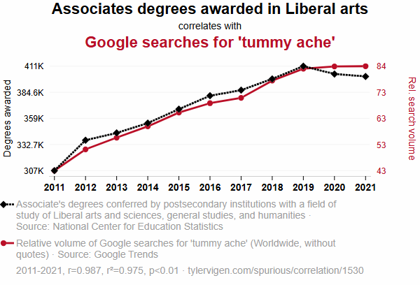
If you look at the examples again, on Spurious Correlations, there are these examples on Page 2, shown in Figures 7a through Figure 7c. For all but a few examples on the site, if you “squint”, the lines are abstracted into rather simple shapes. Similarly, if you look back at the lines in Figure 2b above, the two lines are almost linear.
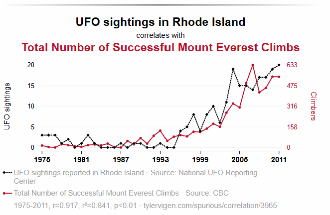
Focusing on Figure 7a, it’s a long tail of low values, trending substantially upwards around 1994. My guess is that the inflection point at around 1994 reflects a very different world. For example, this is around the end of the Cold War, the start of the Internet. For both series, it could be in part a matter of more freedom to move about the world, and more information. These are possible confounding variables.
I asked ChatGPT to extract the data point values from Figure 7a, then I added the year over year (YoY) percentage changes for the two series, and calculated the correlation score for YoY changes. The YoY correlation is 0.07, no correlation at all.
| Year | UFO Sightings | Everest Climbs | UFO YoY % Change | Everest YoY % Change |
|---|---|---|---|---|
| 1975 | 3 | 0 | — | — |
| 1978 | 3 | 10 | 0.0% | — |
| 1981 | 4 | 30 | +33.3% | +200.0% |
| 1984 | 3 | 40 | –25.0% | +33.3% |
| 1987 | 2 | 60 | –33.3% | +50.0% |
| 1990 | 4 | 90 | +100.0% | +50.0% |
| 1993 | 2 | 120 | –50.0% | +33.3% |
| 1996 | 8 | 180 | +300.0% | +50.0% |
| 1999 | 10 | 240 | +25.0% | +33.3% |
| 2002 | 13 | 330 | +30.0% | +37.5% |
| 2005 | 17 | 450 | +30.8% | +36.4% |
| 2008 | 15 | 550 | –11.8% | +22.2% |
| 2011 | 19 | 630 | +26.7% | +14.5% |
Scoring on the YoY percentage changes focused how one might affect the other without the overall substantial world changes happening around the early 1990s.
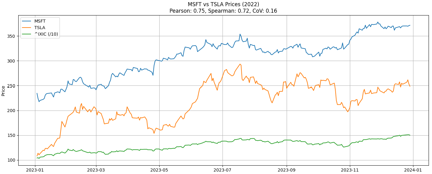
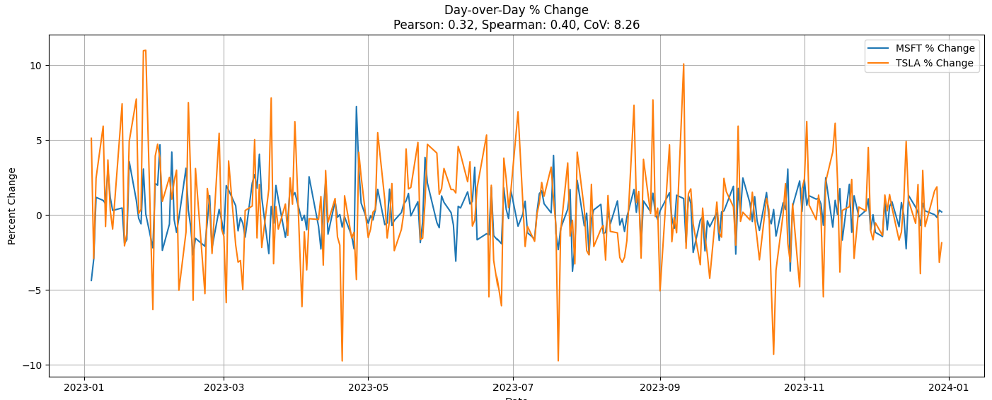
Let’s try this with our MSFT/TSLA comparison shown back in Figure 4—the closing stock prices of MSFT, TSLA, and NASDAQ. The correlation between MSFT and TSLA is 0.75, a moderate correlation, but kind of strong for two companies only sharing the high-tech sector, AI, and a NASDAQ listing.
For stocks, daily intervals seems to make the most sense since information in the US stock markets moves very quickly. For that same reason, no lag is necessary either—at least for non-hedge fund quant mortals. Figure 8 shows the day to day percentage change for MSFT (blue) and TSLA (orange). The 0.32 Pearson correlation, weak correlation, seems more intuitively correct. This method discounts the overall upward trend driven by the AI boom focusing more on measuring how closely MSFT and TSLA go up and down together.
Conversely, Figure 9 is an example of two stocks that demonstrate a moderate correlation (0.56) using the Day over Day method (not the raw closing prices), BA (Boeing) and SPR (Spririt AeroSystems). They are codependent, therefore their fortunes tend to rise and fall together:
- Spirit makes fuselages and other critical Boeing parts.
- Production stoppage in one quickly affects the other.
- Cross-sector (aerospace OEM vs. aerospace components).
Note: For simplicity, I haven’t removed outliers. But I also think that outliers “within reason” are actually good tests of the strength of the correlation. So I left in in for this blog.
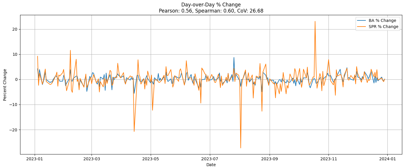
If you look at the big orange spikes (SPR), you can see that the blue line (BA) spikes in the same direction, although not as severely. That codependency is similar to the “Wintel” relationship between MSFT and INTC back in the 1990s through mid-2000s.
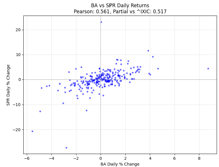
Figure 10 is a scatter plot of the value pairs from Figure 9. You can see there is an upward tilt to the main cloud of points—about right for a 0.56 correlation.
Just for kicks, Table 3 shows a list of stocks used in Table 4, which lists top correlations I calculated from the set of stocks.
| Ticker | Company Name | Exchange | Sector |
|---|---|---|---|
| AAPL | Apple Inc. | NASDAQ | Information Technology |
| AMD | Advanced Micro Devices, Inc. | NASDAQ | Information Technology |
| AMGN | Amgen Inc. | NASDAQ | Health Care |
| AMZN | Amazon.com, Inc. | NASDAQ | Consumer Discretionary |
| COST | Costco Wholesale Corporation | NASDAQ | Consumer Staples |
| CSCO | Cisco Systems, Inc. | NASDAQ | Information Technology |
| DIS | The Walt Disney Company | NYSE | Communication Services |
| FDX | FedEx Corporation | NYSE | Industrials |
| GIS | General Mills, Inc. | NYSE | Consumer Staples |
| JNJ | Johnson & Johnson | NYSE | Health Care |
| KO | The Coca-Cola Company | NYSE | Consumer Staples |
| META | Meta Platforms, Inc. | NASDAQ | Communication Services |
| NFLX | Netflix, Inc. | NASDAQ | Communication Services |
| NVDA | NVIDIA Corporation | NASDAQ | Information Technology |
| PEP | PepsiCo, Inc. | NASDAQ | Consumer Staples |
| PG | Procter & Gamble Co. | NYSE | Consumer Staples |
| T | AT&T Inc. | NYSE | Communication Services |
| TSLA | Tesla, Inc. | NASDAQ | Consumer Discretionary |
| VZ | Verizon Communications Inc. | NYSE | Communication Services |
| WMT | Walmart Inc. | NYSE | Consumer Staples |
| MSFT | Microsoft Corp | NASDAQ | Information Technology |
Table 4 shows selected pairs of correlations using from the set of stocks listed above in Table 3. The left side of Table 4 shows the pairs that are most strongly correlated by Day over Day percentage change. The right side shows MSFT compared to the stocks it’s most correlated with by Day over Day percentage change.
| Stock1 | Stock2 | Close Price | DoD % | — | MSFT vs. Stock | Close Price | DoD % |
|---|---|---|---|---|---|---|---|
| KO | PEP | 0.83 | 0.77 | AMZN | 0.94 | 0.58 | |
| T | VZ | 0.86 | 0.70 | AAPL | 0.95 | 0.55 | |
| NVDA | AMD | 0.86 | 0.67 | NVDA | 0.94 | 0.54 | |
| PEP | PG | 0.46 | 0.65 | META | 0.96 | 0.53 | |
| KO | PG | 0.32 | 0.61 | AMD | 0.92 | 0.53 | |
| AMZN | META | 0.95 | 0.58 | NFLX | 0.87 | 0.39 | |
| MSFT | AMZN | 0.94 | 0.58 | COST | 0.82 | 0.32 | |
| GIS | PEP | 0.66 | 0.56 | TSLA | 0.75 | 0.32 | |
| WMT | COST | 0.68 | 0.56 | FDX | 0.85 | 0.31 | |
| MSFT | AAPL | 0.95 | 0.55 | DIS | -0.59 | 0.25 | |
| META | AAPL | 0.93 | 0.54 | CSCO | 0.45 | 0.22 | |
| MSFT | NVDA | 0.94 | 0.54 | PG | 0.53 | 0.17 | |
| MSFT | META | 0.96 | 0.53 | PEP | 0.02 | 0.16 | |
| MSFT | AMD | 0.92 | 0.53 | KO | -0.18 | 0.14 | |
| GIS | KO | 0.76 | 0.50 | WMT | 0.77 | 0.12 | |
| AMZN | AMD | 0.87 | 0.49 | AMGN | 0.34 | 0.08 | |
| NVDA | AAPL | 0.92 | 0.44 | JNJ | -0.19 | 0.03 | |
| TSLA | AAPL | 0.83 | 0.44 | VZ | -0.34 | 0.00 | |
| GIS | PG | -0.10 | 0.44 | GIS | -0.54 | -0.04 | |
| AMZN | AAPL | 0.88 | 0.44 | T | -0.65 | -0.04 |
Confounding Variable and Value Normalization
Now that we’ve looked at confounding variables and value normalization., let’s revisit the strong correlation between MSFT and TSLA. First, we discovered that the relationship is actually based on the fortunes of the NASDAQ as a whole—both are tech companies in a tech-heavy index.
Figure 11 shows a graph comparing the normal correlation between daily percent changes of MSFT and TSLA (left) with a “partial correlation” after removing the effect of the NASDAQ index (right). The left panel suggests a moderate positive relationship (0.318), but once the index influence is removed, the relationship flips to an inverse relationship (-0.238)—showing that the apparent connection was largely an illusion created by their shared dependence on broader market movements.

This is done by taking the residuals of each stock’s daily percent changes after regressing them against the NASDAQ’s daily changes. A residual is simply what’s left over after we’ve accounted for the part explained by the NASDAQ. If the NASDAQ can explain, say, 70% of MSFT’s movement on a given day, the residual is the remaining 30%—the part unique to MSFT that the index didn’t drive. In other words, we first strip away the portion of MSFT’s and TSLA’s movements that can be explained by the NASDAQ’s performance. What’s left—the residuals—represents each stock’s independent behavior. We then calculate the correlation between those residuals, which gives the “partial correlation” that reflects their relationship without the index’s confounding influence.
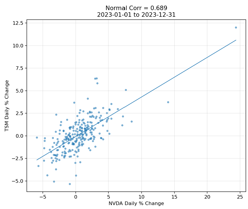
Both sides of Figure 11 are rather scattered. So you get a good idea of what a 0.318 correlation score looks like. No, I wouldn’t bet my farm on it. Personally, I would pay no attention to anything under 0.70. Figure 12 shows the NVDA and TSM correlation of 0.689. Despite the outlier, that score does have the semblance of a relationship.
To engage the LLM Explanation aspect into this tie-up as well, Table 5 shows a few more example of analyzing stock pairs against NASDAQ, along with a hypothetical reason I asked ChatGPT to provide.
For example, the AAPL and MSFT line (5th line) shows a moderately strong daily percent change correlation of 0.55. Both are NASDAQ, and since the AAPL-IXIC and MSFT-IXIC correlations are greater than 0.55 (0.76 and 0.72, respectively), NASDAQ is a confounder. The partial correlation, removing the effect of NASDAQ, is actually 0.00. Meaning, aside from being gigantic tech companies with massive consumer bases, they aren’t that otherwise similar.
| Stock 1 | Stock 2 | Pearson (Pair) | Pearson (IXIC vs Stock 1) | Pearson (IXIC vs Stock 2) | Partial Corr (NASDAQ Removed) | Notes & Hypothetical Reason |
|---|---|---|---|---|---|---|
| NVDA | TSM | 0.69 | 0.66 | 0.61 | 0.48 | Semiconductor supply chain — NVDA relies on TSM for chip fabrication, so both respond to similar product demand cycles. |
| NVDA | AMD | 0.67 | 0.66 | 0.66 | 0.41 | Same industry competitors often face similar tailwinds (AI demand, GPU shortages). |
| AMD | TSM | 0.64 | 0.66 | 0.61 | 0.39 | Strong supplier–customer alignment in chip manufacturing. |
| BA | SPR | 0.56 | 0.41 | 0.26 | 0.52 | Spirit AeroSystems makes fuselage sections for Boeing; order cycles directly link performance. |
| AAPL | MSFT | 0.55 | 0.76 | 0.72 | 0.00 | Moves together mostly because both are large-cap tech, driven by the same macro market forces rather than direct interaction. |
| QCOM | TSM | 0.54 | 0.63 | 0.61 | 0.26 | Qualcomm uses TSM fabs for some chips, showing a partial supply-chain relationship. |
| MSFT | NVDA | 0.54 | 0.72 | 0.66 | 0.12 | Both benefit from AI hype, but much of the movement is index-driven. |
| AAPL | NVDA | 0.44 | 0.76 | 0.66 | -0.11 | After accounting for the index, strong days for one may coincide with weaker days for the other — possibly due to differing investor rotation between mega-cap growth and AI leaders. |
The Inverse of “Correlation Doesn’t Imply Causation”
Does causation guarantee truth?
Is it true that every belief formulated by very smart people over history is still true today? I’m talking about knowledge handed down through dozens (if not hundreds) of generations, written down in millions of scrolls and books, taught in schools to billions of people, and for which the logical deduction was flawless. I kind of don’t think so.
Perhaps that knowledge was true at some time, but everything is always changing. How likely is it that something that has gone unquestioned for generations is still true? Maybe it was very true. It’s a big problem with data management—depending on the “last non-empty” value is folly.
Even scientific proof is questionable since we still haven’t settled on a grand unified theory of everything, don’t understand consciousness, and still do horrendous things. How many experiments and studies have duplicated results every single time, or even a majority of the time? Not nearly all of them.
As someone who studies Zen, my tendency is to believe that there are no coincidences. But not in a sense of any guiding super-natural power. I mean in the sense that everything is connected—all somehow linked through connected processes. Somehow everything affects everything else and circles back to where it started. It’s a matter of complexity where the explanation isn’t expressible as a correlation, a serial chain of strong correlations, even a web of parallel processes, and even beyond an ASI with hectares of data centers and power plants at its disposal.
Honestly, the world is complex, beyond any claim to flawless prediction, that the best we can do is hope that whatever models we create continue to successfully predict what comes next. Of course, like any “machine” it’ll wear down any fail eventually.
Correlation in a World of Adversarial Agents
Without sapience (which currently means without people), things just happen. Continents drift, the seasons come and go, suns burn and go through their phases. Life on Earth does evolve, but it’s usually too slow for us to notice—in countless ways, we’re all the boiling frogs. In such a world, the notion of correlation and causation doesn’t matter.
But we are competitive sentient and sapient beings. What happens in our lives of competing sapient beings isn’t based on just passive observations. We live in an adversarial world, all in the pursuit of outcompeting another entity. Those competitions can be any combination of individuals, families, teams, companies, governments, and perhaps soon, other sorts of sapient entities. Competitions can range from a friendly game of tennis, to competing with the pizza joint on the next block, to lions hunting and eating gazelles. I discuss this in my blog, Levels of Intelligence – Prolog’s Role in the LLM Era, Part 6.
In adversarial situations, what’s obvious is often meant to be obvious—because your opponent wants you to act on it. In Texas Hold’em, for instance, a player might intentionally fake a tell—maybe glancing nervously at their chips when they actually have a monster hand. If you take the bait, it’s not just that you’re wrong—it’s that you’ve been led to be wrong.
It’s the same thing when we camouflage a fishing hook with a worm. We’re obfuscating the hook from the fish. The simple recognition is correct—it’s a yummy worm. It’s the fish’s inability to think more than one step ahead that makes fishing work. Yes, some fish haven’t learned to apply stealth to their foraging—the most obvious example being anglerfish. But that’s it’s only trick and it’s mostly incapable of coming up with more.
In high-stakes competitions between formidable opponents, the first-class clues are hidden. All we have are correlations from which we may be able to stitch together plausible stories.
This blog is Chapter II.3 of my virtual book, The Assemblage of Artificial Intelligence.
