A deficiency I notice in practically every implementation of clustering (segmentation) is the snapshot mentality. For example, a vendor of a product would segment their customers in an attempt to isolate the ones who would be most likely to buy their product. This captures a snapshot of the groups of similar customers right now, but it doesn’t capture how the groupings and salient points of similarity have changed over time. It’s change that triggers action.
The clustering technique of data mining mimics our brains’ constant categorization process. Whenever we encounter something in life, such as we’re about to be caught in the rain, our brains notice sets of characteristics (dark clouds, far from home) and tries as hard as it can to match it to something encountered in the past, even if that often means pounding a square peg into a round hole. Once we find the closest match to what we are currently seeing to a group of similar phenomenon from the past, we can reasonably think that what is associated to that past phenomenon applies to this current one. If those associations do hold true, that grouping gains strength, otherwise, we formulate a new grouping. That’s learning, the basis of our ability to apply metaphor.
Figure 1 illustrates one of the simplest forms of clustering, the Magic Quadrant. Here we see a bubble chart of countries in 2006 clustered on two dimensions – the barrels of oil consumed per 1000 people per year and the GDP/Capita. The size of the bubble actually conveys a third dimension of population.

Figure 1 – Magic Quadrants are a simple clustering technique.
The very simple bubble chart clusters countries into four distinct groups. On the lower-left corner are the countries with low GDP/Capita and low oil consumption. The huge circle in the lower-left is actually two countries, China and India (the huge populations). The upper right are the high GDP/Capita, high oil consuming countries. The relatively large circle is the USA. Generally, we attempt to cluster (categorize) for a reason. In this case, the primo quadrant is the lower-right, high GPD/Capita, low oil consumption.
Guess that country with the relatively large circle, the higher GDP/Capita, lower oil consumption?
I love Magic Quadrants on reports as a graphic. In fact, when implementing BI I’ve trained myself to think in terms of Magic Quadrants as my default view as opposed to a bar chart or line graph. But they are limited to two dimensions even though we could further the clustering to 3D taking into account the bubble size (population). We can easily see the lower-right is easily further clustered into those three larger circles and the other small ones.
However, the real world is more complex than that and a magic quadrant quickly becomes an inadequate tool for helping us to perform effective categorization. We need to consider many more factors when determining what something such as a potential customer or competitor is like. Arrays of magic quadrants help, but clustering will works through the manually process automatically – well, once you’re able to provide the necessary factors.
Clustering as it’s usually implemented these days discovers these categories from scratch, usually as part of the lowest hanging fruit application of target marketing. In those implementations of today, the clustering disregards the aspect of time, forgetting the categories of the past as though they are completely obsolete. Or more importantly, that the evolution of clusters doesn’t have any meaning or value.
People change over time. They get married, have children, are promoted at work, suffer injuries and disease, become weary from work, change careers, become religious or unreligious, heath conscious, become older and wiser or cynical. As with any change, these changes are driven by each person’s sequence of life events. Sometimes there is a typical progression, sometimes there are unexpected setbacks or windfalls. Companies and even countries go through changes as well.
It may seem all that matters is what the customer is right now. The past is the past. What does it matter how we got here, we’re here? That’s like saying a photo of two baseballs crossing paths at roughly the same place in an instant of time is all that is important. But the past dictates the future. The planes have a trajectory that represent more value than the simple fact that they are in relatively close proximity. Along similar paths, customers are more likely to behave similarly.
Normally, this trajectory problem (acknowledgment that things change) is handled by “refreshing” the clusters periodically; for example, before a targeted marketing campaign. Refreshing the clusters using the current state of the customers means we know what they are right now. This may work well for an immediate marketing campaign, but what if I’m attempting to develop a product that will take months to get to market. Could I predict my audience for that time?
Sometimes change is not progressive. For example, we become completely different people in the presence of parents, co-workers, or a club where we have authority. In this case, change is dependent upon circumstance, not just a natural progression driven by time.
Whether changes are predictably progressive or not, people, countries, and companies change, thus how they react to our efforts to service or engage them change as well. So when I apply clustering during a predictive analytics engagement, I take the clustering down to a deeper level than just the entities we’re clustering. For example, how do these customers behave during recessions or boom times, or under fierce competition or where they are secure? How do people behave on vacation versus being at work?
For this blog, I simply created clusters for each country for each year. Instead of simply clustering countries using their current states, I consider each country during each year from 1971 through 2006 as separate cases. What I’m trying to identify are the levels of “development” among the countries. How do countries progress from tyranny or poverty to democracy and/or wealth? The cluster model incorporates four measures that seem like plausible measures of such terms as freedom, poverty, and wealth:
- Enrollment Rate is the percentage of school-aged children enrolled in grade school. Education is certainly a measure of wealth, whether it causes it or is a result of it.
- GDP per Capita has two forms. “GDP Capita” is the GDP divided by the population of the country for each year. I chose to use a figure per capita to eliminate the factor of the sheer size of a country. For example, the USA will would always be in a cluster of its own. Part of what I want to see what countries live at a level of the US citizens.
- The other “GDP/Capita” figure is “GDP/Capita Rate”, the change in GDP/Capita from the average of the past four years to the current year. Moods are very different when things are improving or degrading, even if things are currently good or bad.
Change, Categorization, Correlation and Map Rock
The clusters and graphs shown in this blog were created from a hodge-podge of SQL, SSAS data mining models, DMX, and Excel charts. I call this technique Cluster Drift. Cluster Drift is actually one of the techniques inherent to Map Rock. Map Rock’s core theme is that:
- Change is the primary trigger that gets our brains’ attention. Change is also used as a factor in the same sense as a key diagnostic question is “What has changed since … ?”
- Categorization is recognition. We recognize things by categorizing them into things from the past. Categorization gives us the ability to create a fuzziness about things. We then don’t require direct hits in order to consider something recognized.
- Correlation. Once we are alerted to something through change, recognize what is present through categorization, we then attempt to notice when these things or just a subset of these things were present together in the past. If these things did happen together in the past, it’s reasonable to consider that anything else associated back then as well applies here.
I chose to present this technique without Map Rock as I like to present techniques I’ve developed and implemented in its raw form. “Raw” means that my data prep involved importing data into SQL Server, performing a significant amount of transforms, generating data mining models until I found a set that yielded somewhat coherent results, and ran the models and pasted the results into Excel for analysis.
Data Mining Disclaimer
Before continuing, I need to digress and present this disclaimer, especially with this blog since I’m writing it during the time that all the NSA data mining crap is front-page news. So at this time, I want to be extra careful about anything said about data mining.
This blog is not about presenting any findings. It is about presenting a predictive analytics technique for which I’ve had significant success. Unfortunately, as predictive analytics provides a strategic advantage to my customers, I’m never at liberty to present the real data and results of my customers. Thus, the data I use here is downloaded from “free” sites and I really have no way (or time that I would invest if this blog were about the findings) to adequately validate it for the purposes of research. I certainly would have wanted to share both a data mining technique and research results, but there is only so much time. My hope is that the data is at least coherent enough to communicate this technique.
This is a good a time as any to mention that the data shown here only goes to 2008 because the quality of the data beyond 2008 was surprisingly just too strange.
Additionally, and I should include this paragraph in every blog I do on predictive analytics, predictive analytics should never become a substitute for thinking. It should be considered something like glasses or contact lenses, a tool that enhances our vision, nothing more. It is true that numbers don’t lie. But the human brain exists to resolve problems and with the pressures we are all under, we’re only too eager to buy into something that seems even remotely plausible so we can move on to resolving another problem on our plates.
There is so much data out there that I’m positive we could throw together a set of graphs to support anything conceivable. If one were to switch between Fox News and MSNBC a few times, one would immediately see what I mean. Therefore, the biggest discipline for helpful predictive analytics is the ability to not jump to conclusions.
Data Mining is not easy. It is extremely difficult. But most people who ask me about it think it is easy for the wrong reasons and hard for the wrong reasons. Many think it’s easy because they only know about the data gathering part and building the data mining models. They aren’t really aware of the less glamorous (doesn’t have a cool market name like “Big Data”), extremely tedious “data prep” and validation stages. Validation is usually given short-shrift. In fact it’s a much more developed concept in Map Rock where validation goes beyond testing the results of a test set, but providing tools to “stress a correlation” discovered through analysis. Building the models is by far the easiest part, not much more than executing an algorithm. Procuring the data is still very difficult, but the tools and techniques are well-developed.
So focus on the notion that change is the key to engaging our attention and that change requires time. The data is just to support our conversation here. Phew, that disclaimer rivaled any big pharma commercial.
Cluster Drift
Back to my presentation. Using the Analysis Services Cluster algorithm I generated a cluster model of ten clusters from data that includes about 120 countries from 1971 through 2006. As with most data mining, the vast majority of the results were uninteresting, very obvious, and sometimes confusing or contradictory. After perusing the results, I chose to focus on comparing the USA and Mexico for this blog since the resultant clustering of the two countries illustrate my main point.
Figure 2 shows a sample of the clusters. The selected clusters are the ones that the USA and Mexico belonged to at some points from 1971 through 2006.

Figure 2 – Clusters of the USA and Mexico.
It’s easy to see the variance of values for each measure (look at the values for each measure from left to right). For example, Life Expectancy varies among the clusters in a range of about 30 years (51 through 80) and Enrollment Rate from about 37% to about 88%. However, the clusters aren’t too interesting in that for each cluster, the measures tend to go up and down together. It would have been very interesting to find a cluster where Life Expectancy is very high, but GDP/Capita is very low. We intuitively already know that high enrollment rate, high life expectancy, and high GDP would usually go hand in hand. Nothing new there.
Nonetheless, the clusters help measure when countries break thresholds that place them into different brackets. Figure 3 shows how the clusters of the USA and Mexico have drifted from 1971 through 2006.

Figure 3 – Cluster Drift of the USA and Mexico.
The row axis is the probability that the USA or Mexico belongs to the color-coded cluster. Looking at the USA in 1971, we see that the USA most closely fit to Cluster 4 with about a .83 probability. What stands out about Cluster 4 is the higher GDP/Capita rate. We also see a small probability for fitting into Cluster 5 in 1971 and see that Cluster 5 trends upwards while Cluster 4 trends downwards until around 1976, the USA became more Cluster 5 than Cluster 4. The main differentiator between Cluster 4 and Cluster 5 is that for Cluster 5, the GDP/Capita is much higher, but the GDP/Capita Rate slowed a bit. During the early 1980s, we see the USA start to resemble what the USA is today, Cluster 7, firing on all cylinders.
From the Cluster Drift of the USA, notice that around 1976 and 1985, the USA was in Cluster 5 at .7 probability. However, these were very different Cluster 5s, one on the away from the lower but rapidly growing GDP/Capita of Cluster 4 and the other giving way to very wealthy but more even GDP/Capita of Cluster 7.
Looking at Mexico, we see it starting out in Cluster 10 moving onto Cluster 2 with its higher Enrollment Rate, Life Expectancy, and GDP/Capita. Interestingly, variance of the GDP/Capita Rate of Cluster 10 is wider than it is for Cluster 2. My first thought would be the transition from Cluster 10 to Cluster 2 may hint of signs of stabilizing.
What is really interesting is that around the mid-1990s, Mexico started to fall into Cluster 4, where the USA was in 1971. And as of 2006, Cluster 5 began to trend upwards against Cluster 4. Does that observation hold in real life? Over the past ten years I’ve been to practically every corner of the USA, but to only Monterrey in Mexico. So I don’t know, but it’s precisely because I don’t directly know that I would resort to predictive analytics to arrive at a best guess from an indirect angle.
Figure 4 shows the USA against Japan. It’s interesting to see how what were the two biggest economies for a long period of time mirrored each other.

Figure 4 – Cluster Drift of the USA and Japan.
Contrast Japan’s mirroring of the USA to another “Cluster 7 2006” member, Portugal in Figure 5.
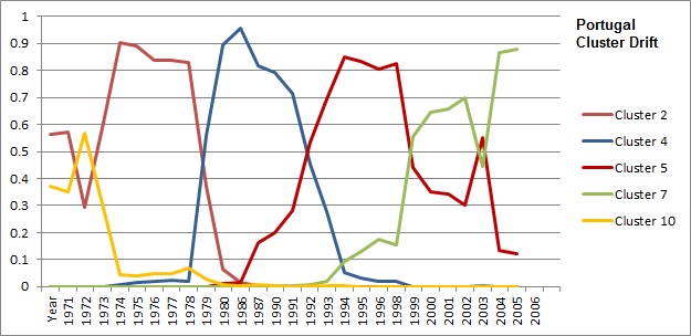
Figure 5 – Cluster Drift of Portugal.
Although the chart for Portugal suggests the people enjoy a similar quality of life to that of folks in the USA, Portugal’s grasp of Cluster 7 status isn’t very tight. It drifts between Cluster 5 and Cluster 7, whereas the USA and Japan are tightly in Cluster 7 despite Japan’s stagnant economy.
Figure 6 shows China. What is most interesting is that unlike the USA, Japan, and Mexico, from about 1975, it couldn’t fit very well (probability of say over .85) into any cluster. China certainly is unusual due to its sheer population size alone. But the USA’s portion of the world’s economy is similarly disproportionate to China’s portion of the world’s population. Yet, the cluster algorithm could fit the USA nicely into clusters much of the time.

Figure 6 – Cluster Drift of China.
China may be the 2nd biggest economy in the world today, but as of 2006, it hasn’t started to resemble the USA at any point as Mexico has (at least as the USA was in the 1970s – which was still very good). Remember, I didn’t include any cluster factors that speak to volume such as the GDP as itself (not per capita) or population size. China may be the 2nd largest economy today, but the GDP/Capita is still very small. Notice though in the lower right corner of the graph in Figure 6, that in 2003, Cluster 4 (as the USA was in 1971) starts to rise to a .1 probability.
Figure 7 shows the clusters China has bounced between, plus Cluster 7 (the USA in 2006) for comparison.

Figure 7 – China’s clusters plus Cluster 7 (current USA).
So What?
If it looks like a duck and quacks like a duck, it’s probably a duck, but there’s a chance it is a duck decoy. Predators getting prey to believe they are something they are not and prey getting predators to believe they are something they are not shaped life on Earth as it is today as much as the nature of water and the average temperature.
Whether we’re going to war, interviewing for a job, or making our pitch to a customer, our odds for success are greatly improved if we know more not just about the customers, but effectively differentiating from the competitors as well. If you’re a software vendor, you would want to know things such as:
- How is the shape of my client-base changing?
- How is the shape of my clients’ clients changing?
- What are my competitors doing to outflank me?
- What are the warning signs of the “death” of my customer?
For a software vendor, Cluster Drift is even more useful if the death and birth of the domain served is high, such as with restaurants. Could we answer something like, “Are we the choice software vendor for is now the walking dead?” If we found the proper clustering model, we could study the cluster drift of restaurants about to die and either help prevent it or move on to something else.
At the end of the day, what we want is intelligence on the entities we deal with. We want to know the nature of our relationship with these entities and how they are changing so we don’t interact inappropriately. Therefore, our cluster models must consist of measures that characterize those relationships. This includes things such as the number and type of contacts, number of successful and failed encounters, and volume of business; all divided by years so we can study the change in relationship.
The most compelling predictive analytics are implemented within a Darwinian meritocracy where business is a competition. For example, one of the big criticisms I’ve heard about Microsoft as a software company is that there are many groups working on the same thing. One example would be something like the workflow aspects of SSIS, BizTalk, Workflow Foundation, and even Visio developed redundantly throughout. It is true that it isn’t an optimal way to run a business, but it’s also beautifully Darwinian as well – attacking the same problem from different angles where each group is fighting for it’s own survival, eventually converging into a richer solution than had one group been charged with the problem. I know that sounds like heresy these days, but for a high-tech business that sort of Darwinian aspect seems to be a defining characteristic of an innovative entity, not a fault.
More Data Mining Caveats
It’s important to keep in mind as well that these clusters alone do not define a country or whatever is being clustered. This sounds obvious, but it’s fairly easy to get caught up in the fun of playing with these results. In reality, in our brains we cluster things from many angles. Most things operating in real life are too complex to be effectively captured via a single cluster. Some of these clusters are valuable, some not, either because they were misinterpreted from the start or have become obsolete.
The reason I love data mining is that it should force us to honestly reflect how we think and what drives us. But there is also a huge audience looking to data mining as alchemy; magic math that will reveal the secrets of the world providing riches grossly disproportionate to the effort invested (like winning the lottery). That magic math does indeed exist. The problem is that when we live in a world where intelligent creatures do not passively flow through life like trees and insects, the math will not calculate wins for everyone. Meaning, there is no way everyone can be the winner. Can a lion and gazelle both win? Life on Earth is based upon competition, an endless sequence of actions and changes.

This morning I read a few blogs on snapchat.com, particulary one from 7/19/2013 titled, Temporary Social Media (http://blog.snapchat.com/post/55902851023/temporary-social-media). It made me think about how the weight of social media artifacts can really weigh down your progression as a living, evolving person. That history of information will be quantified by data mining models further reigning you back in as you reach for growth as a person. That reminded me of how the Cluster Drift concept innately recognizes that people over time are really segments of different (but maybe sensibly similar) people.