Introduction
Back in 2006, I developed an ambitious idea that, though ahead of its time, now poses exciting possibilities in our data-driven era. The concept was simple yet potent: to construct a graph mapping various elements (such as database columns and parameters) used in formulas across Key Performance Indicator (KPI) statuses. The aim was to explore and understand the interconnections between different KPI statuses by identifying common columns.
In those days, however, the tools required for such a concept, such as graph databases, graph visualization, and robust programming and query parsers, were either nascent or non-existent. Consequently, both off-the-shelf and in-house solutions proved insufficiently robust, prohibitively expensive, or difficult to use, preventing the idea from taking hold.
This situation wasn’t unique to my concept, as other complicated and/or large-scale graph-based ideas like the Semantic Web were also emerging around that time. But today, we find ourselves in a vastly different technological landscape. With advancements like Large Language Models (LLMs) such as GPT-4, we can now parse SQL expressions and other mathematical formulas in various programming and query languages, thus bringing the concept of a KPI Status Relationship Map (KSR) to life.
The KSR serves as a dynamic extension to a Knowledge Graph (KG). A KG is a comprehensive graph mapping real-world entities throughout an enterprise and beyond and their relationships. It is a potent way to visualize and trace complex connections. Imagine each KPI as a node in this graph, with relationships between nodes representing the mathematical connections outlined by their respective formulas. Indeed, for business intelligence teams that can see themselves as the caretakers of the “intelligence of a business”, an enterprise KG is the centralized brain.
I’ve recently written about other BI-based extensions to a Knowledge Graph:
- Insight Space Graph – A graph capturing all common salient points that would be gleaned from a dataframe through common visualizations – such as bar graphs, line graphs, pie charts, scatter plots, etc.
- KPI Cause and Effect Graph – This is very much related to what I’m proposing in this blog. The difference is that the Relationship Graph discussed in this blog relates KPIs at the low level of formula elements making up KPI status formulas, whereas the Cause and Effect Graph relates KPIs through the higher level of correlation of the KPI status values computed from those formulas over time. In other words, the former is. “How are the KPI status formulas related?”, and the latter, “Is there really a correlation between the KPI statuses?”
Enhancing this model’s appeal today is the ability of LLMs to infer potential relationships. For example, consider a column from a sales database named [FactSales].[SalesAmount] and another from a CRM system called [CustomerPurchase].[Amount]. Even without explicit linkage in any KPI formula, the LLM can suggest that these columns might represent similar or related data points. This hypothesis, accompanied by a probability estimate, can be incorporated into the graph, further enriching the insights it can offer.
However, before proceeding further, it’s important to note that as of this writing, AI isn’t yet fully capable of handling this effort autonomously. While AI can perform many tasks—like transforming from one programming language to another (for instance, SQL to Cypher or SQL to Python) and making inferences that might elude most humans—it still requires a human touch.
With that said, I realize it may seem like there’s no point to reading this further. However, AI is advancing so rapidly at the time of this writing that efforts that were indeed very tedious only a few years ago are at least in striking distance of feasibility today. The current state of “LLM prompting as code” is akin to a scenario where students of Michelangelo complete 99% of a painting, and the master himself adds the finishing touches – that last 1% which is the magic that bring Pinocchio to life.
To be clear, your results will vary from what I present here. Ironically, some long-time programmers might struggle a little bit with AI having some level of a “mind of its own”. Rather than the purely algorithmic way we’ve historically told a computer what to do via programming, telling an AI what to do is really not that different from how humans are trained to do a task. So this blog is more of an exercise in how to work with an AI as a really broadly knowledgeable co-worker with lots of “book smarts” but no live work experience.
I used to say in BI workshops I taught:
- Q: What is the best thing about computers?
- A: It does exactly what you tell it to do.
- Q: What is the worst thing about computers?
- A: It does exactly what you tell it to do.
That’s not exactly true anymore, and that’s good – for the most part.
Security disclaimer: This blog is about presenting the idea of using an LLM to make KPI Strategy Maps and this Relationship graph feasible. I use ChatGPT as an example of an LLM because it’s by far the most familiar and accessible at the time of this writing. But please consider the risk of exposing what could be sensitive business information to ChatGPT – at least until openAI can make safety concerns unambiguous. I believe Azure OpenAI is safer as your interactions occur in a tenant separated from the rest of the world. Or the notion of “private LLMs” – a completely different topic.
Example – KPI to KSR
In this section, I’ll walk through a simple example of converting a set of KPI status formulas into a KSR. These are the tools we will be using:
- Neo4j – Graph Database – In this new era, Neo4j offers a fantastic platform for the storage, query, and visualization of Knowledge Graphs, making it the ideal tool for constructing and updating our KPI Status Relationship Graph. Although there are other products that can handle the needs of a complicated large-scale graph (ex. Azure CosmosDB), for this blog, I’ll use Neo4j along with its Cypher language.
- Cypher – Graph DML/DDL Language – The native language of the chosen graph database, Neo4j.
- Graph Visualization – Neo4j’s built-in visualization and query tool.
- SQL and Python – Language of the KPI status formulas.
- ChatGPT – AI, Large Language Model – At the time of this writing, it’s the most easily accessible AI.
- Notepad – Text editor for storing the prompts to ChatGPT.
I’ve posted the formulas, prompts, and results on github to dig beyond what I can convey in the inline snapshots included in this blog.
Apologies for the hard to read snapshots. I tried to break it much as much as I can. Click on any image to see a full size.
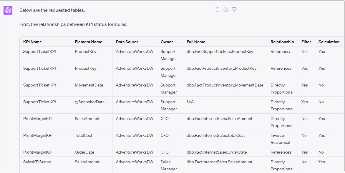
The KPI Status Formulas
This example consists of six KPIs belonging to six different departments. The KPI formulas have been compiled into a single file we will feed to ChatGPT as an initial prompt. It includes an introduction to ChatGPT on what we plan to do and some preliminary instructions.
Figures 1a and 1b, respectively, show the instructions and an example of a KPI status function from the file.
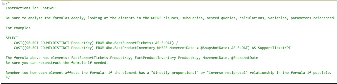
The prompt in Figure 1a is just the first of a series of prompts we’ll give to ChatGPT. Depending on how many KPI formulas there are, the prompt can be too big for ChatGPT to take in at once. This initial prompt is to just give ChatGPT a heads-up for what is to come.
Notice that I give it an example. It becomes necessary when the instructions become more complicated. It seems to help ChatGPT prioritize. Even a human intelligence needs examples when explaining a task.
Figure 1b shows the first two KPI Status formulas that will be fed to ChatGPT – for the Customer Support Manager and the CFO.
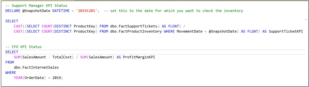
Of course, departments, employees, and even machinery can have a number of KPIs. For this example, there will be only four more. When there are very many KPIs, they should be fed to ChatGPT in chunks.
Notice that I’ve provided a manually-authored comment for each KPI Status formula name. In some cases, it’s not difficult to automate the collection of the KPI Status formulas. For example, if they are defined as scalar functions in a SQL Server database, it’s not difficult to generate a script outputting them to a text file. Additionally, metadata could be added as comments assisting ChatGPT with an understanding. For Python, it’s “pythonic” to include function and parameter descriptions inline with the code.
Parsing the Formulas
Now that ChatGPT has our KPI Status formulas, they need to be parsed into a table of formula elements. Such parsing code has been tricky to write and maintain, especially when many formats or languages are involved. But ChatGPT is actually quite good at parsing code.
Figure 2a-c shows the prompt to parse out the formulas (in three parts) into such a table.
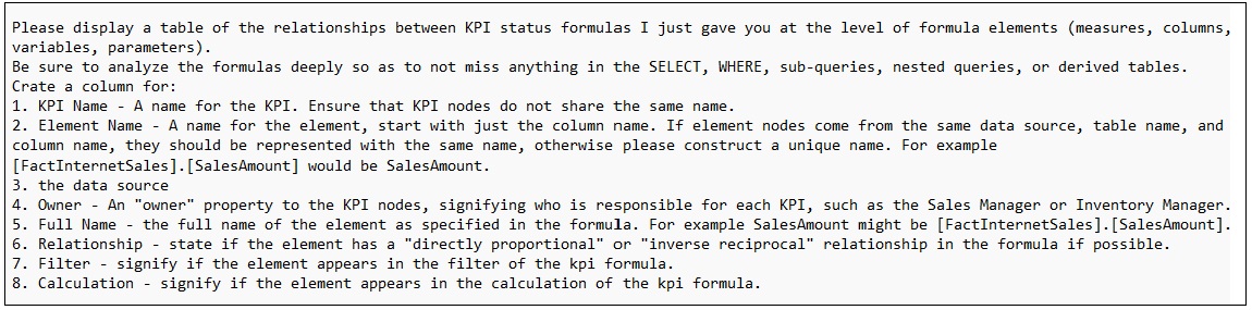
There is an art to prompting an LLM. It’s really not much different from explaining to another person what it is we’re looking for. Note how I spelled out the columns. Additionally, we offer people examples, background, and even provide an outline of the possible steps.
Figure 2b is a prompt asking ChatGPT to create a second table of similar formula elements. I ask it to use its own intelligence to infer similarities between elements. These relationships are actually at the heart of the KPI Status Relationship Graph.

Similar formula elements include formula element pairs that are:
- Sourced from the very same database table and column.
- Could be referring to a what could be the same data, but they are from different sources. In this case, I ask it to use its intelligence to determine if that could be case and provide a probability.
The last part of the parsing prompt, Figure 2c, are instructions unique to the user. The first two parts (Figures 2a and 2b) are rather generic instructions.
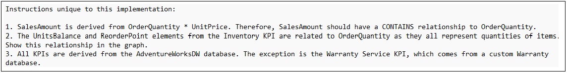
The first instruction is a hint that SalesAmount is a calculated value – OrderQuantity * UnitPrice. Using AdventureworksDW alone, it might be too much of a stretch for ChatGPT to make that assumption itself.
Ideally, we wouldn’t need to make too many of these custom instructions. After all, a primary theme of this blog is that AI can relieve enough of that effort towards the side making the idea of this graph worthwhile.
It seems like sometimes I need to remind ChatGPT that it is an AI and I expect it to offer some connecting of the dots. But sometimes, those instructions are meant to circumvent an erroneous assumption ChatGPT may make that we’re already aware of.
Note that although most of the KPI status functions are coded as SQL, one of them is a python function. Figure 2d shows the python function and the output from ChatGPT for that HR KPI status formula.

The Parsed Output
Figures 3a and 3b show the result of the prompting to ChatGPT in the previous topic. Rather than directly requesting Cypher code to create the KSR, outputting to a table first offers chance for a quality check of ChatGPT’s work. As I alluded to at the end of the overview, ChatGPT still needs some work.
After having written code parsers many times over the decades, I’m thrilled to see how well ChatGPT parsed the formula elements! It’s even more impressive how it could recognize the effect the element might have on the formula (the Relationship column).
Further, the two similarities shown in Figure 3b are inferred by ChatGPT! That’s very incredible.

At this stage, before we create the KSR, we have a chance to correct ChatGPT’s work. For example, the relationship it inferred for SalesAmount and ItemSalesAmount might not be valid. We can ask ChatGPT to ignore it by prompting: Forget about the similarity between SalesAmount and ItemSalesAmount.
Also, sometimes it can be a little lazy. Instead of listing each KPI to element relationship, it lists a few and makes a comment along the lines of “\\ … and it goes on like that …” So look out for that and scold ChatGPT. Even an AI tries to get out of doing work … hahaha.
The KPI Status Relationship Graph
At this point, ChatGPT knows all it needs to know to generate the code for our KPI Status Relationship Graph. Figure 4a shows the prompt we use to request the code.
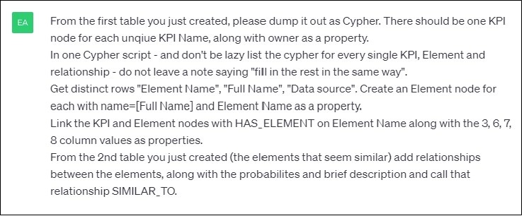
Figure 4b is a partial listing of Cypher code generated by ChatGPT for the creation of our KSR in Neo4j.
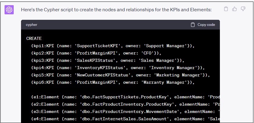
Figure 4c is a visualization from Neo4j’s of the KSR resulting from the Cypher created by ChatGPT shown in Figure 4b. I’ve inserted a few key relationship details into Figure 4c to highlight the similarities between the elements.

The example I’ve just covered could be automated using the openai API. Perhaps with more experimenting and testing with the prompts and more explicit examples, the process could possibly become very near to 100% automated. However, as I’ve mentioned, this exercise should be looked at as a process requiring humans to take the last few steps – at least at the time of this writing.
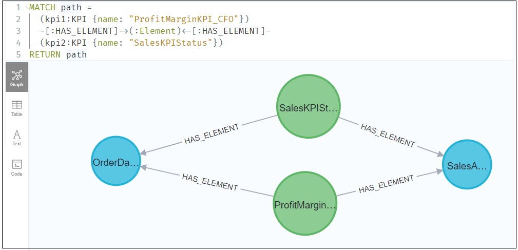
Querying KPI Relationships
Figure 5 below demonstrates a simple example of querying the KSR. In this case, we’re querying the KSR for elements two KPIs have in common.
Much more profound queries are possible when the KSR is connected into a Knowledge Graph.
Connecting to a Knowledge Graph
The KPI Status Relationship Graph (KSR) is intended to be a component of a wide-scoped Knowledge Graph (KG). It can link into the Knowledge Graph through such objects as:
- KPI owners – The KPI owners would map to employees in the KG, which would undoubtly include an org chart.
- Data sources – The KG would most likely include comprehensive metadata of all data sources (a data catalog). The elements of the KSR would map to the column attributes of the data catalog portion of the KG.
- Parameter objects (ex: departments, employees, products) – The KG would probably include objects in lookup or reference tables.
Conceivably, the LLM can suggest other connections based on comments in the prompts and what it knows about the Knowledge Graph, which the LLM could query (ex. ChatGPT could query via a ChatGPT PlugIn).
A Subtle Difference Between KSP and Strategy Map
As mentioned early in this blog, in addition to the subject of this blog, the KPI Status Relationship Graph, I recently wrote about the very similar Strategy Map. I mentioned that both are graphs of KPI status values, but the former relates KPIs at the lower level of the formula elements. That is versus the latter relating KPIs at a higher level of correlation of the KPI status value.
However, the Strategy Map generally only links KPIs with known and/or intended cause and effect (do the statuses between a pair of KPIs go up and down together). In contrast, the KSR links KPIs via common formula elements. Those common formula elements can link any KPIs that happen to share elements, including elements inferred to be similar through the assistance of AI.
Because the KSR finds common elements between all KPIs, it could discover relationships we didn’t think might exist. Likewise, we could just for kicks, correlate any pair of KPI statuses in the strategy map to discover relationships we didn’t know we didn’t know.
Conclusion
The ultimate goal here is to remove friction from understanding the relationships between various KPIs, which in turn defines the motivations driving information worker actions. With less guesswork and more knowledge, organizations can evolve proactively and play offense rather than merely reacting to the environment.
The journey from concept to feasibility has been long, but today, we finally have the tools to make the KPI Status Relationship Graph a potent reality, a reality that promises to contribute significantly towards how organizations understand and act upon their data.

I thought this blog I wrote on how data vaults are closer to knowledge graphs is an interesting related topic: Data Vaults and Knowledge Graphs – Kyvos Insights