______
Oct 2, 2023 – Quick update since the original post date (March 21, 2022) – I wrote a newer version at my Kyvos Insights blog page. It’s shorter, a little more LLM-y, Knowledge Graph-y, and focuses more on the benefits of Kyvos’ Semantic Layer and the superb query performance: https://www.kyvosinsights.com/blog/knowledge-graph-bi-component-insight-space-graph/
______
The Insight Space Graph is my concept of an automated recording, mapping, and linking of simple insights gleaned primarily from human analysts performing typical Business Intelligence tasks. An example of such an insight are the overall trends and spikes spotted in a time series line graph. Such insights provide hints that contribute towards decisions, direction, and the formulation of strategies.
Analysts utilize sophisticated Business Intelligence (BI) visualization tools such as Power BI and Tableau to explore vast data spaces. From a catalog of business entities, the attributes of those business entities, and metrics of activities involving those entities, they construct various visualizations of data that reveal insightful nuggets of information.
For the most part, these visualizations are the sort that most of us are well accustomed to – line graphs, bar charts, pie charts, and scatter plots. We see them every day on countless news sources, ads, and educational material. From these visualizations, we’re able to glean easily digestible insights. For example, the composition of things, trends, directions, magnitudes, etc.
Some of these insights are readily relevant to problems at hand. Some might be interesting to note for future reference or provide clues to an unsolved mystery. Some might be irrelevant, uninteresting, or seemingly obvious. Some potential insights might go unnoticed, in a needle-in–haystack, “Where’s Waldo” sort of way. For insights without clear and present value, the analysts make mental notes of the insights, maybe saves the visualizations, closes the visualization tool, and maybe shares some of them with select team members who she knows might find it valuable.
Consider though. Could those insights, whether of value or not to her, be valuable to any of the potentially thousands of fellow employees in far reaches of the enterprise? If they were, the analyst probably wouldn’t know who to tell and they wouldn’t know who to ask.
She and every other analyst across an enterprise could mass-email their insights to everyone else – just in case it might be of value to someone. But multiply that by thousands of times for each insight by all those analysts and it becomes readily apparent that it’s not a good idea.
However, the vast majority of those insights from those common everyday visualizations are easily programmatically lifted. Meaning, our ability to readily articulate the interesting things we see in the graphs means it’s relatively easy to encode with a programming language. And most of these visualizations are populated with tabular-shaped data sets that is extremely easy to work with.
It starts with capturing the query from the analytics tool to the database. It’s usually some form of SQL GROUP BY (queries returning aggregated metrics, mostly sums and counts). The results of that SQL could be fed through an array of functions, each calculating a different insight. It is recorded into a graph and linked via various metadata (ex. database, table, column, value, user login id, visualization tool, datetime).
The end-product is an integrated network of a large-scale number of insights previously trapped only in the heads of thousands of analysts. These insights may not be the deepest caliber of insights spawned by the brains of people, but it collectively forms a richer layer than the relatively elemental form provided by current analytical data sources.
TLDR as an SBAR
- What is the next step after Data Mesh?
- Wider/Flatter-scoped integration of human and machine intelligence?
- Inferences are made from chains of relationships, not grids of values.
Situation
The bulk of the “intelligence of a business” resides solely in the heads of thousands of individual human workers. At the same time, the scope of the enterprise awareness required to successfully compete in a progressively data-driven world is expanding. Thus, the volume and breadth of data entering the data space of enterprises is frantically widening. In turn, the gap between business scenarios we face and our ability to analyze it is widening. What measures can we take towards narrowing that gap?
Background
For the last few decades, information workers supplemented their human intelligence by querying databases of enterprise activity. However, the sheer scope of enterprises means that the collective volume of those insights is too massive to be assimilated by more than a few workers. How could that knowledge be better shared without an explosion of information overload?
Analysis
The mere activity of analysts across an enterprise querying data warehouses through visualization tools provides rich hints about what data is important to them. The choice of visualization (line graph, bar chart, scatter plot) provides clues as to how the data is valuable.
Resolution
- A large-scale graph can be automatically built from information distilled from captured queries of the activity of enterprise analysts. It presents a richer form of information than what is in current Business Intelligence data warehouses.
- The “distillation” is performed through a set of well-understood functions, probably written in Python. The functions return the sort of thing human analysts see in common BI visualizations that are readily codable. For example, skew, trends, correlations, …
- That graph relating salient points automatically distilled from analyst BI activity is a rich map of “points of interest”.
- The graph could be queried to provide analysts with valuable insights already discovered by other analysts. For example, clues towards the resolution of problems and/or highlight what has already been explored.
- Updates to the proposed large-scale graph, which can involve thousands of queries, can be drastically accelerated using OLAP cube technology, particularly, Kyvos SmartOLAP.
Big Graphs
Although graphs are ubiquitously present in all corners of data analytics, the notion of graph databases still resides mostly on the cutting/bleeding edge, nice-to-have side of things. However, Semantic Networks, Knowledge Graphs, Bayes Networks, and Markov Chains are a few forms of large-scale graph databases housing large-scale sets of relationships that seem to be picking up traction.
Further, although not as large in scale, Data Catalog, Data Fabric, and Data Marketplace are other buzz-worthy notions that are at its core graphs mapping relationships between large collections of things along a spectrum homogeneous to heterogeneous. Centrally, the metadata of data sources across an enterprise
The rise of these comprehensive large-scale graphs addresses the somewhat neglected “V” of the originally “three Vs of Big Data” – Variety. The other two, Volume and Velocity, has been well addressed by Hadoop-like technologies, Spark, Kafka, and of course, the continuing improvements in hardware (including network speed and the Cloud).
Variety is only half-addressed. Variety in this half normally means a variety of data formats such as csv, xml, images, audio, video, etc. From an end-user point of view, Big Data variety is just a glorified, online hard drive (data lake) that is really fast for the size of the “files” it deals with.
I also include in this half of variety the steps taken to address the growing complexity of data landscapes. For example, the notion of schema-on-read (JSON formats, document databases, even those very wide “one big tables”) addresses that objects in the world are related to each other in a vastly wide and a persistently evolving variety of ways.
To illustrate that point, think about how as an employee, my employer is primarily interested in my past jobs, education, contact information. Depending on the job, that can extend well into what seems to intrude into the personal realm – health, close relationships, social media activity, credit rating.
Add the attributes of me as a spouse, relative, friend, colleague, student, teacher, consumer of products related to my interests. The open-schema paradigms of the document database world addresses this phenomenon.
In the Data Warehouse world, Data Vault addresses the understanding that objects are more than just what we currently find relevant. Our enterprises, customers, vendors, laws, partnerships, social norms – they all evolve. Data Vault facilitates the easy addition of new families of columns to the data warehouse using a structurally agile methodology.
Scale of the Breadth Half of Variety
We usually just think of the major software implementations such as the CRM, SCM, and ERP. But the number of software applications implemented in a typical enterprise goes well beyond that, in the range of dozens to hundreds. These are specialized pieces of software facilitating and optimizing hundreds of specialized roles throughout an enterprise.
Presumably, each of those software implementations ultimately provides value to the whole of the enterprise. Should the performance and value of these applications be left out of the radar of the analysts? It’s not easy to do. Integrating information from just two data sources is tough enough. The level of difficulty increases exponentially as more cooks are added to the task.
However, today the number of external data sources dwarfs the number of internal software applications. At an e-commerce site I recently worked at, there were over 500 external data sources from vendors, 3rd parties (ex: various Google services, Axiom, Experian), corporate customers, the latest research figures, and government agencies. Of course, we can add to that very many metrics from thousands to millions of IoT devices of very many types.
Surely some of those data sources become zombies, no longer useful, but we’re too afraid to cut them off. However, it doesn’t take away from the fact that enterprises now interface very intimately with its external world, driving the explosion of variety.
Due to that scale of data sources these days, “Variety” and “Wide Tables” takes on an entirely different meaning. Similar to a how a few terabytes was a big number 10 years ago, a couple of hundred data sources, comprising a few tens of thousands of columns may have been considered a large variety ten years ago. Today, large-scale variety is around the magnitude of thousands of data sources comprising a few million columns.
The Other Half of Big Variety
The other half of “Variety” is handling the side-effect of the widening breadth of data. That is the reduction or generalization of the number of entities and attributes. For example, at a health insurance company, there may be tables for Members and Patients. Both represent the human subjects of the business. Members and Patients have some common attributes (ex. birthdate, name, mailing address, gender) as well as attributes unique to the context of a member of an insurance policy and as a patient.
This is what I think of as the “Hard Problem of Business Intelligence”. The brute-force ETL, bus matrix, activities of the Kimball BI era has been the traditional discipline for attacking this problem. Then along came Master Data Management (MDM). But both are very difficult processes. It’s a very labor-intensive process even with assistance from major-league machine learning. In fact, this pain of the BI world is a big part of the pain Data Mesh and Data Vault addresses.
Metadata Management, Data Catalogs, Data Virtualization, and Data Fabric address integration by at least mapping out the existence of data sources and whatever metadata that can be derived. But truly integrating, generalizing, abstracting of the entities and attributes isn’t addressed very well.
To fully handle the scale of variety today, graph structures must step up as first-class data structures, beyond the realm of the “nice-to-have” status of the “we aren’t there yet” world. Graph structures lets us store a wide variety of relationships that are queryable in a logical, inferential manner.
The primary mechanism for generalization is some form of “is a” relationship. Many are the result of calculations (aggregations, ML predictions, ontologies) that summarizes a large volume of data into a nugget of information.
I think it’s safe to say that many of the most innovative and leading corporations have moved well into the realm of prescriptive and proscriptive analytics powered inferential queries facilitated by graph structures. As these structures improve, those without them will be further left in the dust.
Caveats, Disclaimers, and Clarifications
Before continuing, this is a good break point to clarify a few things.
The first is that although I discuss certain products to significant lengths in this blog, this is a blog about concepts I had been working with since about 2005 – not the products. I have built actual code (Map Rock and Porphyry) around these concepts. And where appropriate, I’ve incorporated bits and pieces of the concept for various customers.
However, I believe it’s only now that conditions are right for these concepts to gain significant traction within the Business Intelligence circles I mostly run in. Those conditions include:
- The currently considerable traction of Data Mesh bringing the discipline of the OLTP-side Domain Driven Design to the OLAP side. Data Mesh opens the flood gate for data-starved analysts, downstream from a bottleneck of pain.
- The tremendous interest in graph databases, particularly large-scale ones I mentioned earlier such as Semantic Networks.
- Kyvos SmartOLAP filling the big shoes of SQL Server Analysis Services in a Cloud-scale way. Pre-aggregated cubes that accelerate query performance of statistics-based queries from massive data volumes.
There are a few products I mention frequently in this blog that are either defunct (Map Rock, Porphyry) or heavily deprecated (SSAS MD). I bring them up to paint the context in which the idea of an Insight Space Graph emerges. However, Kyvos SmartOLAP and Neo4j are products that are alive and kicking at the time of this writing.
Map Rock is a product I developed starting around 2011 but has been in mothballs for over five years. I built it mostly as an attempt to reinvigorate the drastically declining popularity of SQL Server Analysis Services, my bread and butter at the time.
Porphyry is a simpler implementation of the Map Rock concepts. In fact, it’s an implementation of the subject of this blog, the Insight Space Graph (ISG). But the code behind Porphyry is trivial compared to that of Map Rock. Unlike the original Map Rock, Porphyry has no fancy UI and extensive SQL Server stored procedures. The code is mostly just a relatively trivial bit of Python code executing MDX (the language of SSAS and Kyvos SmartOLAP) or SQL and churning out Neo4j Cypher code.
I built the original Map Rock UI mostly so I could effectively demo concepts that were quite foreign back then to most of my BI audience. After a decade and all that has happened in BI since, I consider the Map Rock code not worth salvaging out of moth balls. However, the Porphyry code is relatively up-to-date. So some time in the near future, I will upload the Porphyry code to Github.
Regarding SQL Server Analysis Services. I believe the edition of SQL Server Analysis Services known as “Multi-Dimensional” (SSAS MD) to be an obsolete product. As far as I can tell, it seems to be “unofficially deprecated”. So I’m not recommending SSAS MD. I reference it much in this blog since SSAS MD and the problems it solves is very well-known to my audience. To be clear, it’s the SSAS MD product that I believe to be obsolete, not the immense value of pre-aggregated OLAP cubes.
Pre-aggregated OLAP cubes are alive and well in a Cloud implementation from Kyvos Insights. At the time of this writing, I’m employed at Kyvos Insights as a Principal Solutions Architect and Evangelist. I’ve authored many Kyvos-specific blogs describing the immense value of Kyvos pre-aggregated cubes in a modern data architecture.
However, although I will talk much about SSAS MD and Kyvos, the idea of the Insight Space Graph does not require OLAP cubes. Any data source that would work well in BI tools such as Tableau and Power BI will work. For example, conventional data warehouse sources such as those in Snowflake, Redshift, or Azure Synapse. The reason I stress OLAP cubes is that the idea is to integrate insights from a wide array of sources. OLAP cubes ensure the best possible query performance scalability.
Lastly, security could be the biggest monkey wrench in this. So I’m giving you fair warning early on. I’ll discuss security towards the end of this blog. The issue is mostly a matter of the complexity inherent with merged-database security. However, at the very least, there should be at least a few analysts who could benefit from course-grained access or even full access. Please do read on as I believe working through security paradigms for highly integrated data is a critical requirement for analytics to move forward.
Now, back to our show!
Connect the Dots … La La La (Pee Wee Herman reference)
I need to be clear that it’s not the fancy visualization of graphs I’m advocating. As mesmerizing as they are with all the bubbliness and lava lamp aesthetics, these graphs become unreadable and humanly incomprehensible very quickly, after few dozen nodes, often just a dozen. Instead, my interest is in massive numbers of relationships that are in a format that’s readily query-able as a database – just as one would query any other very large database. But in a very chatty, iterative manner.
The graph I’m thinking about:
- Consists of a massive number of nodes and relationships – in the magnitude of millions to billions and beyond.
- Has a relatively simple, highly-generalized, elegantly taxonomized schema. That means a few types of nodes and relationships.
- Is readily conducive towards automated construction. Relationships can be automatically calculated through fairly simple methods. For example, SQL GROUP BY queries.
Flow Charts, Work Flows
Most graphs we’ve encountered consist of relatively few nodes, so they are easy for we humans to understand. These graph visualizations with few nodes are great for illustrating high-level workflows. We often see these in user manuals, instructional videos, and PowerPoint presentations.
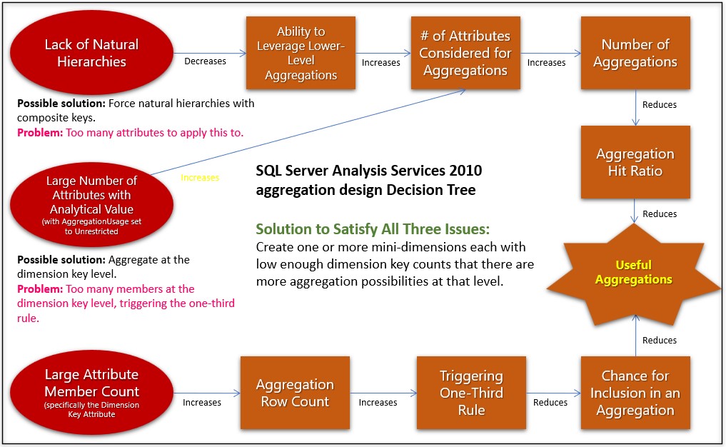
Figure 1a is an example of a workflow I authored around 2010. The few nodes conveys the high-level cause and effect of a highly technical system (SQL Server Analysis Services performance tuning). Befittingly, it illustrates cause and effect of performance due to very wide dimensions in an OLAP cube.
The graph in Figure 1b goes much deeper. It is a partial view of one I authored back in 2005 spelling out the cause and effect of interacting components and metrics of SQL Server 2005. It took too many hours to encode my knowledge of the SQL Server engine. In this case, although the graph is hard for we humans to comprehend, at about 200-300 nodes, it is relatively few nodes.
The challenge with building such graphs is that figuring out the dots and connecting them is a very intellectually arduous task requiring deep subject matter expertise. I’ve read of biologists who have spent years mapping out the “food chain” (trophic cascades) of just one moderately-scoped ecosystem. Those seem to be on par with my SQL Server graph.
The placement of the nodes were manually set using my human intelligence. The distances between the nodes (or length of the relationships) is purely artistic. The distance doesn’t have any mathematical meaning as it would in a scatter plot.

As difficult as it was for me to author the SQL Server performance graph in Figure 1b, it was somewhat effective at helping me troubleshoot issues I encountered that were novel to me. Querying for all paths between two symptoms provided ideas of multiple steps of cause and effect that would otherwise be very tedious to mentally trace through.
The sort of graph in Figure 1b is not what I’m talking about in this blog. However, I can imagine an open-source development efforts to build and maintain such graphs.
While there are graphs consisting of massive numbers of nodes and relationships (from thousands to trillions) that do paint insightful visualizations, the idea is more of a “50,000 foot view” of the graph. Those “social networks” comes to mind, clusters of millions of people, resembling a map of galaxies. The placement, size, shape, and coloring matter.
Large-Scale, Database-Populated Graphs
A couple decades ago I had the privilege of assisting on data crunching and analysis for the renowned cyber sociologist, Marc Smith, currently at the Social Media Research Foundation, where there are many such compelling and tantalizing examples. The clustering of nodes does paint valuable information.
My time working for Marc heavily influenced how I’ve approached Business Intelligence – with a flavor of social science. In the case of the ISG, it’s about promoting synergy among information workers through the “meta-analysis” of their collective analytical efforts.
Due to the volume of data, such graphs are obviously not manually authored. Rather, they are populated from databases. For example, a table of movie recommendations, emails from/to, or tweets/likes.
The Graphs I’m Thinking About
Like the graphs seen at the Social Media Research Foundation site, the graphs I’m thinking about for this blog are also populated from a database. In this case, a database of query statements (SQL, MDX, etc.) resulting from the normal BI activity of analysts across the enterprise. However, they don’t necessarily paint such visualizations that emerge from massive numbers of dots.
Rather, they enable methodical tracing of paths through massive numbers of automatically collected and connected dots. The main idea is to correlate notable things analysts might see in their BI visualizations. By correlating what highly knowledgeable analysts see, we drastically reduce the immense space of all the possible notable things that exist in the petabytes of data available to an enterprise.
The Four Realms of Business Intelligence “Space”
We could possibly be growing a little weary of analogies of data to bodies of water. It started from streams of data, flowing into data lakes, data reservoirs, data oceans, lakehouses, and beyond. So how about space analogies?
What I call “insight space” certainly isn’t A.I., but its information in a form closer to what resembles A.I. than the quality of information as it stands in current tabular and/or dimensional BI databases.

The reason for the existence of analytics/BI systems is to curate data into a relevant, trustworthy, and understandable form, and serve it to researchers, decision makers, and strategists. From that information, they take calculated actions. Unfortunately, it’s hard to see the effect of those actions beyond a few steps of cause and effect. Most likely some unintended side-effect will arise, which will trigger the need for more information.
That population of researchers, decision makers, and strategists isn’t as small as most people think. Most people work compartmentalized in their departments. They mostly interface with other departments through formal channels, receiving input from them and producing output to others. They are vaguely aware of most of what goes on in dozens of other departments.
There they are, thousands of information workers, each with knowledge of just their “fragment of the elephant”. Similar to how none of our bodily organs knows how the human works, no one employee knows how the enterprise really works. But yet your body and enterprise somehow works. The full workings of an enterprise is beyond any one brain because the idea of an enterprise is to scale-out the capacities of people.
The following is a tongue-in-cheek discussion of four topics describing the transformations of what happens starting in the real world through to some sort of graph that captures insights fragmented throughout many brains. The trick is that these insights must be a quantum that is more valuable than raw facts but simple enough that they can be harvested en masse.
Physical Space
In the context of the Insight Space Graph, the lowest-level realm of space is the physical world – real space where we do our work. This is where products are manufactured, customers live and consume products, and you continually optimize and adapt your enterprise to changing conditions.
It is of course, the most vast of the spaces because it extends beyond the walls of an enterprise out to vendors, customers, governments, world events both man-made and natural, fads, research, etc.
Data Space
In the physical world are computers and other gadgets that record events happening in the real world. This is the OLTP data world. This data can be rather dirty, incomplete, fragmented, possibly extremely voluminous, and often hard to decipher. Because of the drastically increasing number of data sources, the data space is widening.
The Internet of Things, e-commerce, and the Cloud are among paradigm-shifting subjects that expands the volume and variety of the data we’re able to capture. This blog is mostly concerned with the expansion of the variety of data. Despite talk of the explosion of the volume of data in the magnitude of exabytes, data space is the least vast of the four spaces. Exabytes of data and tens of thousands to millions of columns isn’t really that big. It’s a model representing a tiny fraction of what’s in physical space.
It might seem odd to think of data as events. Most are used to thinking of data as something looked up from a database. But really, the databases supporting those kind of lookups are just the current state of the database, the end result of a series of events.
This notion of data as events has been picking up steam via the concepts of Event Sourcing and the feature known as time-travel. Basically every change to data (change to the database state) is an event.
Cubespace
For the last few decades, OLTP data has been contorted through painfully crafted ETL processes into a form that is cleaner, integrated, organized, and optimized. It’s this user-friendlier form that’s exposed to human analysts. They are called dimensional models, a.k.a. cubes, multi-dimensional cubes, OLAP cubes.
These days, they’re rarely called cubes, but they are still at least equivalent to dimensional models. That goes for those csv files or “one-big-tables” which are flattened versions of dimensional models. Even though the term “cubes” might not be used much these days, the vast majority of analytics is still performed on these dimensional models.
Figure 3a compares physical space to cubespace, a term widely used in day of SSAS MD (ca 2000s). Like physical space, cubespace are scaffolded by some number of dimensions comprising the axes of the space. For cubespace, dimensions are high-level entities, under which are a number of attributes of those entities.
In the same way that every point in physical space can be addressed by coordinates (latitude, longitude, and altitude), values in cubespace are referenced by coordinates called tuples. The entire set of tuples forms a cubespace. Figure 3a shows that at the coordinate of Brad, Sales, 2019, there exists the value of 35,488. Move the yellow line one click to the right and we find the tuple of Curtis, Sales, 2019.

Figure 3b illustrates the concept of a set of tuples. Whereas a single tuple is a coordinate in cubespace, a set of tuples is a chunk of cubespace, ranging from a line of values, to a 2D plane of values (the tuple set shown in Figure 3b), to a 3D subcube of values, and to a 4D tesseract, to a 5D whatever you call it, and beyond.
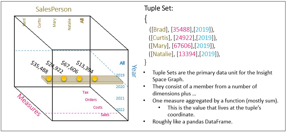
A set of tuples is roughly like Python dataframes. So sets of tuples are the common currency between OLAP cubes and Python. The concept of tuple sets is central to the Insight Space Graph since the insights are simple things we could say about a set of values, which is richer than the things we could say about individual values.
Cubespace is vast. It may not look like it based on Figures 3a and 3b. Believe it or not, even a moderately-complicated production cube (say around 30 “dimensions”, a few having 1000+ members) probably has a cubespace containing more points than there are stars in the Universe.
And that’s just one cube! With the currently powerful traction of Data Mesh, the analytics data of enterprises will consist of a larger number of domain-level “data products”. Data Mesh removes the bottlenecks that still prevent unimpeded flow of data from business process systems to analysts and strategists. Data Mesh ameliorates the bottleneck by advocating the distribution of the responsibility for the development and maintenance of analytics data from a monolithic, IT-centric effort into a parallel domain-level effort producing coherent, independent, and high-quality data products.
A domain is roughly a business process such as a sales cycle, the manufacture of a product, or the on-boarding of an employee. A data product is a consumer-facing data source consumed by analysts. By distributing the development and maintenance of analytics data from central IT, the IT bottleneck is removed and the people who actually work with the data is responsible for it.
Because the data products of Data Mesh are developed and maintained by the domain, the data is of a higher quality. There is less chance for misinterpretation of the meaning of domain data by folks who are not expert with the data. Thus, whatever analyst activity the Insight Space Graph is recording has less of a garbage-in/garbage-out factor.
In the context of this blog, each Data Product could be manifested in the form of a cube. That would be one or more cubes (data products) for each domain. The set of cubes (Data Products) could then be integrated (linked) via common dimensions. Examples of methods for linking might be:
- Master Data Management – A very non-trivial effort of mapping database objects (tables, columns, members) from one system to another.
- 3rd Party master data – There exists data from vendors that map codes or identities of various sorts.
- Enterprise-wide ID – Generally, a microservices implementation naturally creates enterprise-wide IDs of entities that are passed from microservice to microservice.
- Time is a ubiquitous dimension.
The point is that Data Mesh is a big factor in opening the floodgates for the hugely widening number of data sources finding its way to a population of data-starved analysts. The “sum” of those many cubes (data products) comprise a pretty daunting cubespace.
In a data mesh paradigm, the Insight Space Graph should be considered a data product in itself.
Lastly, note that even though cubespace is vast, cubespace is very sparse. Meaning, the vast majority of points are empty (null). If this weren’t the case, the idea of cubes wouldn’t work. For example, if thousands of salespeople at an enterprise sold tens of thousands of different products every day at thousands of stores to tens of millions of customers, the sales cube would contain so many values that we couldn’t store it.
Fortunately, that’s not nearly the case. In reality, it’s more like thousands of salespeople each sell a few dozen different products every day from one store to a couple hundred customers. Cubespace is a virtual concept. In reality, only non-null values are stored.
Insight Space
What I call Insight Space is the full set of notable features that could be derived from visualizations typically utilized by analysts and other consumers as they explore the cubespace through data visualization tools. Cubespace and Insight Space are related in the same way as a big box of Legos of various shapes and colors versus the different things we could build with the Legos.
Analysts explore cubespace mapping insight space using tools such as Tableau and Power BI. This is analogous to Captain Kirk and crew board exploring space for interesting things in their starship. It’s a mindbogglingly big space with just a few hints to set an initial direction towards something of value.
When an analyst opens up Power BI or Tableau, connects to a cube, and slices and dices, she is exploring a cubespace in the form of a dimensional model or flattened table. In reality, that loaded cubespace is usually just a small fraction of the data space of an enterprise. There’s only so much a human brain can take in. Fortunately, there are usually many analysts across an enterprise with an expertise with different parts of the data space.
Slicing and dicing around an OLAP cubespace isn’t very different from “exploring strange new worlds” like in Star Trek. They visit places in three-dimensional space (sometimes four or more) and chart the places they’ve been to along with a chronical of their adventure (“Captain’s log”) into their 23rd/24th Century Cloud.
The chronical of their adventure is the richer form a data akin to what I have in mind for the Insight Space Graph. Not just sums and counts, but notable qualities of a chunks of cubespace. The crew also has knowledge of qualities of the discovery that might be of interest to some parties out there – so it’s hashtagged as relationships: #dilithiumcrystals #crazyisotopes
Insight Space should be even bigger than cubespace. To use the Lego analogy again, the number, shape, and color of Legos in a box is much smaller than the number of things we could build with those Legos (permutations).
The maximum number of possible points in the insight space only begins with the product of the number of tuples that exist in cubespace (already a really big number), tuple combinations (an even bigger number), and the number of notable, thoroughly socialized features. Fortunately, putting it ridiculously lightly, the number of points and relationships human or machine analysts might find worthy of mapping in an actual production Insight Space Graph will be an immensely small fraction of that number.
What does “worthy of mapping” (or notable feature) mean? Worthy to whom? The things we recognize as valuable are only valuable in the context of our personal “birth-to-date” frame of experience. We probably fail to fully appreciate the vast majority of important things as we encounter them because the context in which it might be valuable is still unknown to us. It’s very difficult to proactively find something of significant value that isn’t already known and obvious.
However, it could be that the human analyst is plagued with biases of many types. Those blinders miss many opportunities for exploring completely uncharted area. This is where the inclusion of analytics from across the enterprise analyzing data for multiple purposes across multiple databases comes in.
Because of the overwhelming sparsity of novel insights in an Insight Space, the Insight Space Graph method must incorporate some level of the human intelligence of analysts for hints. The normal activity of these analysts are clues to what could be important, substantially narrowing the search space. Being a machine, the Insight Space Graph is less prone to the effects of information overload than human workers with all sorts of stresses in and out of the work environment.
Insight Space is an awful lot of space for a relative handful of human analysts to thoroughly explore through Tableau! Indeed, that’s still a lot of space even for a program automatically brute-force querying each permutation of tuple sets. Further, as mentioned earlier, the data space is drastically widening.
Additionally, Insight Space is as void of new and valuable insights as outer space is mostly void of matter and gold mines are mostly void of gold. Using the Lego analogy for the last time, most things that could be built with Legos are essentially garbage. It’s actually very difficult to find something in a BI system that isn’t already known, downright obvious, or too ridiculous to entertain. A common customer complaint in the land of BI consulting is, “Show me something I don’t already know.”
A Little Anecdotal Detour: A few years ago, I built a “Bayes Network” from actual claims data (of course, with the required scrubbing) for a healthcare-related organization. I found it surprisingly difficult to find anything interesting. Just about everything was either too weak to bother mentioning or very obvious (ex. cough and flu). However, one particular diagnosis, Vitamin D Deficiency, correlated with quite a few unlikely other diagnoses. When I presented the “Bayes Network” to a group of mostly MDs, I asked if anyone had thoughts on my Vitamin D finding. They chuckled at the silly programmer; there’s obviously some confounding factor. My point is that within a couple of hours searching an extensive “Bayes Network”, that’s the only juicy example of something interesting that I could find.
Insight Silos
At least for now, “insights” are a human thing. Insights materialize when the dots are connected in someone’s brain. What I mean by Insight Silos is that those discovered nuggets of enlightenment are stuck in the heads of people and therefore are not readily consumable by other humans.
However, I’m not talking about the very high-intellect, Earth-shattering, few-in-a-lifetime insights such as those produced by Newton and Einstein. I’m talking about the abundant, simpler, lower-level insights of the sort we all have every day. Specifically, the insights a human analyst gleans from the common data visualizations I mentioned towards the beginning of this blog.
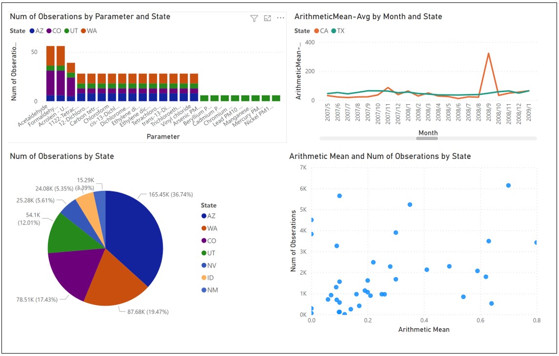
Imagine an analyst opens a powerful data visualization tool such as Power BI, Tableau, or even good ol’ Excel. She connects to a data source, selects columns and measures, and views the data in various ways, noticing different qualities painted by each visualization. For example, from the top left, clockwise, notice the graphs in Figure 4:
- Bar charts – Shows the composition among a set of entities, the overall value of each member, the distribution of the overall value, and that there seems to be three “classes” of members by that value.
- Line graphs – Lines representing different objects over time reveals relationships. Which lines go up and down together, or down when the other goes up? Note that odd spike for CA and that in fact CA has a spikier pattern than TX.
- Scatter plots – A quick and dirty clustering. For example, “Magic Quadrants”. Or the scatter plot could show a tight linear relationship. It exposes outliers.
- Pie charts – Is there a dominant entity? Or an oligopoly of entities, followed by a long tail of little players?
All of those noted insights can play a part (a dot to be connected) in decisions or devising strategies utilizing that insight. Most of these insights will probably end up on the “cutting room floor” for that analyst, never noted, and eventually forgotten. But could those interesting albeit not useful insights be of value to other information workers? There’s a good chance that among thousands of others working in their silos, your “garbage” is their treasure.
All of those insights are easily captured in code. In fact, most of basic machine learning is about programmatically extracting such insights from large data sets. For example, linear regression, k-means, my favorite, the Pearson Product Moment Correlation Coefficient (PPMCC).
The PPMCC measures the similarity between two lines plotted on a line graph. The beauty of the PPMCC is that it works very well with the ubiquitous time dimension. The calculated value ranges from -1 through 1:
- -1.0 = Inverse correlation. When one line goes up, the other goes down, and vice versa.
- -0.5 = Somewhat inversely correlated.
- 0.0 = No correlation at all.
- 0.5 = Somewhat correlated.
- 1.0 = Perfect correlation. Both lines proportionally go up and down together.
For a 100% Stacked Bar Chart, the compositions could be captured through simple variance. Insights from a Scatter Plot are captured through K-Means clusters or linear regression.
The structure of a graph of these insights resembles a human brain more than artificial neural networks (ANN). I’m not talking about resemblance to the structure of neurons and synapses, but the integration of information recorded across a wide variety of sources. Essentially, a graph of relationships between what human BI analysts can assert from regular BI visualizations.
Basic Mechanism
Think of the many intellectually taxing jobs, such as those of detectives, doctors, and software support. Obvious solutions are easily found through cheat sheets and search engines. But solving novel problems requires traversing a web of relationships. For example, a detective searching for any chain of relationships that a particular death relates to a strange object found near the crime scene.
In the scenario where a human user is analyzing through Power BI or Tableau, we capture the SQL submitted to the underlying databases (through the database’s logging mechanism) and process the resulting data sets through a series of functions, each calculating some metric. Each metric is a representation of some salient point one would notice in a common visualization.
Of course, that means the analyst must be using a direct connection to the database – as opposed to exploring data sets imported into the tool. In the latter case, we can’t capture the queries filling the visualizations.
Alternatively (or additionally), manually authored SQL GROUP BY queries could be registered into a metadata store and used to automatically populate and refresh the graph periodically.
Subject Matter Expert Analysts vs Data Scientists
I should address why I’m suggesting this very human-effort-intense method of capturing insights, as opposed to the programmatic, thorough, and precise methods of machine learning. This splits up the business analytics folks into two high-level categories – the more traditional BI analyst and data scientist.
The end-game for both is to improve the strategy of the business and optimize its processes. They both depend heavily on data. In my view, the for the analyst, data plays a supporting role to the analysts’ human intelligence. Whereas for data science, the roles are switched – data plays the central role and the data scientist plays more of a supporting role.
Generally, Data Scientists are expert with machine learning algorithms and statistics, as well as being at least fair with coding (usually Python or R, usually better with SQL than analysts). However, they aren’t usually experts at a particular business process/domain. Without domain expertise, data scientists must wade through thousands of columns of data (up to hundreds of thousands) to find possible data sets. Of course, the data scientist employs machine learning to automatically cull the columns to a juicy set to run through algorithms. But it’s still a painstaking process due to the vastness of the data space.
On the other hand, analysts generally tend to have more of an expertise in the business process but aren’t as adept with mathy/technical statistics and machine learning as data scientists. These days business subject matter experts usually work as a team with data scientists (and data engineers).
However, for many “everyday” analytical tasks, deep machine learning expertise isn’t required. Analysts still make much headway without data scientists, exploring data spaces through powerful visualization tools such as Tableau and Power BI. These tools are designed for relatively simple and mostly manual exploration of data – without programming, data wrangling, incomprehensible representations, or machine learning expertise.
I should clarify that by analyst, I’m not thinking strictly of the MBA sort of role. Most managers are analysts to a far extent. In fact, I’d say “analyst” is a spectrum of information workers, anyone who relies on information to some degree to excel at their work. This means the collective analytical power of human analysts is still considerably more voluminous (albeit not as intense) than that of the collective data scientists.
Although Machine Learning, A.I., and robotics are quickly maturing, the expertise of humans – who actually do the work using their still superior brains – comprise the vast majority of the “intelligence of a business”. Even if a robot or “A.I.” physically does some type of work, a human sets it all up, at least for now. It’s the activity of these Business Intelligence users and the accompanying use cases that are the prime building blocks of the subject of this blog.
Insight Space Graph
Everything is a relationship. The strategies we envision, big and small, are the result of computations traversing a web of relationships. Today, despite the Cloud, Big Data, and Machine Learning, almost all of those relationships about how things in our society works lives in our brains. The analytics we do with Excel and Tableau simply supplies values for the dots we connect within models of relationships we’ve learned over our lives.
Therefore, as most graph database fans know, the data structure of a genuine A.I. would need to start with a graph, and minimal primitives (basic algorithms for noticing things within data sets).
So a few years ago, I had the opportunity to use Neo4j as the primary database in a project. It was a rare time that I got to deeply wrap my brain around graph databases, Neo4j and Cypher. Usually, projects I work on required my brain to simultaneously embrace multiple programming/query languages. Around that time, it would typically include a few dialects of SQL, C#, MDX, JavaScript, R. It was a rare treat to focus on a subject of great interest to me.
As soon as the project ended, I took advantage of having my brain fully wrapped around Neo4j and Cypher by developing an up-to-date version 2.0 of Map Rock, an application I built around 2011 for building graphs of correlations held across BI data (SSAS MD OLAP cubes). This time from a different angle.
The bulk of the effort involved with the first version of Map Rock was primarily around a rich, specialized UI. The concepts of Map Rock at that time required much custom work, including graph visualizations. The heavy data lifting was performed by SSAS MD, and to a lesser extent, SQL Server itself. This newer version of Map Rock:
- Isn’t an extensive UI, but more of a process for developing a large-scale graph of insights. The code consists of relatively straight-forward Python.
- Employs Kyvos SmartOLAP (instead of SSAS MD) and Neo4j for the two primary classes of data heavy-lifting.
- Distributes focus across more kinds of relationships than just the Pearson Product Moment Correlation Coefficient.
The reason I originally focused on the Pearson Correlation is that it works across time series. Date/Time is pretty much the only ubiquitously common dimension between data sources. Master Data Management wasn’t as ubiquitous as it is today, so the time dimension was the only reliable way a sizable array of SSAS cubes. However, although there is very much value in this method of integration, it’s not enough. Integration of data must involve other kinds of entities. For example, major entities such as customers, products, locations, and employees in various roles.
Figure 5 below illustrates the two high-level kinds of integration of data I discuss in this blog:
- Insight Space. Integration of “deduced interest”. Capturing what we think human analysts look for in visualizations and storing it in a really big graph.
- Cubespace. Mapping the array of independent, coherent Data Products within a Data Mesh.
The big orange oval is the Insight Space, a graph of metrics derived from the data used to render simple visualizations. Each of the purple-lined boxes is a metric applied to a tuple set. Note that most of the metrics (purple-lined boxes) are metrics of single tuple sets. However, the Pearson metric is between two tuple sets.
The green-circled numbers within the orange oval describe a few major aspects of the Insight Space:
- Through Tableau, the analyst is looking at two visualizations built from the same tuple set – a 100% Stacked Bar Chart and a scatter plot. From the tuple set, several notable metrics are calculated and associated to the tuple set.
- A dashboard (near the red-circled “2”) contains a few visualizations. Each visualization is built from different tuples, possibly from different data products.
- The metric object (let’s say it’s a Pearson Correlation) is the product of two tuple sets (the two blue incoming lines).
- The “A.I. Explorer” (** just a hypothetical component **) would be a consumer of the Insight Space Graph. It would look for valuable and not-so-obviously valuable paths.
- The Data Scientist is a consumer of the Insight Space Graph, using either the Neo4j browser and/or the Neo4j Python library.
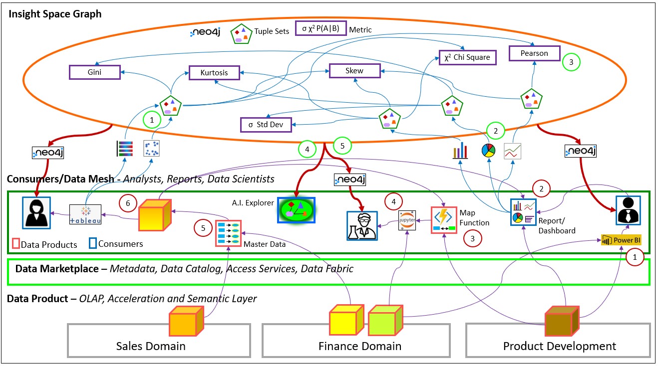
The numbers circled in red (within the green box) in Figure 5 above describes a few of the common ways that data is integrated (linked/bridged) between data products of a Data Mesh. Data Mesh could be thought of as the methodical application of the OLTP-side Domain Driven Design to the OLAP side facilitates the ability to supply a wide breadth of data to analysts, managers, and data scientists. As I mentioned that breadth is drastically widening – at the least, wider than you really think.
The Data Mesh plays a very important role in the building of the large-scale ISG. The wide breadth of analytical data the Data Mesh enables is like the rich plotting of points on a map. In this case, we are mapping the enterprise ecosystem. As one could infer the possible locations of where to plant crops or build to a datacenter from a rich geographic map, one could infer strategies and yet unseen “levers” from a rich map of insights.
However, we need to go further than must delivering data products. There must be bridges/links between data products of the data mesh. Otherwise, they are fragments, analytical silos. The following describes the six methods (numbers circled in red) for linking/bridging the array of data products (cubes):
- Self-Service Modeling Capability – Power BI and Tableau are equipped with modeling features. Data sets from one or more sources can be imported and linked utilizing powerful features.
- Report Modeling – A report can consist of components from multiple sources. For example, one data product could supply KPI information, another could supply charts for sales. This isn’t really mapping data, but it’s still a sort of composition of data from multiple products.
- Map Function – A map could be something as simple as a table. For example, one that maps ICD9 to ICD10 codes. It could be a function that takes in a customer’s body weight and height and returns some BMI bucket value. The latter is a simple example of a map function that is a product of data science.
- Custom Code – These are complicated transformations beyond table mappings and simple functions. They usually take the form of scripts or Notebooks written with languages such as Python, R, and PowerShell. They are generally developed by data scientists, data engineers, and sometimes analysts. An example of a script written by an analyst could be a “Python script” data source in Power BI.
- Master Data Management – Master data is usually implemented as a set of tables in some database. The master data could be accessed from a query to join entities from other databases or the master data could be downloaded into data sources. As mentioned, it is a crucial enabler of Data Mesh. But as this list of mapping types demonstrates, it’s not the only one.
- Materialized Composite Cube – One or more data products merged into a single cube. It may be that one or more cubes contain data that are often used together, have rather static schemas, possess common dimensions, are updated on the same cadence, and have at least somewhat similar granularities. A single common cube offers the most performant option.
Master Data Management (including 3rd Party mappings) is the most formal method for integrating a variety of sources. Microservices implementations naturally address integration of entities since communication between the microservices refers to system-wide keys.
However, the bright side about external data is that there is some natural level of mapping. For example, vendors must somehow map their invoice numbers to our purchase orders and vice versa – which already happens. But deeper down, there will most likely be issues with data formats and semantics, such as differences in name and address formats.
Lastly, please note that although Figure 5 depicts data products as cubes, I don’t mean to say data products must be pre-aggregated cubes, as in SSAS MD or Kyvos cubes. Rather, I chose to depict data products as cubes here because the plurality of data products across an enterprise will be in the form of a dimensional model. Data products are not restricted to cubes or dimensional models.
The Ubiquitous Time Dimension
Unfortunately, Master Data Management can only address a small subset of entities at play within an ecosystem. Mapping even simple entities from one system to another is a surprisingly daunting task. With all the combinations of mapping there would be at a typical enterprise, there will always be a backlog of unmapped data.
However, as mentioned earlier, there is one ubiquitous common dimension – Time. Therefore, my initial focus with Map Rock back in 2011 was to catalog correlations between tuples using the Pearson Correlation I mentioned earlier.
Please note too that most of the queries related to what I propose in this blog equates to sets of relationships, not a single relationship. For example, a single query would create/update a matrix of statistics between tuple sets and/or tuples. Results from an OLAP cube could return a matrix of Pearson correlations (values of tuples across a segment of time), not just one query per calculation.
Figure 6 is a snapshot from the old Map Rock (2011) of what I called the “Correlation Grid”. The row and column axes are from two different cubes.

The implications of retrieving what could be a large grid of correlations en masse is that because of the drastically superior query performance of a Kyvos cube for this class of query, we could entertain the option of not actually materializing some values (insights) in the ISG. If the number of relationships is very large and it’s not used too frequently, we could consider a method of generating those relationships at query-time. It’s along the lines of the ROLAP storage option in the OLAP cube world. It complicates matters, but Kyvos’ optimization unlocks that door if we need to enter it.
Figure 7 shows a Cypher query finding a chain of correlations between two entities, the ticker stock symbols AAPL and AMAT. This is a query that could help someone looking for any connection between those two stocks.

Another very compelling aspect of a web of correlations is that it could identify confounding variables. For any correlation between two objects, if those two objects correlate to a third object, both to an even strong degree, that third variable is really culprit.
As an example, there is the famous example of the correlation between depression and cancer. However, there is a confounding variable – smoking. Smoking is even more tightly correlated to both depression and cancer than is depression and cancer. Adding confounding relationships reminds me of inhibitory synapses in the brain.
Lessons From the Data Swamp
Although the Data Lakes of a few years ago addressed volume scalability as well as easing deployment and operational chores (thanks to the Cloud), there wasn’t enough focus on tidiness of the data lake. Setting up a highly scalable, somewhat inexpensive, storage account was of substantial value and fun in itself. It shifted E-T-L to E-L-T; just get the data somewhere accessible and let the consumers lose on it.
But this newly found capability resulted in many Data Lakes ending up as so-called data swamps. Data Vault and Data Mesh addresses this side-effect. Data Vault through a strict methodology of simple rules. Data Mesh by imposing the discipline of the OLTP-side Domain-Driven Design to the OLAP side of the fence.
Therefore, while addressing the “V” of variety through the construction of the large-scale Insight Space Graph, we should try to incorporate some sort of methodology. Porphyry is just my shot at generalizing what goes into such a graph with as few types of nodes and relationships as possible.
Figure 8a illustrates the core graph schema of Porphyry.
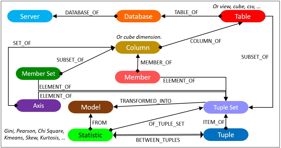
The terms, Server, Database, Table, and Column are familiar to anyone who has used relational databases to any degree. Member, Member Set, Axis, Tuple Set and Tuple are terms associated with OLAP cubes. These are generalized concepts that have multiple contexts:
- Server – An on-prem database server such as an Oracle or SQL Server server. It could be an SSAS or Kyvos OLAP cube server/account. It could also be a Cloud storage account, or connection to a Cloud data warehouse such as Snowflake.
- Database – A database within Server. For a Cloud storage account, this could be a directory.
- Table – For an OLAP cube source, this could be a Cube – A cube could be represented as a flattened table. For a Cloud storage account, this could be a file in a CSV format or even a JSON, XML.
- Column – For an OLAP cube source, this could be an attribute or hierarchy.
- Member – A unique value of the domain of a column.
- Member Set – A unique set of members from a single column.
- Tuple – A unique permutation of members from one or more columns of Table.
- Tuple Set – A set of tuples with the same dimensions. For example, the total sales for Eldery in CA across all cities.
- Insight – There is just one general Measures type of node. The type of measure (metric, statistic) is a property of the Measure node.
The relationship between Measure and Tuple Set indicates some sort of measure about the tuple set. For example, the Relative Standard Deviation or Gini Coefficient of the tuple set.
The relationship Measure and Tuple indicates a statistic between two tuples. Examples are a Pearson correlation between two tuples.
Figure 8b is a closeup of the tuple set schema.

Note that:
- Tuple 1 and Tuple2 inherits the Members of the Tuple Set. That includes Pens, Boise, and Sales Amount.
- Tuple 1 and Tuple 2 have one of the items of the Member set.
Insight Schema Examples
Figure 9a illustrates the schema of a Tuple Set insight. In this case, a Gini coefficient is a measure of the distribution of calories consumed over age groups.

The Insights nodes connected to a Tuple Set are where results of most machine learning algorithms would fit. Again, a tuple set is pretty much a Python dataframe. So something like the result (ex. RMSE) of a linear regression on a tuple set could be an “insight”. The insight (what a human user would see) is the strength of the correlation between two measures.
Figure 9b illustrates the schema of insights between two tuples. It depicts a measure of similarity of selected classes of liquor between Boise and Honolulu and Boise and Phoenix.

Note that:
- The three tuples inherit specified members from a TupleSet node.
- The Insights are its own nodes, as opposed to just relationships between two tuples. This is because the most insights will refer to shared nodes such as Model, Member (measure), and Member Set (distribution) nodes.
- The two Insights are the result of a single query which returned a matrix of composition similarity scores.
Figure 9c shows a possible special case for a tuple to tuple insight with the Pearson Product Moment Correlation Coefficient. As explained earlier, the Pearson Correlation is special because it is a value that involves the ubiquitous common dimension of time. The member set and measures are completely dissimilar. That means we could correlate tuples across just about any diverse data set in a powerful way.

The benefit of the format in Figure 9c is that the insight between the tuples takes the form of a relationship rather than an intermediary node. This is just one relationship as opposed to a node and two relationships. This will benefit performance of “six degrees of Kevin Bacon” class of queries seeking paths of correlation as illustrated in Figure 7 earlier.
There is a cross-join between the tuples from the left and right tuple sets. This symbolizes the “casting of a wide net” in the search for correlations. We can look for correlations by the “matrix load” as opposed to one at a time.
Figure 9d shows an example of an insight between two tuple sets. In this case, it’s a t-test between two cohorts.

As mentioned earlier, tuple sets are roughly Python dataframes. So Figure 9d covers whatever we measure between two dataframes.
Cubespace Measures
Measures about tuple sets and measures between two tuples are insight space phenomena. However, there are also two kinds of cubespace phenomena that are not illustrated in Figure 8a. Those are measures between two members and between two columns.
Measures between two members mostly measure the similarity between them. For example, “Eugene Asahara” in the customer database is the same as “Eugene A. Asahara” in the marketing database. These measures of similarity would probably be imported into the graph from Master Data Management sources. However, they could also be generated through a simple and fast algorithm such as Levenstein.
Similarly, Column to Column measures are measures of the similarity of the set of members in each Column. For example, the intersection of the members of the “Zip Code” column from one table and the “zipcode” column from another table is high – say 98% of the members in common.
Correlating Status Metrics of Key Performance Indicators
The status metric of a key performance indicator (KPI) is a measure of how well we’re currently doing towards our goal. The simplest example of a formula for the status metric is value-to-date divided by target-to-date. So, if we’ve made $12,000 so far this quarter against expecting to make $15,000 so far this quarter, the raw status metric is 0.80 which probably warrants a “yellow flag” warning.
KPI metrics are often modeled into OLAP cubes as “calculated measures”. That’s because many KPIs are formulas utilizing sums and counts, so OLAP cubes are good at calculating these metrics “on-the-fly” as they were at any given date.
So why is this compelling? Given the ability of OLAP cubes to quickly calculate the KPI statuses of many tuples, we could find correlations between the KPI statuses. For example, we may find that over the past year, the KPI status of Inventory goes down when Marketing goes up. This inverse correlation is possibly because for Marketing, out-sized success is good, but it competes with Inventory’s Just-in-time goals.
A chain of correlations across departments could be run as in Figure 7 above. If we discover marketing adversely affects inventory, we are aware of a place we may be shooting ourselves in the foot. Chains of these KPI status correlations form into a strategy map.
Access to a strategy map composed of KPI status correlations is the foundation for rapid discovery of directional clues in a time of crisis. It’s the closest we can get to an automatically (semi-automatically) map of “cause and effect”.
Porphyry Sample
Figure 10 depicts a very simple subset of a Porphyry graph database. On the right we see the property types.

Other nodes include:
- Tan – Two columns forming the tuple – the parameter (chemical) and reading method. The number of tuples in the tuple set is of unique combinations of the parameters and reading method.
- Pink – Two members from different columns. One of the members is the measure of the tuple set – Number of Observations.
- Red – The table (cube) in which the tuple set resides.
User Interface
The targeted audience for this blog, business intelligence folks, is used to their queries being about compute across massive numbers of fact table rows. Queries to the Insight Space Graph are about logic and inference. BI analysts are used to logic and inference being the domain of their human brains.
Examples of compelling use cases for the Insight Space Graph include:
- Traversing paths between seemingly disparate objects (connecting the dots).
- Searching for insights others have encountered during their daily BI analytics activity.
- Provide hints as to where to go next. What are some interesting drill-downs?
- View a map of how domain data sources are linked – via common tuples, analysts, insights, focus of activity.
Figure 11 below illustrates an example of that last item. Browsing an SSAS cryptocurrency cube through Excel Pivot Tables, we’re curious about the close price for 1ST for June 2018.
In the old SSAS (Multi-Dimensional), there is a feature called “Actions”. The cube developer could develop custom actions that could be executed by right-clicking on a cell or member in a cube browser. By far, the most common action is drill-throughs (drill down to the underlying facts). The ability to open a URL is the action of interest here. A URL could be constructed at browsing time. That includes using selected tuple members as parameters. For example, a constructed URL could be something like:
https://somecompany.aspx?Symbol=1ST&Month=2018/6
This action would link to a URL that would execute a function that searches an Insight Space Graph for all saved insights for the tuple and display them in a window. Figure 11 shows how we right-click the cell of interest, click on “Additional Actions”, and select from whatever custom actions the cube developer has provided.

That sounds unbelievably cool. However, these Actions are primarily an SSAS MD feature, which is certainly not part of a modern analytics architecture. Equally important, Excel Pivot Table seems to be the only mainstream browser that recognizes those actions.
Ideally, UIs such as Power BI and Tableau would incorporate some sort of background process similar to spellchecks and Intellisense. As we hover over cells, the elements comprising the tuple of the cell are used to query the Insight Space Graph and return already discovered insights.
In Map Rock, the insights were listed in a window similar to how errors are listed in a Visual Code window. Figure 12 shows how syntax code warnings and errors are found and listed automatically in Visual Code.

A similar feature could be implemented into analytics UIs (Power BI, Tableau, Notebooks) as follows:
- A Python function is called from a client (analytics UI, Notebook, etc.) submitting parameters that include the tuple set(s) in question.
- The Python function is implemented as something like a Power BI Python Script, Azure Serverless Function, pypi library, etc.
- It constructs Cypher to find all Insights related to the specified tuple set(s) – matching all members or just some members.
- Executes the Cypher query through the neo4j Python library on an Insight Space Graph.
- Returns any matches to the UI.
- The matches could be displayed in a window (like in Figure 12), a pop-up menu to select a choice (such as “go to that member”, “drill-down by attribute”).
- The user now has hints of valuable possibilities in the cubespace area she is exploring.
Another item of the pop-up menu could be for people to annotate the insight. For example, mark it as “not valid”, supply a reference, etc.
“A.I.” Explorer
Back in Figure 5, I jotted down something I referred to as “A.I. Explorer”. It’s meant to throw out that the ISG could be a large subgraph of a bigger graph of relationships. In particular, I’m thinking of the so-called Semantic Networks – large graphs of subject-verb-object triplets – primarily “Is a”, “Has a”, “A Kind of” relationships.
These “triplets” are a prime element of logic. For example, “Eugene is a programmer” and “Programmers buy high-end laptops”, therefore, “Eugene is a prime customer of Apple” (added an indirect object).
Like an ISG, Semantic Networks can be very large. That’s because most subjects could be members of very long database tables. For example, subjects could be:
- Sales persons numbering in the thousands.
- Locations numbering in the thousands.
- Products numbering in the tens of thousands.
- Customers numbering in the hundreds of millions.
For each of those subjects, data scientists and analysts come up with all sorts of verbs (relationships) and objects (classifications) that could be applied to those subjects:
- All sorts of verbs such as “looks like”, “has a propensity for”, “visited”, “recommends”, “parent of”, etc.
- Objects such as “good customer”, “big cars”, “action movies” – for example, “Harry is a good customer”.
Therefore, semantic networks can be largely built automatically from database entities and data science products. Machine Learning models are the primary data science products. Think of the ISG as a kind of automatically graphable “analyst product”. Certainly, there are parts that require human authorship such as defining process workflows, at least for now.
Whatever an Artificial General Intelligence (AGI) is, it’s hard to imagine that it wouldn’t have a graph-like structure of what it has learned at its core. Semantic Networks, Markov Chains, Bayesian Networks, Strategy Maps, and the ISG share nodes that usually trace to database objects. Therefore, these elements are linkable.
Although human analysts are the primary “sources” for the Insight Space Graph, the output of data scientists – mostly ML models – can be merged as a subgraph with the Insight Space Graph. Part of Map Rock was a piece that converted PMML (a universal format for ML models) into graphs. The nodes of the PMML would mostly represent data columns. These data columns would be the link to Map Rock’s Pearson Correlations.
It doesn’t take an AGI to leverage such a graph. If such a graph existed, humans could query it with Cypher (or Gremlin) just as folks currently query more common databases with SQL.
Drill Through
This is a good time to mention that I don’t think it’s a good idea to download all data into the ISG. I’ve known a few people to take my comment, “Graph databases are great because everything is a relationship”, to the extreme. They downloaded all data from their relational databases into a graph database.
While that can be done, I prefer to limit relationships to those of a higher quality in a graph database and drill through to “raw” details residing in the original data source if needed. There are a few good reasons:
- Different types of data work best on certain types of databases. The best example is homogenous transaction data that naturally partition across many servers. I do believe graph databases have to potential to become the only kind of database necessary. But not yet.
- Although the ISG is about “integration”, I still feel more comfortable with taking advantage of distribution when we can. The idea of drill-through is that for the consumers of the ISG, they will rarely require any particular chunk of raw data. So why burden the graph database with all of that?
- As I discuss in the next subject, security isn’t quite granular enough in Neo4j, at least at the time of this writing. So detail-level data is better secured in its original home.
The nodes shown in Figure 8a above contain all the metadata required to reconstruct the SQL that resulted in the data from which insights were distilled.
Security
Concerning security, integration of data across domains is touchy and complicated. Security could end up being a showstopper, but more likely just coarser than what would be ideal.
In the data mesh paradigm, access for each data product is managed by the data product team. Access is requested, ideally through the Data Marketplace, and granted by the data product’s DBA.
Unfortunately, the granularity of the database technologies housing most data products (ex. SQL Server) is finer than that of Neo4j. Neo4j’s ability to secure by property is somewhat equivalent to column-level security. However, there is an apparent lack of something analogous to row-level security (RLS), where rows of data can be secured based on filters. For example, restrict the role of the IdahoManager to where State = ‘Idaho’.
For Neo4j, there would need to be a WHERE clause (** to be clear, the WHERE clause is hypothetical **) for the ability to mirror the security model of conventional BI databases. For example, this *hypothetical* statement would grant access to nodes labeled TupleSet with a property named cube having the value of Sales. Something like:
GRANT MATCH {*} ON GRAPH somegraph NODES TupleSet TO analysts WHERE cube=Sales
The ability to secure at the level of attribute or property values has been very clear in SSAS MD, where securing chunks of the SSAS MD cubespace is defined by an MDX expression. For example, this MDX expression limits (or denies) access to Bikes in Idaho:
([Product].[Product].&[Bikes], [Customer].[State].&[Idaho])
While securing access at a low granularity in Neo4j might be possible through labels (for example, IdahoManager as a label to nodes already labeled Tuple or TupleSet) that can explode the number of labels, since there could be very many ways data is secured across the data products:
(tup:Tuple) to (tup:Tuple:IdahoManager)
The coarse solution of restriction at the data product level will result in less label explosion. The idea is to add the data product name as a label:
(tup:Tuple) to (tup:Tuple:Sales)
The number of data products should be relatively small, such as in the range of dozens. But it’s still coarser than how it could be in the data products.
With attribute-value-level security applied to data products, different analysts will probably have different security restrictions on the data products they explore. Therefore, different analysts issuing the same query would receive different results. In such a situation, each measure relationship should include the analysts’ user ID as a property. The con is that this will multiply the number of measure relationships in the ISG.
On the bright side, although it may be very difficult for the integrated ISG to fully mirror the collective security policies of the data products, there should be a reasonable implementation that satisfies most roles, albeit to a coarser level. Neo4j’s security capabilities (user-defined roles, label, property, grant/deny) is still very versatile.
At a minimum, an example of a viable but perhaps frustratingly constrained security model could include granting access to objects labeled:
- Classified – Available to a small set of highly trusted analysts.
- Analysts – Available to internal analysts.
- Internal – Available to internal knowledge workers.
- Partners – Available to partners, vendors.
Here are a few thoughts to consider:
- Most of the “insights” are higher-level aggregations, which means data is to an extent naturally obfuscated in the sums. The Insight Space Graph shouldn’t involve individual-level data for people entities. Aggregations involving few rows could be labeled as something like “LowCount” and access denied objects with that label.
- Although the spirit of the Insight Space Graph is that it should benefit all analysts across an enterprise, it can still be very valuable even if only a select few can see the entire graph.
- Data Products with highly complicated security could be partitioned off into a separate graph and secured at a high level. This wouldn’t help much if security of the majority of data products were complicated.
In any case, the security model required for the integration of data across many sources is a problem implementers of data mesh (which is roughly what I’m calling the cubespace) will need to address as well.
Accelerating the Updates of a Statistics-Based Large-Scale Graph in the Cloud Era
Last, but certainly not least, the large-scale graph I’m proposing is populated by a number of database queries of an analytical (OLAP) nature. This means each query could involve a massive volume of data. Because data is always changing, the Insight Space Graph should be updated on a fairly frequent basis.
Execution of potentially hundreds to thousands of analytical queries could take an unacceptable amount of time, in the scale of hours to days or more. However, data that is stored in multi-dimensional, pre-aggregated OLAP cubes could cut that time down by up to a few magnitudes. The automatic and smart management of pre-aggregation equates to substantially less computer, which translates into substantially:
- Faster query computation.
- Concurrency of queries.
- Lowered compute costs. Compute is a very common method for incurring charge.
The mention of OLAP cubes and graph databases in the same blog might seem like a strange pairing. On one hand, graph databases are almost by definition flexible in schema. On the other hand, OLAP cubes are pretty much by definition rigid in schema. However, extremes often meet up. In this case, the nature of OLAP cubes naturally optimizes the statistics-based insights mapped and linked in the Insight Space Graph.
As mentioned, I originally employed SQL Server Analysis Services Multi-Dimensional for this acceleration. Indeed, it was the speed of SSAS that facilitated the feasibility of the Map Rock concepts. However, that was pre-Cloud. Today, Kyvos SmartOLAPTM would provide that benefit. I’ve written a 3-part series comparing SSAS and Kyvos.
From the outside, Kyvos SmartOLAP is similar to SSAS MD. The primary difference is that SSAS MD runs on a single-server, whereas Kyvos is built for the Cloud. Whereas SSAS’s scalability is limited by the strength of a single server (for which the cost scales in a non-linear fashion), Kyvos can scale to massive levels across clusters of many commodity servers.
As a very rough estimate (there are lots of “it depends”), instead of refreshing the graph of 1000 queries through a database of billions of rows taking 1000 minutes (say a mode of 1 minute each), it could take about 1000 seconds from pre-aggregated OLAP cubes. It could possibly be much less due to the higher concurrency.
Kyvos as the Consumer-Facing Layer of a Data Mesh
In a blog on the Kyvos Insights site, I wrote about using Kyvos SmartOLAP as the consumer-facing layer of a Data Mesh self-service data platform. Towards the end of that blog, I describe the composition of domain-level data products. (I also discuss this in Embedding a Data Vault in a Data Mesh – Part 4). That is, integrating data products in a loosely-coupled fashion – integration of processes between bounded contexts.
I believe the Insight Space Graph further strengthens the argument I make in the Kyvos blog for Kyvos as the consumer-facing layer of a Data Mesh for the plurality of data products across an enterprise, Kyvos SmartOLAPTM cubes are:
- A consistent, versatile, and human-friendly structure – star/snowflake schema.
- A fully-optimized format for the fastest query response time of deterministic results (meaning, there are heuristics such as HyperLogLog that would be faster, but not deterministic).
I will soon post a blog on the Kyvos site describing the implementation of an Insights Space Graph using a stack consisting of Kyvos SmartOLAP, Neo4j, and some Python code. The primary models will focus on structures that are very compatible with the additive pre-aggregation of Kyvos OLAP as well as conducive towards composition. This first set includes Bayesian Belief Networks, Markov Blankets, and grids of Pearson Correlations.
How Porphyry Got Its Name
Porphyry is a type of rock studded with little crystals. When homogenous rock (homogenous to our naked eyes) is placed under some range of pressure and/or temperature, then slowly cools down, little crystals form. These crystals remind me of the gems of insights mined from a mountain of data.

Porphyry is also a prominent Greek philosopher heavily influenced by the work of Plato. Prior to the release of the first version of SQL Server Analysis Services back in November of 1998, “OLAP Services 7.0” (the original name of SSAS) was code-named “Plato”.
