Introduction
Like it or not, competition is arguably the biggest force affecting how things in our world work, in terms of both evolution and society. Without competition among genes, at the least, life on Earth wouldn’t be as it is today. And for better or worse, societal competition at various levels (individual, tribes/cities, countries) wouldn’t have advanced the knowledge and technology we know today without incentives fueled by competition. I suppose it’s possible that from here on, now that we’ve reached this higher level of wisdom, other less disruptive forces might take over to move things forward in a less hectic manner—but that’s a topic for another time.
A world of competition means many forces act on each other in a complex battle where consequences are more than simply more points on some game’s scoreboard. Although we’re told that thinking in zero-sum terms is thinking small, we’re still mostly trapped on Earth and in our spacetime, so the reality of the bulk of our lives is still resource-constrained and obtaining what one thinks one needs fuels competition.
To preserve what we have and continue to acquire what we need, we’ve built resilient systems that operate fairly linearly—a tweak to x results in a predictable change to y—until a new technology or algorithm is developed. We don’t really know how the effects of every permutation of cascading chains will play out. Our only sign is it pushes the values of parameters we count on to move to unintended levels.
The key component of intelligence we’re focusing on in this blog is how far can we push before disaster? Where is that line? What happens when it’s crossed? Here are examples of when lines were famously crossed with (regionally) catastrophic results:
- Fukushima Daiichi (2011): The plant’s original design-basis tsunami was around 3.1 meters (later revised to 5.7 meters in 2002), with the site elevated about 10 meters above sea level and seawater pumps at ~4 meters. The actual tsunami run-up at the site reached approximately 14–15 meters (with waves up to ~15 meters coming ashore), far exceeding both the original and revised assumptions. This overtopped/flooded defenses, disabling emergency power systems (e.g., diesel generators) and pushing the plant beyond its engineered safety margins for flooding/external hazards.
- Hurricane Katrina levee failures, New Orleans (2005): The storm surge (combined with wave action and water levels) overtopped and/or breached numerous sections of the levee/floodwall system. Investigations (e.g., by the US Army Corps of Engineers’ IPET and independent panels) found that many breaches resulted from overtopping followed by rapid erosion/scour of the levee material. Once overtopped or breached, flooding accelerated dramatically into the city (which sits mostly below sea level), inundating ~80% of New Orleans. Some sections failed due to design/construction flaws even before full overtopping, but surge exceeding tolerances was the primary trigger.
- Northeast U.S.–Canada blackout (2003): The blackout began with overloaded transmission lines in northern Ohio (initially sagging into trees due to high loading, heat, and prior faults), which tripped offline. This caused instability and power redistribution that exceeded thresholds on other lines. Protective relays and safeguards activated (tripping lines/generators), but operators lost visibility/control due to issues like alarm failures and outdated contingency analysis. The result was a rapid cascade of outages across the interconnected grid, affecting ~50 million people. It crossed operating/protection limits, leading to uncontrolled propagation.
In many business systems, the most dangerous relationships don’t look dangerous at first. Regional port congestion inches upward—containers sit a little longer, dwell times stretch by fractions of a day. Retail inventory managers compensate. Safety stock cushions the impact. From the outside, the relationship between port congestion and stockout rates looks almost linear, even manageable—like one side is pushing while the other absorbs. It’s the long, quiet left tail—the boiling-frog stretch where escalation doesn’t feel urgent, maybe because it hasn’t triggered alarms yet, or because it sits below operational priority.
These types of hockey stick relationships, though, are really about “crossing the line”. That’s a phrase we usually hear in confrontational contexts—some entity “going too far” and decisive action is taken—and we have enough of that framing in the world today. It’s the phase change where action (often half-baked expedited action made under duress) is finally taken and things will change. In the context of the intelligence of a business, the line isn’t social or moral, rather it’s more systemic, structural. It’s the point where a system can no longer absorb pressure at levels beyond their designed specifications. When port congestion crosses that line, buffers collapse. Stockouts spike. Emergency freight ignites. The curve doesn’t simply continue to gently rise but snaps upward. The response becomes violent in a mechanical sense—small additional delays produce disproportionate operational and financial consequences.
Technically, the hockey stick is just the first two phases (long period of high stability, then rapid acceleration) of a broader S-curve (a hockey stick is simply a truncated sigmoid or exponential segment). We often don’t see that third saturation phase in business because the explosive 2nd part (rapid acceleration) often ends in shutdowns, loss events, or forced intervention. The left tail feels linear and predictable. The elbow feels sudden. And the right side feels unstable—fast, volatile, and short-lived. That’s the regime where fragility lives.
Figure 1 shows the relationship between two metrics using fictional data:
- x-axis: Regional Port Congestion, avg container dwell days.
- y-axis: Retail Inventory Stockout Rate.
What is plotted is the comparison of those two metrics taken daily over the course of a few years. Let’s discuss the three sections the graph is broken into. The red line (the elbow of the hockey stick curve) is a severe inflection point where stability gives in to instability.
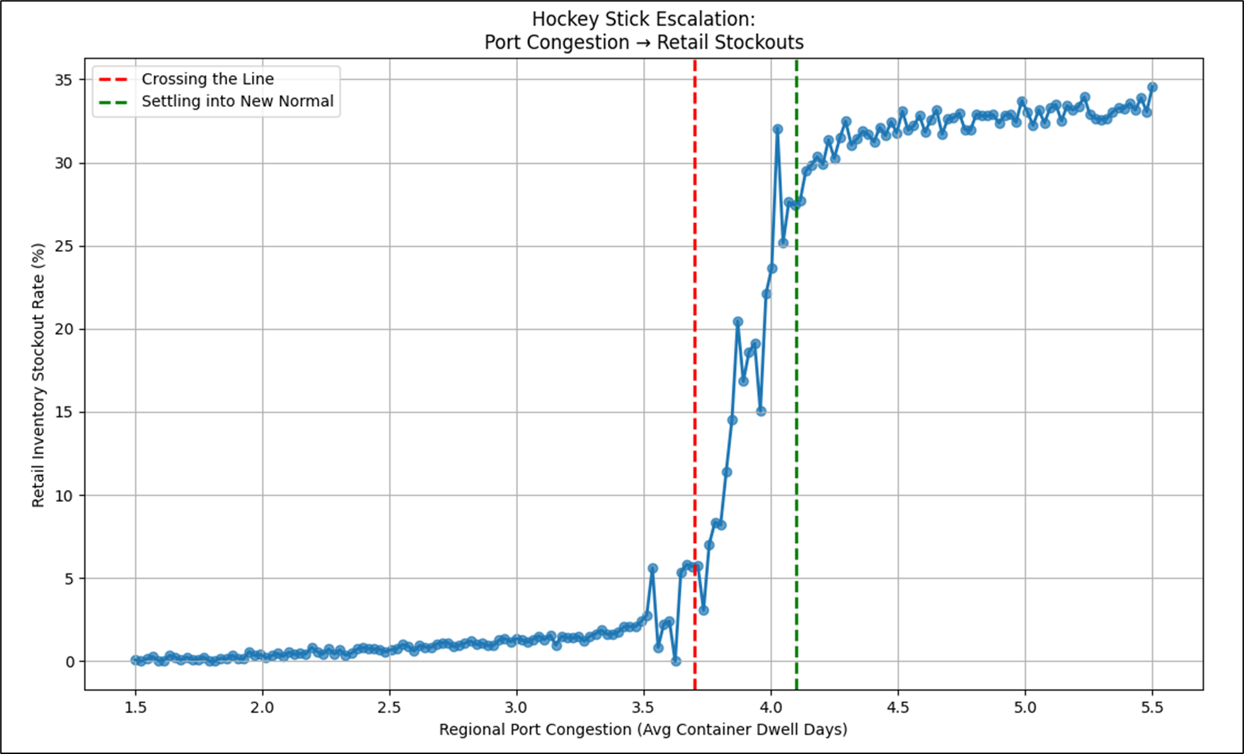
Figure 1 shows a story of a disruption and how things were before and after.
- Left of the Red Line – Well-Oiled, Resilient Machine: This is basically how things were for a long time, when things were simple. Notice that the relationship is mostly linear, kind of a straight line. From 1.5 to about 3.5 container dwell days, Retail inventory stockout rates were pretty resilient, but it hurt more along the way from 1.5 to 3.5 days. This reflects a system that was created, then tweaked until it ran like a machine for a long time. That is, until something happened that prevented ships from docking and unloading their cargo. At some point, the system broke.
- Between the Red and Green Lines – Disruption: The more optimized a system, the more brittle it can be. That is, unless resilience is built into the system. But resilience from what? The thing we don’t know that we don’t know? At some magical point, the system doesn’t work and that escalates into a period of chaos. Sometimes the chaos is so extreme that the system never recovers and even explodes.
- Right of the Green Line – The New Normal of Post Disruption: Most of the plots in this section are from the period of post-disruption. Life is much more complex with a whole lot of things we didn’t need to worry about before. But there is a level of order we’ve learned to live with. As long as the system doesn’t explode, we eventually figure out how to smooth things out. It becomes a new normal. Resilience is built in at the expense of smooth sailing.
At the most basic level, Figure 1 is a scatter plot. Scatter plots are one of the primary visualizations in analytics used to understand how two metrics relate to one another. Each plotted point represents the value of Metric X and Metric Y taken at the same observation unit—in this case, a shared date. Rather than showing how one metric evolves over time, a scatter plot shows how two metrics (two in this 2D version) move in relation to each other.
One of the most common use cases for scatter plots is correlation analysis—looking for directional relationships, nonlinear patterns, or structural breakpoints such as the hockey stick effect we’re discussing here. The other major use case is cluster detection (we’ll briefly discuss later), where points group into distinct regions that suggest segmentation, regimes, or hidden categories within the system. In short, scatter plots help us see structure that would otherwise remain buried inside tables of numbers.
Extending the Tuple Correlation Web
This blog is about recognizing hockey stick curve relationships between qualified metrics. The Tuple Correlation Web (TCW) is a field of statistically observed regularities derived from Business Intelligence (BI) activity across the enterprise. I extensively describe the TCW in my book, Enterprise Intelligence, page 288, Tuple Correlation Web.
The TCW extends earlier work on my past wide-net exploratory analytics, most notably Map Rock, by treating results of BI queries as attention signals and correlations as transient, time-weighted clues. The TCW is probed for Chains of strong correlations which serve as “hypothesis ore” passed forward to System 1 for fast recognition and System 2 for deep reasoning and organizing.
In Enterprise Intelligence and subsequent blogs supporting it (most of my blogs since June 2024), I’ve focused mostly on the Pearson correlation between tuples. Pearson correlations are suited for linear relationships. Linear relationships are the type we like because their simple nature enables us to reliably predict how the change in one metric affects the other. And of course, I need to make the obligatory disclaimer that correlation doesn’t imply causation—even though correlation is a hint towards at causation (it may signal relationships worth causal investigation). Strong linear correlations between two metrics do imply stability, which is a good thing. And we all want stability, right? Sure you do.
But in our complex world, outside the walls of a labs and offices, relationships are not as clean. Relationships are muddied by misunderstanding, different goals, adversarial intent, etc. They reflect the ubiquitous phenomenon of “it depends”. It depends on the who, what, where, why, when, and how of a situation. That brings us to unstable relationships. Particularly the kind that can start from stability and suddenly spin out of control—i.e. the hockey stick curve. The TCW will not do as good a job of modeling relationships if it doesn’t have the capability of incorporating these relationships. We’ll discuss this more in the topic, Having a System Meltdown and Living to Tell About It.
With the properties of hockey stick curves (location of the elbow and the regime-specific correlations) incorporated into the TCW, a reasoner (System 2) has options:
- Treat left-of-elbow as “how things usually work” (stable operating rules).
- Treat right-of-elbow as “fragility territory” (amplification risk).
- Use the elbow as a decision boundary for monitoring and alerting.
Keep in mind that the TCW itself is a data structure, a substrate of correlations that is maintained and explored by System ⅈ and utilized by System 2 (the reasoner).
That last part is important: the TCW does not conclude anything moral or causal about the relationship. It only needs to preserve the structural facts so other reasoning layers can interpret them. As System ⅈ might say, “I just work here.” This blog extends the TCW’s structure. With knowledge of fragile correlations, a System ⅈ process fires the addition of a hockey stick relationship as a “thought”, informing the intelligence of the new knowledge of a condition for a catastrophic event:
Hey, I just discovered a new hockey stick curve!
The tuples of the TCW link to nodes of an extended knowledge graph that represent not only its traditional ontologies and taxonomies, but also risks, pros and cons, validated cause and effect. Those tuples with associated hockey stick relationships are therefore connected to these special types of graphs and can be fired to System 1 and System 2 as a “thought” too:
“Regional Stockout Rate” is in a dangerous place. It’s a key metric of the enterprise’s strategy map that represents a risk of missed opportunities.
Another kind of thought fired from System ⅈ to System 1 and 2 is if an x value (horizontal axis) has been trending left towards the hockey stick elbow—or even exceeded it. The trend tidbit is from a System ⅈ that monitors event streaming (more on the Time Molecules side):
Hello … I detected a port congestion level that is trending or playing near a hockey stick elbow in relation to retail product stock outages.
Helpful Pre-Reading
I generally try to keep blogs that aren’t explicitly part of a series as self-contained as possible. But reviewing these resources will help get you through this one:
- Tuple Correlation Web (TCW): I discuss conditional probabilities in Enterprise Intelligence (Conditional Probabilities, pg. 295).
- System ⅈ: The Default Mode Network of AGI: System ⅈ is a background process that asynchronously probes the TCW for potentially valuable correlations, among other background processes. The correlations that are found are presented to System 2 as “thoughts” towards reasoning.
- The Explorer Subgraph is intended to support System ⅈ processes, so this is the most important.
Notes and Disclaimers:
- This blog is an extension of my books, Time Molecules and Enterprise Intelligence. They are available on Amazon and Technics Publications. If you purchase either book (Time Molecules, Enterprise Intelligence) from the Technic Publication site, use the coupon code TP25 for a 25% discount off most items.
- Important: Please read my intent regarding my AI-related work and disclaimers. Especially, all the swimming outside of my lane … I’m just drawing analogies to inspire outside the bubble.
- Please read my note regarding how I use of the term, LLM. In a nutshell, ChatGPT, Grok, etc. are no longer just LLMs, but I’ll continue to use that term until a clear term emerges.
- This blog is another part of my NoLLM discussions—a discussion of a planning component, analogous to the Prefrontal Cortex. It is Chapter XI.3 of my virtual book, The Assemblage of AI. However, LLMs are still central as I explain in, Long Live LLMs! The Central Knowledge System of Analogy.
- There are a couple of busy diagrams. Remember you can click on them to see the image at full resolution.
- Data presented in this blog is fictional for demo purposes only. This blog is about a pattern, primarily the pattern of unstable relationships.
- Review how LLMs used in the enterprise should be implemented: Should we use a private LLM?
Lastly, I’d like to acknowledge Nassim Taleb for the influence his brilliant work has contributed to my AI/BI work over many years. Antifragile (2012) provided much inspiration towards the development path of Map Rock, which I worked on from 2010 through 2015. Map Rock is the precursor to what is now the TCW, the heart of this blog. His articulation of convexity, fragility, and nonlinear harm deeply influenced how I came to think about cascading relationships, threshold effects, and systemic risk in enterprise intelligence architectures. This blog really is about what is a fundamental lesson of his writing—a modest change crossing some magical threshold, resulting in a supremely outsized reaction.
Background
The topic of this blog can be rife with confusion. This involves highly technical visualizations, algorithms, and concepts for which there are finely-specific domain terms. However, as my goal is to reach a BI audience, I try to use more colloquial, intuitive, non-esoteric phrasing. So after the introduction we just went through describing the gist of this blog, I’d like to set the terminology to provide some background.
It’s incredibly important to remember that the correlations we’re working on in this blog are not rules. I’m not talking about one-shot functions that make decisions, hopefully with high precision, recall, accuracy and F1 score. The correlations of the TCW are part of an abductive process of gathering clues/hints and deducing plausible stories from the pool.
Colloquial Terms Translation
While the full S-curve describes an entire lifecycle of stability, transformation, and new normal, this discussion intentionally zooms in on the hockey stick segment. That is the portion where fragility reveals itself. In many real systems, the curve does not make it cleanly into the “new normal” phase. The explosive escalation overwhelms buffers, propagates stress downstream, or triggers cascading failures before stabilization can occur. From a TCW perspective, this is the zone of greatest systemic risk—where small upstream changes produce outsized downstream impact, and where chains of correlated tuples become most vulnerable. Studying the hockey stick in isolation therefore isn’t about ignoring the rest of the curve—it’s about focusing analytical attention on the regime where predictability breaks down and fragility amplifies fastest.
Table 1 lists the formal and colloquial name for the hockey stick and S-curve, while Table 2 lists the parts of the S-curve (which subsumes the hockey stick). But first note that S-curves tend to appear in two broad systemic flavors: escalation–containment dynamics and expansion–saturation dynamics (ex. diminishing returns of LLM parameter expansion). This blog focuses on the former, specifically the Stabilization Inflection Point where accelerating disruption is brought under control and the system begins settling into a new equilibrium.
| Formal Name | Colloquial Name | Why this colloquial term works |
|---|---|---|
| Threshold / Convex Escalation Curve | Hockey Stick | The long flat handle followed by a sharp upward blade makes nonlinear escalation visually obvious — ideal for illustrating fragility activation. |
| Logistic Growth Curve / Saturation Curve | S-Curve | Widely recognized adoption and diffusion shape — slow start, rapid acceleration, then diminishing returns toward stabilization. |
| Formal Name | Colloquial Name | Why this colloquial term works |
|---|---|---|
| Pre-Threshold Linear Regime / Absorption Phase | Boiling Frog | Reflects gradual escalation that fails to trigger response. Conditions worsen, but the incremental change masks the growing systemic risk. |
| Inflection Point / Regime Shift Boundary | Elbow | Conveys the physical bend where system behavior changes intensity or character—a clear, intuitive boundary between stability and escalation. |
| Post-Threshold Convex Escalation / Runaway Growth Regime | Explosion Zone | Captures the violent amplification phase where small additional pressure produces disproportionately large impact, often destabilizing adjacent systems. |
| Post-Acceleration Saturation Point or Stabilization Inflection Point (Applies only to S-curve) | The 2nd elbow of the S-curve. Point of stabilization, workaround, remedy— usually the start of a new normal. | Captures the stabilization bend where escalation is brought back under control and the system begins settling into a new equilibrium. Unlike the earlier inflection elbow that signals acceleration, this elbow marks containment—interventions take hold, feedback loops weaken, and volatility compresses. |
| Post-Acceleration Saturation / Diminishing Returns Phase (Applies only to S-curve) | New Normal | Signals stabilization after shock — the system settles into a higher baseline where escalation subsides and behaviors normalize at elevated levels. |
Translation of Hockey Stick Phenomenon Terms
This mini-glossary describes more verbosely what the third column of Table 2 states. This may be redundant, but I wanted to present the definitions in a simple table first and in paragraph form for a second attempt at understanding, if necessary. It’s a few jargony terms related to this concept:
Gradual pressure builds until a threshold breach triggers a phase change, revealing underlying convexity, which may propagate into cascade failure and ultimately produce a lasting regime shift.
- Threshold Breach: A threshold breach is the moment pressure crosses a boundary the system was designed—or assumed — to tolerate. Up to that point, buffers, policies, or human interventions keep outcomes within a manageable range. Once breached, those protections lose effectiveness and the system begins reacting disproportionately. In hockey stick terms, this is the instant where creeping escalation gives way to acceleration — the line where gradual stress becomes structurally consequential.
- Convexity describes a relationship where the impact of change accelerates as conditions intensify. Small movements may at first produce minor effects, but later movements, often near or past a threshold, produce dramatically larger outcomes. It is the mathematical backbone of the hockey stick’s blade. In operational language, convexity is what makes systems fragile: the same increment of pressure that once caused little disruption suddenly creates outsized consequences.
- Cascade Failure occurs when stress in one part of a system propagates outward through connected components, triggering additional failures along the way. Rather than remaining isolated, the disruption compounds. In a Tuple Correlation Web, this is what happens when a hockey stick escalation in one tuple transmits fragility into correlated tuples—logistics shocks turning into margin shocks, then financial shocks, then market reactions.
- This second elbow represents a fundamentally different kind of structural transition than the first. The earlier elbow is the ignition point—the moment where pressure begins compounding and the curve steepens into runaway escalation. The later elbow, by contrast, is the containment bend. It appears when corrective forces finally overpower destabilizing ones: supply chains reroute, liquidity returns, interventions dampen feedback loops, and volatility begins to compress. The system is not restored to its original baseline — the shock has already reshaped it—but it is no longer accelerating toward failure. It is settling into what becomes the new normal.
- In non-crisis applications (expansion–saturation dynamics), this same geometric bend shows up as the point of diminishing returns—the phase where effort, capital, or attention continues to rise while marginal impact falls. Technology hype cycles, market saturation curves, and late-stage optimization efforts often display this pattern. Structurally the curve looks similar, but the causal story differs: one is stabilization after disruption, the other is exhaustion after expansion. Your blog’s emphasis sits squarely in the former — the elbow where escalation is arrested and systemic breathing room returns.
- Regime Shift is a sustained transition into a new pattern of behavior. Unlike a brief spike or anomaly, the system settles into a different operating mode. The rules, baselines, and sensitivities change. In curve terms, it is what happens after the elbow is crossed—the system no longer responds linearly and may never return to its prior state. A regime shift can stabilize into a new normal or continue cascading depending on system resilience.
Hockey Sticks and S-curves
With the terminology out of the way, we need to differentiate a few terms even more deeply.
At first glance, a hockey stick and an S-curve look like the same animal. In fact, a hockey stick is a truncated S-curve. So, both start with long quiet stretch, a sudden bend, and a run-up that feels like things are “going nonlinear”. But they mean different things operationally. A hockey stick is often what you see right before a system breaks—and when it breaks, the dataset ends (the system is broken and doesn’t emit anymore data). An S-curve implies the opposite. That is, the system survives and stabilizes under a new set of rules, a “new normal”, which makes the pre-elbow data a different, distant era entirely. In other words, an S-curve is not one relationship over time—it’s two eras stitched together by a transition. In a TCW, that suggests we should model “before” and “after” as separate tuples and treat the elbow as an event boundary—for example, the days after 9/11 and the period of the Covid-19 pandemic, where things didn’t settle back to the way it was before the event.
However, some S-curves imply phase changes where different sets of rules apply. I wrote about phase changes in my blog, Outside of the Box AI Reasoning with SVMs (which is really Part 1 of this blog), particularly the part about support vector machines.
The ability to detect the presence of hockey stick relationships and remember them enables us to move beyond the push-button intelligence of fight or flight. We use it to intelligently assess the risk of dialing up a business driver. It also enables us to know how far we can go without being overly cautious, and even dip our toes beyond the identified danger zone.
A hockey stick is usually a warning signal. It tells you stress is accumulating in a way that will eventually overwhelm the system. Because of that, the right side of the curve is usually sparser than the left side. Life to the right of the elbow doesn’t last very long. Things break, processes halt, or interventions reset the environment before a plateau ever forms.
For example, the relationship between customer complaints and web site performance is fairly linear. Worsening performance leads to a proportional number of customer complaints. But at some point, the effects of that level of web site performance is noticed by higher ups. Soon, every customer manager is filing a complaint, not just to the vendor’s complaint department, but to managers at the vendor. Two things can happen:
- The problem is resolved and the relationship between customer complaints and web site performance goes back to linear.
- The whole relationship blows up. The customers all move to another vendor and the web site vendor closes shop.
The first is good. We can’t anticipate everything, but we fixed it, life goes back to normal, we learned valuable lessons that make us more resilient. The second what we want to avoid. That’s sort of the main ideas behind Nassim Taleb’s Antifragile (2014) and Black Swan (2010), respectively.
An S-curve tells a survival story. The system doesn’t fail — it adapts under a different set of rules. But that adaptation makes earlier data less relevant or often irrelevant. What looked like one continuous relationship is really multiple eras stitched together by a transition boundary.
Phase-based S-curves go a step further. Here, the curve isn’t just transitioning — it’s operating under entirely different rule sets at different segments. Capacity thresholds, automation tiers, regulatory gates, or scaling architectures can all create discrete behavioral regimes. In those cases, segmenting by date alone is insufficient; the segmentation must reflect operational phase.
In TCW terms, this means:
- Hockey sticks highlight fragility propagation risk.
- New-normal S-curves highlight regime replacement.
- Phase S-curves highlight rule-set transitions.
Same shape family — very different implications for modeling, forecasting, and downstream tuple exposure.
| Curve Type | Operational Meaning | Data Behavior | Segmentation Strategy | Why Segmentation Matters |
|---|---|---|---|---|
| Hockey Stick | Pre-failure escalation. System stress accumulates quietly, then crosses a breaking threshold. Often ends in disruption, shutdown, or forced intervention. | Long stable left tail → sudden elbow → explosive right tail. Right tail often sparse or truncated because operations break. | Segment primarily by date around the elbow event. Pre-elbow vs incident period. Post-elbow data may be limited or irrelevant. | Focus is fragility detection. The value is identifying where escalation becomes nonlinear and what downstream tuples are exposed to amplified risk. |
| S-Curve — New Normal Event Triggered | System adapts and stabilizes under new operating conditions. The relationship continues, but under different assumptions. | Slow growth → acceleration → plateau. Data continues after the elbow but behaves differently. | Segment by date: Before transition vs After transition. Often tied to a triggering event (technology adoption, policy change, macro shock). | Pre-transition data may distort forecasts. Modeling both eras together hides the new equilibrium relationship. |
| S-Curve — Phase Regimes Situation Triggered | Distinct operational phases governed by different rules, capacities, or constraints. More like discrete states than a single evolving relationship. | Multiple slopes and behaviors across the curve. Plateaus and accelerations correspond to regime shifts (capacity limits, process changes, scaling tiers). | Segment by phase rather than just date. Phases can be labeled (Startup, Scaling, Saturation, etc.) or inferred algorithmically. | Each phase has its own correlation structure. Treating the curve as one tuple hides the mechanics of how the system behaves under different constraints. |
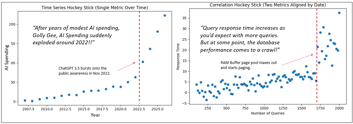
Time Series vs. Scatter Plots
When most people hear “hockey stick curve”, their mind immediately goes to a time series. They picture a line chart where the x-axis is time—months, quarters, years—and the y-axis is some metric like the Dow, AI spend, user growth, or revenue. It creeps along slowly for a while, then something happens—virality, market adoption, funding, hype—and the curve shoots upward. That is absolutely a hockey stick, but it’s a hockey stick of a single metric evolving over time.
What we’re talking about in the correlation context is structurally different.
In the TCW-style plotting, the axes are not time and value. Both axes are metrics. The only role time plays is as the universal join key that allows us to merge two otherwise unrelated datasets. Each plotted point represents the value of Metric X and Metric Y on the same date unit. So instead of asking “how did one thing grow over time,” we’re asking “how do two things move relative to each other when aligned by time.”
That difference sounds subtle, but visually and analytically it’s huge.
Take a scalable system example. Let’s say X is the number of queries and Y is response time. Early on, as query volume increases, response time creeps up only slightly—horizontal-ish movement across the plot. But at some threshold, components hit capacity breakpoints: cache exhaustion, thread contention, network saturation. Now a small increase in queries produces a disproportionate spike in response time. That produces a hockey stick shape—but it emerges from a two-metric relationship, not from time progression.
So:
- Time-series hockey stick → One metric accelerating over time.
- Correlation hockey stick → One metric accelerating relative to another.
People are deeply familiar with the first because business dashboards are full of them. The second is less intuitive, which is why it helps to explain it away early. The visual resemblance is real, but the analytical meaning is entirely different: one is about growth dynamics, the other about system stress, thresholds, and nonlinear coupling between variables.
This can be confusing because a plot could be of two metrics, but it’s also true that certain pairs of values at particular parts along the x-axis might have occurred in the same time period, which makes it seem like a time series. Again the major tell of a time series is that the x-axis is date. For example, looking way back at Figure 1, it might be that:
- For a long period of time, things worked smoothly. Port congestion and Retail stock levels fluctuated somewhat, but always within a familiar range.
- Something happened that threw a monkey wrench in the system (like a pandemic that shut down commerce activity).
- Then new processes were put into place that are more cumbersome than before but enable commerce to slow.
Non-Linear Relationships for the Tuple Correlation Web
The Tuple Correlation Web (TCW) is a major substrate (data structure) of a System ⅈ process in the sense that it explores broadly and continuously for chains of strong correlations. Most of the time, we talk about TCW edges as “correlations between tuples,” which is already valuable: it helps you stitch together a story of what is happening across the enterprise.
There are many types of non-linear relationships, but there’s a special kind of edge that deserves its own warning label:
A relationship that looks tame for a long time… and then suddenly goes bonkers. That’s the hockey stick curve.
When a TCW edge is hockey stick shaped, it becomes an amplifier. And amplification is what makes fragility contagious: if X → Y is a hockey stick, then every tuple connected to Y is potentially vulnerable once X crosses the elbow.
In many business systems, the most dangerous relationships don’t look dangerous at first. Regional port congestion inches upward — containers sit a little longer, dwell times stretch by fractions of a day. Retail inventory managers compensate. Safety stock cushions the impact. From the outside, the relationship between port congestion and stockout rates looks almost linear, even manageable.
The danger isn’t the gradual climb, where there’s kind of a boiling frog effect. It’s the instant the system crosses the line and proportional change gives way to cascading consequence.
In the TCW, each node is a tuple (a concrete, measurable thing). Each edge is an association measured across time slices:
- You choose a date range (e.g., last 24 months).
- You choose an interval (e.g., weekly).
- For each interval you compute each tuple’s metric.
- Then you plot X vs Y where each point is a time slice.
Examples of typical BI tuples:
- Regional port congestion, measured as average container dwell days by coastal region and week, correlates with retail inventory stockout rates by product category and distribution center.
- Retail inventory stockout rates by product category and week correlate with emergency air freight cost per unit by logistics lane and carrier class.
- Emergency air freight cost per unit by logistics lane and week correlates with retail operating cost per unit sold by business unit and geography.
This is not a time series chart. It’s a relationship chart, built from time-sliced aggregates.
Non-Linear Correlation with Spearman
Spearman creates a more accurate correlation for non-linear lines, but it doesn’t make Pearson obsolete.
Pearson merely answers: “Is it linear?” Pearson correlation is a cheap, effective detector for linear coupling. If you want to know whether changes in X produce linear changes in Y, Pearson is still your best “first glance.”
Spearman is more compute intense than Pearson, but compared to getting the data (reading a database), the speed difference pales. It computes a correlation score for non-linear relationships better than Pearson. But its main drawback is that the data should be monotonic (the results will be very off if it isn’t). Spearman correlation tells you whether Y tends to rise when X rises, even if the curve is nonlinear. It’s a “directional consistency” measure.
In regular terms, monotonic simply means it keeps moving in the same direction. It doesn’t have to move smoothly, and it doesn’t have to move proportionally — it just can’t reverse course. Think of customer support backlog versus average response time. As the backlog grows, response time tends to grow too. Early on, response time may only creep up slightly. Later, as queues clog, response time may rise much faster. The curve bends, but the direction never changes — more backlog never produces faster response. That’s monotonic.
What monotonic is not is a relationship that changes direction along the way. Imagine employee overtime versus error rates. At first, a little overtime may reduce errors — people stay late to finish carefully. But push overtime too far and fatigue sets in — errors begin to climb. Now the curve goes down, then up. Because the direction reverses, the relationship is no longer monotonic. Spearman loses clarity here because it’s built to detect consistent directional movement, not turning points.
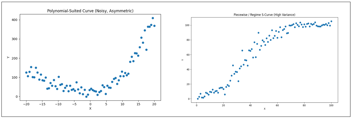
Figure 3 is intended to visually ground the distinction between monotonic and non-monotonic behavior using a set of non-linear response curves. The two curves on the left are non-monotonic because their direction changes across the domain—each contains a turning point where the function shifts from increasing to decreasing (or vice versa).
In contrast, the two curves on the right are monotonic increasing: they never reverse direction even though their rates of change differ. Importantly, monotonicity here includes the S-curve (sigmoidal form), which plays a central role in the broader discussion of the blog, since it captures regimes of slow buildup, rapid transition, and eventual saturation. The rightmost curve shows a purely concave, diminishing-returns profile; if that rightmost segment were removed, the remaining rising portion would resemble the familiar “hockey stick” shape often used to depict acceleration without saturation. The purpose of the figure, therefore, is not to contrast linear versus non-linear behavior—all four curves are non-linear—but rather to make clear, at a glance, which shapes preserve directional consistency (monotonic) and which do not.
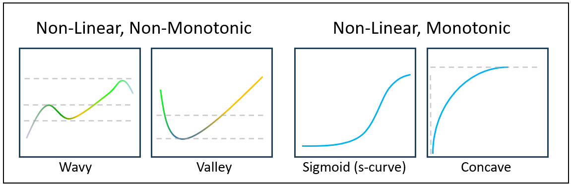
Table 4 matches the best-fit algorithm for each graph in Figure 3.
| Curve Shape (Visual) | Best Fit Algorithm | Proper / Formal Name |
|---|---|---|
| Wavy (dip → rise → dip → rise) | Piecewise Linear Regression (Segmented Regression) | Multi-Regime Relationship / Segmented Relationship |
| Valley | Quadratic Polynomial Regression | Parabolic Relationship |
| S-Curve | Logistic (Sigmoid) Curve Fit | Logistic Growth Curve / Sigmoid Function |
| Concave Rise | Logarithmic Regression (or Power Regression < 1) | Logarithmic Growth / Diminishing Returns Curve |
We’ll take a closer look at the left-most graph of Figure 3 later (Wavy). It’s a multi-regime relationship that’s out of scope for this blog focused on the informational qualities of hockey stick curves. I just brought it up now to help define monotonic. We’ll briefly discuss it later.
Figure 4 compares two data sets exhibiting non-linear pattern.
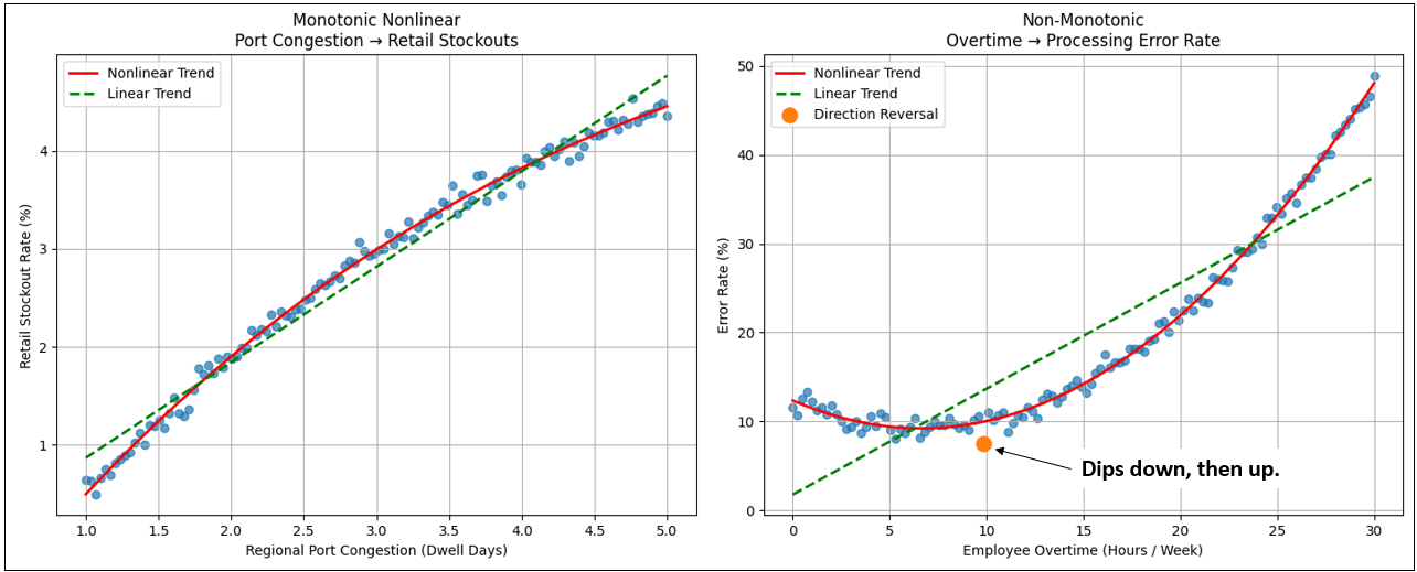
For both graphs, the points are fairly tight, so we expect the correlation to be high. For the left graph, we see that the correlation scores are high for both. Which is intuitively better (observing them with your eyes)? The curve of the points is readily visible, and we can see the points stray more from the green line than from the red line. So Spearman wins, although both are pretty good.
The question is: “Is Pearson mostly good enough for both Monotonic non-monotonic?” Meaning, there’s no sense in throwing in Spearman where the added information isn’t worth the trouble. We’re not looking for exact correlation values. Mostly, we just want to know if there is a strong correlation. Pearson and Spearman provided that for the monotonic data (left graph).
| Relationship | Monotonic? | Pearson | Spearman | Intuitively Correct |
|---|---|---|---|---|
| Port Congestion → Retail Stockouts | Yes | ~0.86 | ~0.97 | Spearman |
| Overtime → Processing Error Rate | No | ~0.48 | ~0.08 | Pearson |
When you look at the two plots side by side, don’t start with the statistics—start with the direction of the curve.
Just a note that for turning-point relationships (the right graph in Figure 4), a correlation coefficient is the wrong primary tool. Rather, treat this as a visual hint to invest in exploring the more compute intense piecewise / spline / regime modeling for a more accurate assessment of the relationship.
In the monotonic relationship, the line bends, but it never turns back on itself. As the pressure on one side increases — port congestion in this case — the response on the other side continues to rise as well. It may rise slowly at first and then accelerate later, but it never reverses course. There is a kind of directional loyalty in the relationship. More congestion never produces fewer stockouts. The curve is nonlinear, but it is consistent.
Now contrast that with the non-monotonic plot. Here the curve actually changes direction. Moderate overtime initially reduces processing errors — people stay late to finish work carefully. But push overtime too far and fatigue takes over. Errors begin to climb. The relationship first improves, then deteriorates. The line doesn’t just bend — it turns. That turning point is what breaks monotonicity.
This difference matters more than it first appears. Spearman correlation stays strong in the monotonic case because rank order holds — more of one thing still aligns with more of the other. But once the curve reverses, that rank order collapses. The relationship becomes regime-dependent. What helps at one level harms at another.
Visually, the simplest way to distinguish the two is this:
- If you can trace the curve from left to right without ever having to move downward, it’s monotonic.
If at any point you have to reverse direction, it isn’t. - And that directional reversal is often where interpretation — and risk — becomes far more complicated.
What Spearman captures, then, is directional loyalty. It doesn’t care whether the relationship is a straight line, an S-curve, or the front half of a hockey stick. If increases on one side consistently align with increases on the other, Spearman will recognize the relationship even when Pearson struggles because the slope isn’t uniform.
| Approach | Finds | Misses | Risk relevance | Relative compute vs Pearson | Hockey stick accuracy |
|---|---|---|---|---|---|
| Pearson | Proportional coupling | Thresholds, curvature | Baseline stability | 1× | Low (often diluted by long left tail) |
| Spearman | Monotonic coupling | Elbows, regime shifts | Smooth nonlinear | ~2–4× | Medium (detects “same direction,” not the elbow) |
| Polynomial curvature | Curved relationships | Threshold localization | Early fragility hints | ~5–10× | Medium–High (sees convexity, not where it breaks) |
| Piecewise regression | Elbows + regime slope contrast | Multi-threshold complexity | Fragility amplification | ~10–40× | High (finds elbow + quantifies tail acceleration) |
Too Steep for Spearman to Catch
A hockey stick curve can have high Spearman correlation values, but a high correlation value doesn’t capture the phenomenon of a point where a small change in something produces a big change in something else. That is, a point along the x-axis where a small change to x results in unusually large change in y—and deceptively points forever skywards.
Further, if a Spearman (or Pearson) calculates a moderate correlation (like between 0.70 and 0.90), which would usually be ignored, that moderate correlation might still be a hint of a hockey stick curve. So the TCW pipeline is naturally layered:
- Pearson and Spearman are the cheap scouts.
- Hockey stick detection is the expensive investigator.
One of the cheapest clues I’ve sought to test if a relationship may be hiding a hockey stick is not the correlation strength, but the spatial distribution of points. If we slice the plot diagonally from the lower-left to the upper-right corner—independent of any trend line — hockey stick relationships tend to cluster heavily below that line. This reflects long periods where escalation on one side produces only muted response on the other, followed by a late surge. Two relationships can share similar Pearson scores, yet this diagonal density split reveals that one is structurally stable while the other is quietly building toward amplification.
At first glance, both relationships show a positive correlation. If we stopped at Pearson alone, we might conclude they are simply two moderate-strength couplings between business metrics. But when we look at the structure of the scatter—where the dots actually sit—the story changes.
In the diffuse linear case, the points are scattered fairly evenly around the diagonal. Sometimes the responsive metric overshoots expectations, sometimes it undershoots. The relationship is noisy, but balanced. Variability exists, yet escalation remains proportionate. This is the kind of coupling most organizations are comfortable living with — unpredictable in detail, but predictable in magnitude.
The hockey stick relationship behaves very differently. For most of the range, the responsive metric barely moves. Pressure builds slowly, almost deceptively. The left tail looks calm, even stable — what feels like normal operating conditions. But once the threshold is crossed, the relationship changes character. Escalation accelerates sharply. Small additional increases in the driver produce outsized reactions.
This is why the triangle density matters. In the hockey stick plot, the overwhelming majority of points fall below the diagonal — meaning the system under-responds for most of its operating life. Then suddenly, in a short regime, it over-responds violently. That imbalance is the signature of fragility.
Two relationships can share similar correlation strength, yet carry completely different systemic risk. Correlation tells you whether two things move together. Shape tells you how dangerous that movement becomes once a line is crossed.
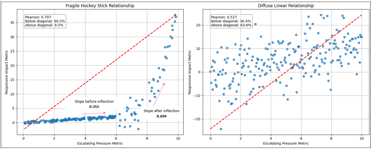
| Relationship Type | Pearson Correlation | % Below Diagonal | % Above Diagonal | Structural Pattern Observed | Risk Interpretation |
|---|---|---|---|---|---|
| Fragile Hockey Stick | 0.707 | 90.5% | 9.5% | Long calm tail → sharp convex escalation | Threshold fragility / explosive amplification |
| Diffuse Linear (Noise) | 0.527 | 36.4% | 63.6% | Even dispersion around diagonal trend | Stable but noisy proportional coupling |
Figure 7 lays out the process:
- Two knowledge workers from two very different domains are experiencing trouble with one of their key metrics.
- In a data-driven manner, System ⅈ checks if these metrics are correlated. It performs an inexpensive Pearson correlation, a rough estimate of correlation. The value is 0.70, a moderate signal of correlation.
- Usually, System ⅈ would discard a moderate Pearson correlation in order to preserve query compute and storage resources. However, a moderate correlation could be a symptom of something worse. So, System ⅈ performs a rudimentary test to detect signs of a hockey stick correlation.
- The test is positive for a possible hockey stick correlation. System ⅈ places an order for a lab test.
- The lab results are sent to System ⅈ, and it determines it is a hockey stick curve.
- So, System ⅈ orders a full evaluation.
- The results of the hockey stick evaluation and the Pearson correlation are packaged into a set of properties.
- The properties are appended to the correlation between the two KPIs.
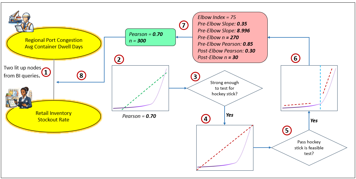
The value of recording this relationship is that when the metric for Regional Port Congestion-Avg Container Dwell days is on a fast track approaching the elbow value of the hockey stick curve, System ⅈ will notice it and it will appear as a “thought” to System 2 (the reasoning and execution agents, human and AI).
The Dangerous Hockey Stick Nonlinear Curve
To treat hockey stick edges as first-class citizens, we need to know:
- Where is the elbow? (inflection / breakpoint)
- How “explosive” is the tail? (slope acceleration / convexity)
- How predictable is it? (fit / tightness around the curve)
That last one matters. A hockey stick can be:
- Fragile but predictable (points hug the curve)
- Fragile and unstable (points scatter towards the right side of the tail)
The second case is the scary one.
Hockey sticks that Signal Disaster
These are escalation curves where the explosion phase usually overwhelms buffers faster than the system can adapt. The right side of the curve is chaotic, compresses time, and often triggers cascading failures before any “new normal” can form. They feel intuitive because we’ve all seen—or lived—versions of them.
Examples:
- Credit card debt vs. interest burden: Minimum payments absorb stress early. Then compounding interest explodes balances beyond recoverability.
- Personal stress vs. burnout: Small pressures accumulate quietly — then performance, health, and relationships collapse rapidly.
- Server load vs. system outage: Infrastructure absorbs demand until capacity thresholds are crossed — then latency spikes and outages cascade.
- Supply chain congestion vs. stockouts: Inventory buffers mask disruption — until shelves empty and recovery becomes nonlinear.
- Housing prices vs. affordability crisis: Gradual increases become exponential relative to wages, triggering market dislocation.
- Fraud exposure vs. financial loss: Early anomalies look tolerable — then coordinated exploitation accelerates losses.
- Wildfire spread vs. containment capacity: Small burns manageable — threshold crossed, containment fails.
- Social media rumor vs. reputational damage: Slow uptake — then viral amplification beyond control.
Common theme: The system cannot stabilize fast enough. The explosion phase outruns response capacity.
Having a System Meltdown and Living to Tell About It
The scary thing about hockey stick curves, these unstable relationships, is that they are much more prevalent than you think or our data reveals. The data we collect probably doesn’t reflect hockey stick curves as well as it should because the data is detected from well-oiled systems that are rigorously maintained and troubleshooted by human workers. Systems that work well are carefully composed webs of relatively predictable cause and effect. When something goes out of whack, we quickly take care of it, so much of the data reflecting troubled times for the system is pre-empted by our diligence. And often, whatever data reflecting that instability that does make it through is filtered out as noisy outliers.
Our enterprise systems are generally under our control. They should be. At the time of writing, most systems are designed by humans—not AI, which may not have been trained with or have access to information about the idiosyncrasies of a system that were discovered well after the formal documentation was written. Darn that entropy and things we didn’t know we didn’t know! That fuzzy, fragmented tribal knowledge currently exists only in the heads of the people who maintain the system who never had time to adequately document their diagnoses and solutions to issues because once they fix one thing, they are off to the next item on the list.
Don’t underestimate the value of tribal knowledge. At the time of writing, the vast majority of enterprise wisdom exists in human heads.
For the systems we carefully design, we carefully consider how the components interact and what exceptions might occur (all the things we can think of that could go wrong). For each exception, we impose constraints on input and output (what and how much goes into a component), build subsystems to mitigate the known issues, and if all else fails, we monitor metrics in real time. We have a system that takes in as little input to produce as much output with as much mechanistic precision and reliability as we can. The diligence of the maintenance team makes a good part of that precision and reliability an illusion, obfuscating the hockey stick curves from our idealistic minds.
The key is that although we design tightly-coupled systems where each component (which are systems in themselves) and inter-component relationship are purposely designed, all systems in the real world are effected by other systems in a loosely-coupled way. The level of loose-coupling ranges from legal contracts regulating how they interact, to relationships built on good will, to the whims of nature and complexity (the things out of our control). For most issues that pop up between loosely-coupled components, we probably don’t have direct authority over both. So issues may wreak havoc for extended periods, cascading instability to other relationships. Further, countless unknown unstable relationships live hidden in the interactions between loosely-coupled components (Black Swans).
We hopefully learn from disastrous experiences and implement measures to assure that we don’t get fooled twice. A side-effect of that wisdom is that we don’t go too far to the edge of the cliff, so we really don’t have data points about what happens. We can reason about what might happen.
Those Who Push the Boundaries
However, it’s possible that we occasionally have tepidly tested the boundaries. Thanks to those natural thrill seekers, the sort who think nothing of hiking the scary part of Angel’s Landing. We ventured a little into the DMZ to see what happens. If there is indeed disaster awaiting and we wisely turned around to see another day, what happened? What made us step back from the boundary? Did we capture any events that correlated to those times that we approached and even crossed the boundary? Approaching and/or crossing those boundaries is rich in events that will yield valuable insights.
Live Stress Testing in Production
Part of testing before rolling out software into production is stress testing, pushing the system well beyond the intended parameters. It will break, but at least we can know where it does. These testing parameters and metrics give us a fairly reliable definition of a what disaster looks like.
However, the problem is we likely haven’t tested every possible way a system can break. Do we really need examples of when that happened? This is more of the Black Swan side, one of countless outcomes on the long tail of possibilities.
That reminds me of the monkey stress tests I was introduced to at Microsoft. Before rolling out “OLAP Services 7.0” in 1998, we recruited people, who couldn’t even spell OLAP, from all over to just bang away at the keyboard. It did reveal a number of useful things to harden, most certainly reducing Black Swan errors from SSAS out in the field.
A test environment is kind of like our brains. With our human symbolic thinking (what we’re experiencing can be broken down into separate objects/agents) and our self-awareness, we can perform experiments (variations of candidate plans) in the safety of our brains—imagining the progression, the obstacles, the outcomes—before committing to physically irreversible actions.
Hockey Sticks that End in Antifragility
These are escalation curves, hockey stick, not s-curves, where the explosion phase actually strengthens the system—forcing innovation, efficiency, or evolution that would not occur under stable conditions. This is what most of us want most of the time.
Things are humming along, then something snaps. But a specialized commando team addresses it (shout out to IT teams) and things go back to normal— the “old normal”, not a “new normal”. Things are the same, but the team that fixes things is wiser, and so the system is more resilient. Unfortunately, these unforeseen issues are only found the hard way—otherwise, there would already have been a guardrail in place.
The right side of the elbow isn’t destructive — it’s catalytic. Here are a few examples of situations where tragedy could strike, but a crack team addresses the issue, and things settle back to the old normal, except maybe an incremental bit better and wiser:
- Cyberattacks vs. cybersecurity capability: Early attacks expose weaknesses → defenses harden → systems become more secure than before.
- Market competition vs. product innovation: Competitive pressure accelerates R&D and differentiation.
- Economic downturn vs. operational efficiency: Cost pressure drives automation and process optimization.
- Startup funding scarcity vs. business discipline: Constraints force lean operations and clearer value propositions.
- Athletic training vs. physical adaptation: Micro-stress tears muscle → recovery builds strength.
- Immune system exposure vs. disease resistance: Controlled stress builds resilience.
- Supply shortages vs. sourcing diversification: Disruption drives supplier redundancy.
- Regulatory pressure vs. governance maturity: Compliance requirements strengthen operational controls.
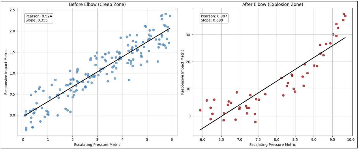
Figure 8 shows the left graph of Figure 6 diagonally bisected into two parts (the diagonal red line). It also highlights the elbow of the line (the vertical red dashed line).
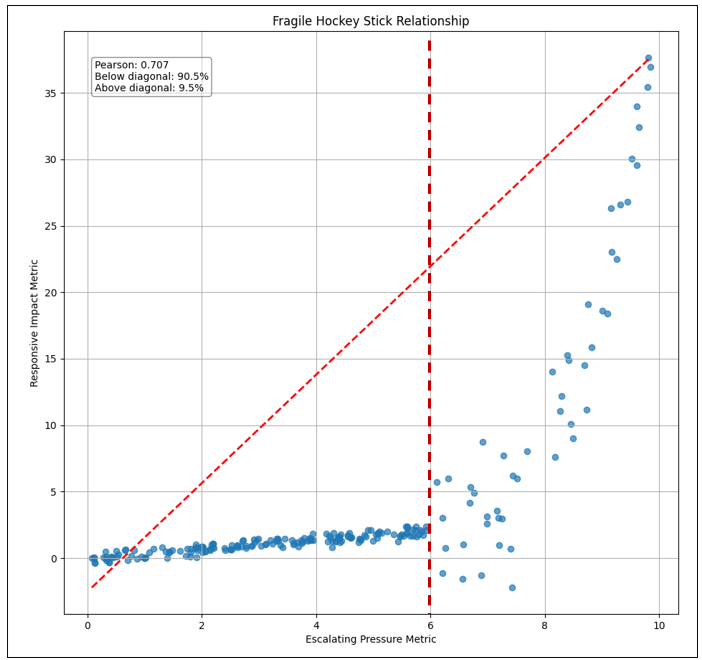
Figure 9 breaks Figure 8 into two parts—left and right of the maroon line (elbow). Note that the graphs in Figure 9 are scaled differently so they are visually sloped differently. However, note that the slope values are indicated in the graphs, 0.355 and 8.699, respectively—the right side is very much steeper than it looks on the right side of Figure 8 above.
A hockey stick has two properties that matter in the TCW:
- Boiling frog deception: Most points live in the long, mild, left-side tail. The relationship looks almost linear and safe… until it isn’t.
- Amplification near the elbow: Once X enters the right-side elbow region, the local slope (sensitivity) explodes:
small ΔX → outsized ΔY
Now the TCW graph effect:
- Y becomes volatile.
- Any tuples correlated to Y (or downstream of Y) inherit that volatility.
- Your correlation chains become fragile chains.
S-Curves
With the exception of the antifragile hockey stick curve we just discussed, S-curves are what happens if we survive the turmoil of the inflection.
Figure 10 shows an example contrasting a new normal S-curve versus a Regime Change.
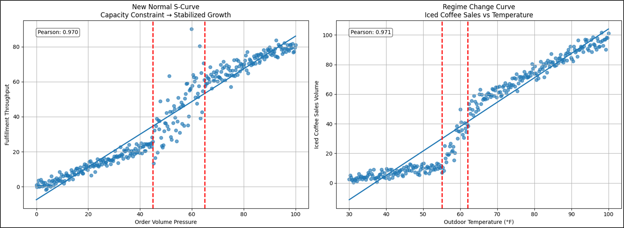
At first glance, both curves appear to show a similar story—pressure rises, response follows, and somewhere along the way things “bend”. But what happens after the bend is what separates a regime change from a new normal. In the iced-coffee example, the inflection marks a behavioral transition. Below the threshold, demand behaves under cold-weather rules—modest, linear, predictable. As temperature crosses the comfort boundary, consumer preference transforms almost overnight. The relationship doesn’t stabilize — it operates under a different demand model. Cold logic gives way to warm logic. Two regimes, two rule sets, stitched at the inflection.
The new-normal curve tells a different operational story. Here, pressure pushes the system into a constraint — fulfillment capacity buckles, volatility spikes, and performance becomes chaotic. But unlike a pure fragility curve, the system adapts. Infrastructure scales, staffing models adjust, automation is introduced. The turbulence subsides. What emerges is not a return to the old world, but a re-platformed equilibrium. Throughput remains permanently higher, yet predictability returns—the curve straightens back into a stable, linear operating band. In other words, the explosion phase was disruptive, but survivable—and once absorbed, the system resumes motion under familiar physics, just at a new altitude.
Reaching for a “New Normal”
For this version of S-curve, the inflection is more like growing pains. It doesn’t result in disaster, but a new normal, the reward of enduring a tumultuous period. It’s like Boise transitioning from a small city in 2000 to a mid-sized city in 2026. In the meantime, we deal with the chaos of road construction everywhere, what was once farms with real beehives are now apartment buildings that look like beehives for people. Eventually, the transition will be over and we can settle into the new normal of a mid-sized city.
These are escalation curves where the explosion phase is intense but not inherently destructive. Systems adapt, scale, or reorganize around the new level of demand or stress. The right tail is more volatile that the left tail before the transition, but it bends toward stabilization rather than collapse.
This type of S-curve is beyond the scope of this blog, so I’ll close this short topic with a few examples of long tails followed by semi-chaotic transition to the new normal:
- Product adoption vs. market penetration: Slow uptake → viral acceleration → eventual saturation.
- Cloud compute demand vs. infrastructure scaling: Usage spikes, but elastic capacity absorbs the surge.
- E-commerce volume vs. logistics automation: Order growth explodes — fulfillment networks evolve.
- AI adoption vs. enterprise productivity: Rapid scaling, then operational embedding.
- Urban population vs. transit investment: Congestion escalates → infrastructure expands.
- Fitness training vs. strength gains: Early effort minimal results → threshold → rapid improvement → plateau.
- Learning curve vs. skill mastery: Slow comprehension → insight breakthrough → steady competence.
- Startup revenue vs. operational maturity: Chaotic growth → process stabilization.
The common thread is that the system reorganizes faster than it collapses. The explosion phase is disruptive—but survivable—and gives way to equilibrium.
Regime Change
Here, “regime” simply means an outcome or decision based on a particular set of rules. There exists a sets of rules that determined which tactic was use towards addressing a problem. For example, different rules apply to frequent flyers of Delta Airlines (None, Silver, Gold, Platinum), so a graph of customer satisfaction rating versus onboard purchases would tend to form four clusters. This S-curve fundamentally differs from the new normal we just discussed.
An example of what is different about regime change versus new normal is that for the former, there is a presidential election every four years, where the set of rules are again switched and metrics will differ under different presidents. For the latter, new normal, there’s no going back—the system metamorphosed into something different for good. It’s like unswirling cream in coffee.
Note that the title of this topic mentions “Regime” in the singular. S-curves represent one regime change. For now, we’ll consider just one and discuss more of them soon.
Finding and Slicing the Rule by Regime
Relationships between metrics that result from different sets of rules means that we can isolate the phases by slicing by attributes that define the rules. For example, the correlation between approvals for a particular treatment and the outcome might be determined by certain comorbidities—for example, a particular treatment is more effective for people who are not diabetic versus those who are diabetic.
Finding that attribute can be a challenge. However, we could engage an LLM to provide clues of what that could be, based on the tuple descriptions.
Other Examples of Regime-Shift S-Curves
These are intuitive, operationally grounded transitions where the explosion phase forces a different rule set into place.
- Workforce Productivity vs. Automation Adoption: Early automation yields incremental efficiency gains. But once automation crosses a threshold — robotics, AI copilots, process orchestration — the nature of work changes. Humans shift from execution to supervision. Metrics move from throughput to orchestration quality. This isn’t scaling labor — it’s redefining labor.
- Data Volume vs. Analytics Architecture: Small data works in spreadsheets. Moderate data works in relational warehouses. But once event streams, IoT telemetry, or clickstream exhaust explode, traditional architectures collapse under weight. Organizations move to distributed compute, streaming platforms, and lakehouse models. Same objective — insight — but entirely different technical regime.
- Cyber Threat Volume vs. Security Posture: At low threat levels, perimeter defense works: firewalls, endpoint controls, reactive patching. But at scale — ransomware ecosystems, nation-state actors, automated intrusion — perimeter thinking fails. Organizations adopt zero-trust architectures, behavioral monitoring, and autonomous response systems. Security stops being a wall and becomes an immune system.
- Retail Demand vs. Fulfillment Strategy: Brick-and-mortar logistics can absorb steady growth. But e-commerce surges — especially during shocks — break traditional distribution models. Companies shift to micro-fulfillment, last-mile optimization, predictive stocking, and robotics. The supply chain becomes algorithmic, not physical.
- Energy Demand vs. Grid Design: Traditional grids assume predictable demand and centralized generation. But electrification, EV charging, and renewable intermittency push grids past design thresholds. Utilities move to smart grids, decentralized generation, storage balancing, and demand shaping. Same electricity — different operating physics.
- Customer Support Volume vs. Service Model: Human call centers scale linearly — hire more agents. But once digital product adoption explodes, support tickets outpace hiring capacity. Companies deploy AI chat agents, self-service portals, and knowledge automation. Support shifts from reactive human response to proactive digital resolution.
The Transitioning Regime Version of the “Uncanny Valley”
Regime shifts are rarely clean. There is often a destabilizing transitional phase where the old system is breaking, but the new one isn’t fully operational yet. It’s like when the fully staffed day shift takes over for the skeleton graveyard shift. There are a few minutes of turmoil as they make the transition, then everything coalesces into the epitome of beautiful execution expected of the day shift.
Examples:
- Hybrid cloud environments doubling cost and complexity
- Partially automated warehouses slowing throughput
- AI copilots deployed without governance
- Electric grids balancing fossil and renewable volatility
Performance often dips here before stabilizing. This is the operational uncanny valley — the most fragile part of the curve.
Complicated Relationships
No, I’m not talking about the sometimes contentious relationship between ChatGPT and me. The subject of this blog is the special hockey stick curve, particularly its ability to signal danger. However, I should end this blog mentioning a couple more types of relationships we might find in a scatter plot.
Wavier than S-curves: Multi-Regime Relationships
We earlier discussed monotonic relationships where as we move from left to right (x axis), the y axis always moves upwards or at least stays the same. However, some don’t behave like hockey sticks at all—they bend, reverse, accelerate, and decelerate across multiple operating regimes. When plotted, the scatter doesn’t form a single curve but rather a stitched sequence of directional segments, each governed by a different behavioral rule set.
I also mentioned earlier, most metrics actually can have many regimes, where each is one of those pesky “it depends”. For example, when traveling, how we get there depends on the length of the trip. Under a mile, we probably walk. Under a few hundred miles, we might drive. And over a few hundred miles, we might fly. Of course, that also depends on how long we have to get there, our financial circumstances, our tolerance of boredom, etc. It also depends on availability vehicles, the state of our health, how safe the sidewalks, roads, and airports are, and of course, the weather.
The factors that we just described are the elements of a tuple. For example, the average time it takes me to pick up groceries depends on the distance to the nearest store, the qualities of the store (selection, price), availability of car, how much groceries I need to pick up (a defined set of market baskets), etc. The tuple looks like this:
(Start=Home, Destination=Albertsons, Vehicle=Car, Purpose=Weekly Groceries, Metric=Duration)
If we analyzed all the trips I made under that tuple, because that’s a pretty specific tuple, it would form a distribution with a median of about 30 minutes and a standard deviation (“give or take”) of about 5 minutes—about 68% of the time I make that grocery run in 25-35 minutes, occasionally all the stars align and it takes less than 25 minutes, and sometimes bad timing results in more than 35 minutes. That is illustrated on the left graph of Figure 11.
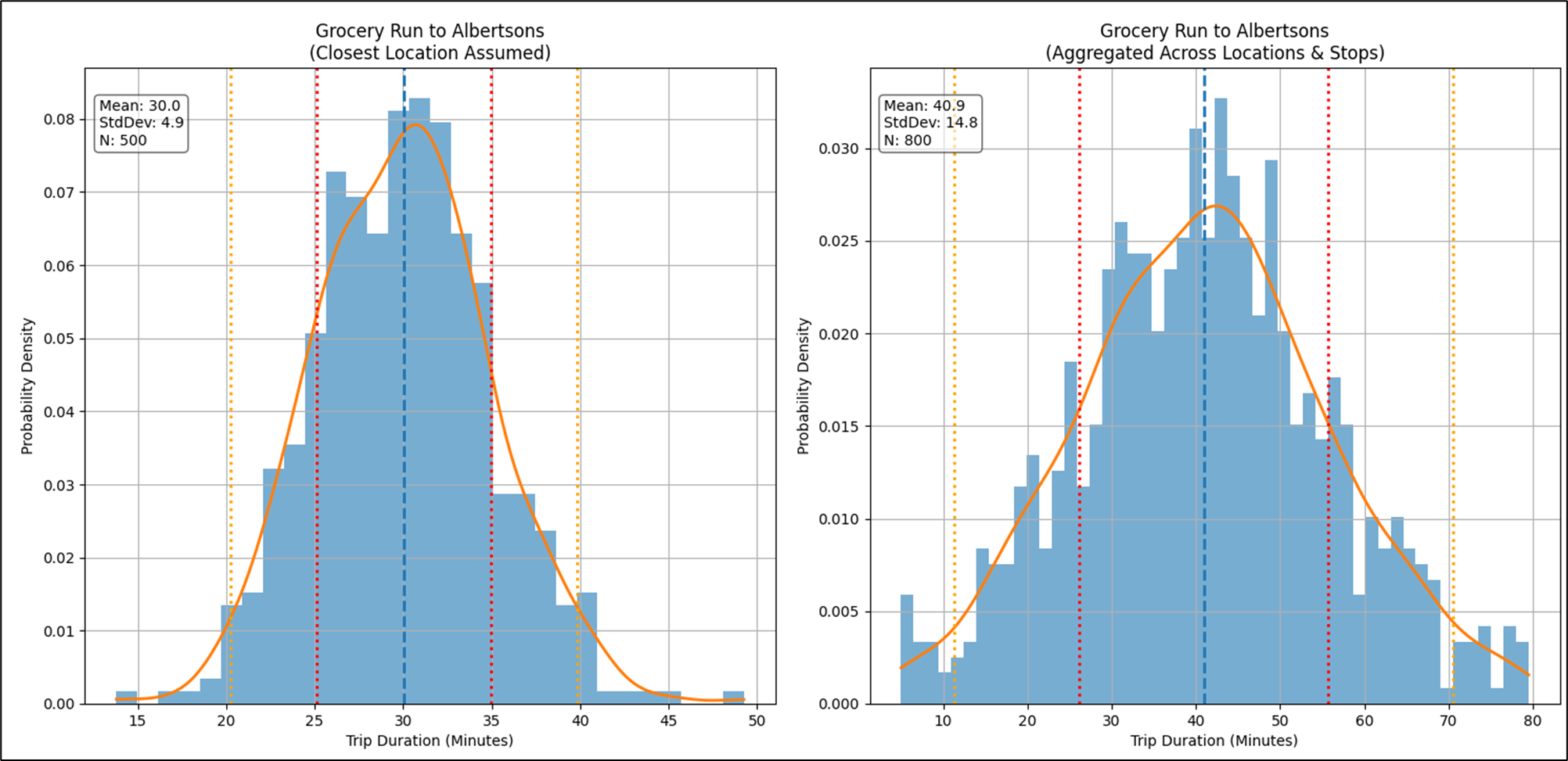
But what if the distribution wasn’t as clear as a bell (pun intended), as shown in the right graph in Figure 11? We have a problem. What we intuitively thought should result in a fairly predictable distribution (a tight standard deviation), didn’t. Instead of nice bell curve, we have a rather flat and wide distribution, which isn’t very helpful.
As always in the world of BI, that means we need to further segment our data. The spoiler alert is that there are several Albertsons within reasonable distance of where we live. The left graph assumed I meant the Albertsons closest to us, which makes sense—I’d usually go to the close one. However, the other two are close to a facility where we might also want to stop. For example, our favorite Starbucks, the post office, bank, each very close to one of the other two Albertsons near us (not the closest). So the duration of the grocery run also depends on other stops piggybacking on the grocery run, which determines which of the three Albertsons we visit.
The particular Albertsons is the regime. Figure 12 shows the other two Albertsons isolated.
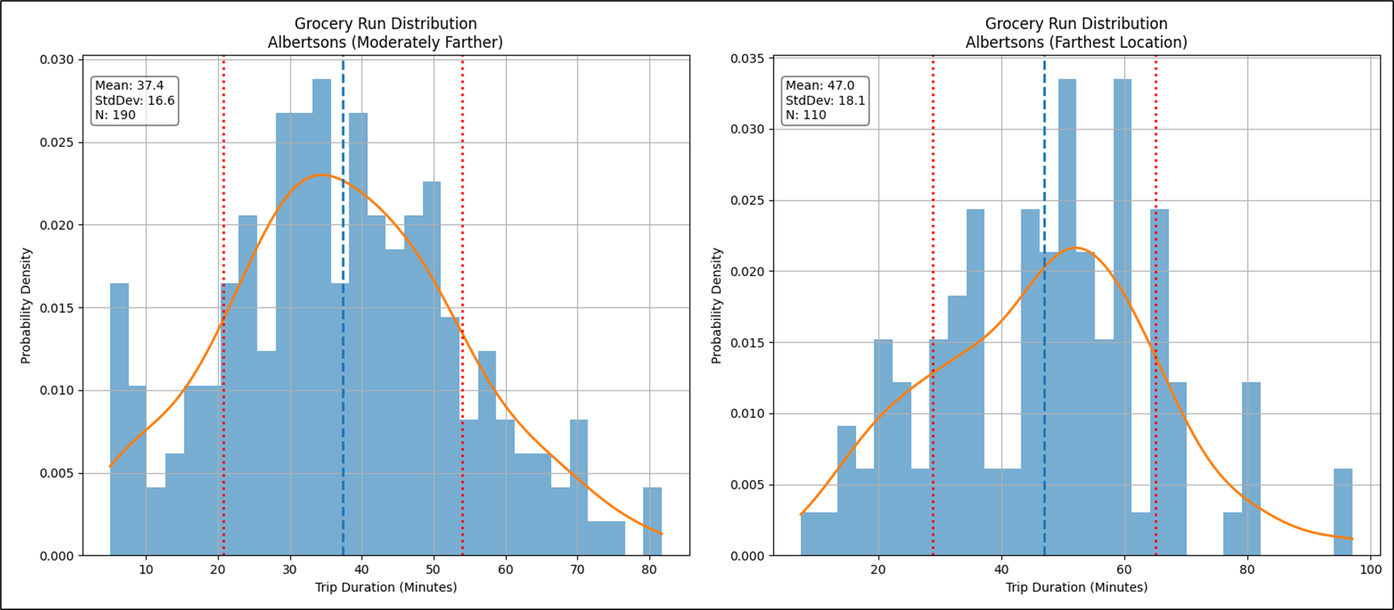
Figure 13 shows a plot of miles traveled vs. duration for my trips to all three Albertsons. If all we saw was the left graph, the story leaves a lot to the imagination, which isn’t good for decision making. The right graph shows us color-coding of three stores and a clearer picture emerges. However, we should slice by the individual Albertsons and analyze the patterns individually.
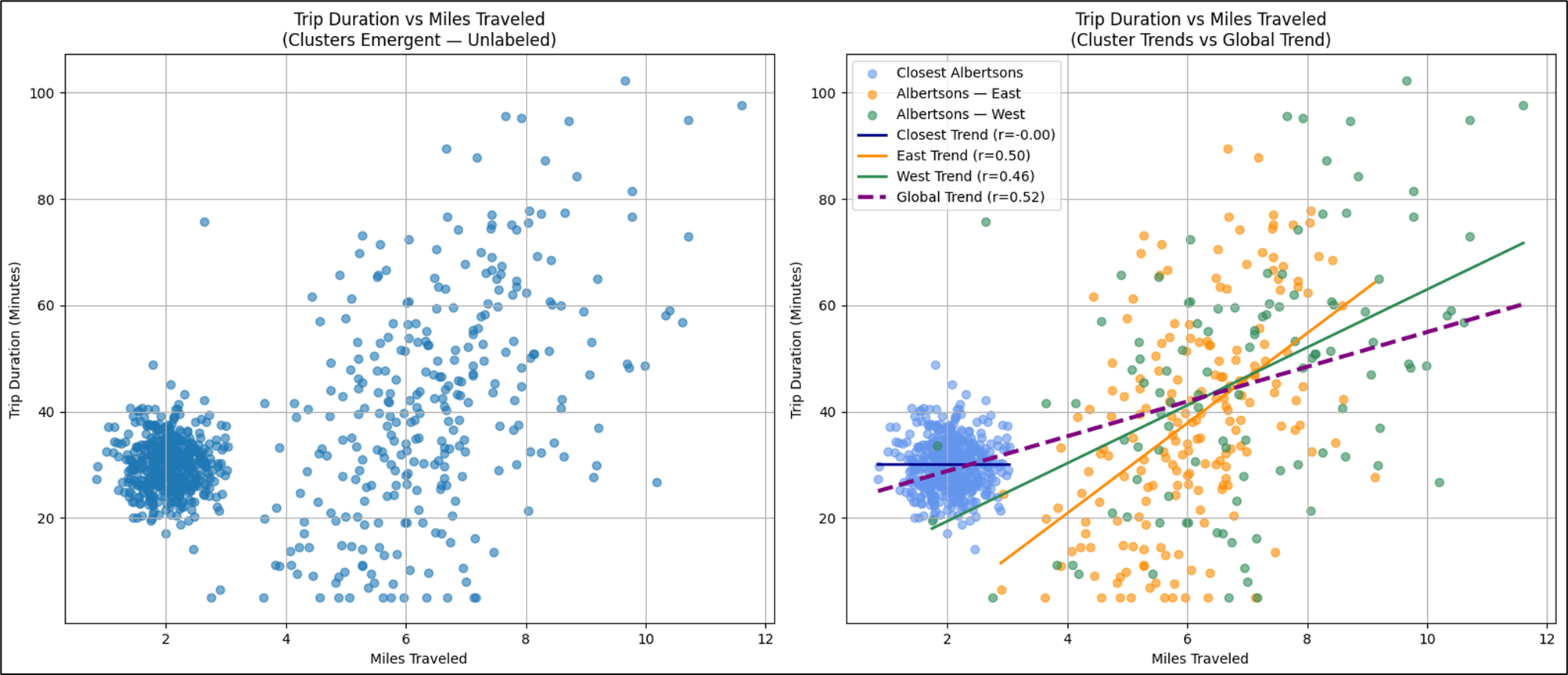
The Albertsons example is focused on providing intuition of regimes using an example that’s easy to relate to. All three Albertsons stores show a moderate linear correlation between miles and duration of the trips. But now, let’s look at a trend line that is more complicated than a hockey stick or even the full S-curve—which are 1 regime and 2 regimes, respectively.
Whereas a hockey stick tells a story of threshold fragility, a multi-regime curve tells a story of shifting mechanics. Instead of one elbow, there are several turning points—inflection boundaries where the slope of the relationship changes sign or magnitude. Each segment is locally coherent, often exhibiting strong correlation internally, yet the global Pearson correlation collapses toward mediocrity because opposing slopes cancel each other out.
Operationally, this is critical. A single low to moderate Pearson score might suggest:
“There’s nothing interesting here.”
But once segmented, we discover multiple tight relationships hiding inside the same plot—each representing a different operational state. Typical drivers of multi-regime behavior include:
- Capacity tiers (manual → assisted → automated)
- Policy thresholds
- Incentive changes
- Behavioral fatigue
- Regulatory gates
- Market saturation effects
- Resource depletion or replenishment cycles
Figure 14 shows an example of a multi-regime curve. This is not a linear relationship, nor a hockey stick or S-curve.
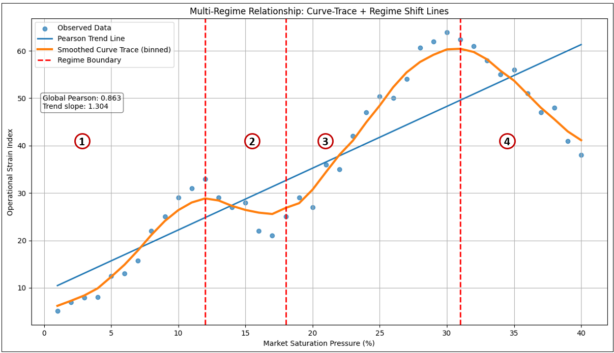
In the example shown in Figure 14, four regimes emerged:
| Regime | Behavioral Interpretation |
|---|---|
| 1 | Early scaling efficiency — effort produces strong gains |
| 2 | Fatigue or friction zone — additional pressure degrades outcomes |
| 3 | Process redesign — gains resume under improved mechanics |
| 4 | Saturation or overload — further pressure harms performance |
Table 9 shows the measured details of Figure 14. It’s the same information but in a tidy table.
| Regime | Start_X | End_X | Points | Slope | Pearson |
|---|---|---|---|---|---|
| 1 | — | 12.0 | 11 | 2.725 | 0.975 |
| 2 | 12.0 | 18.0 | 6 | -2.286 | -0.950 |
| 3 | 18.0 | 31.0 | 13 | 3.439 | 0.988 |
| 4 | 31.0 | — | 10 | -2.658 | -0.979 |
The key takeaway is that one tuple-to-tuple relationship may actually contain multiple localized correlations, each valid only within its regime boundary.
From a TCW perspective, this suggests structural extensions:
- Store regime breakpoints along the X-axis
- Store slope and correlation per regime
- Allow reasoners to interpret which regime current observations fall into
- Detect when transitions between regimes are occurring
In other words, the TCW edge becomes not a single correlation, but a segmented behavioral profile.
Clusters
The subject of clusters is out of scope for this blog, but I feel like I need to mention them as they are one of two primary patterns (perhaps the most familiar) usually visualized in a scatter plot. The other are the trend lines which are the subject of this blog—linear regressions, hockey stick, and S-curves.
The great example of the simplest type of “cluster” is the “magic quadrant”, such as the ubiquitous Gartner’s Magic Quadrants. It uses the simple algorithm of bisecting a square in the up-down and left-right directions.
If regime curves represent phase changes along a continuous axis, clusters represent something different entirely. That is, discrete behavioral populations occupying the same metric space.
Instead of a curve, the scatter plot forms islands—dense pockets of points separated by sparse gaps. Clusters often signal hidden categorical drivers that are not present on either axis. Figure 15 shows an example of a scatter plot.
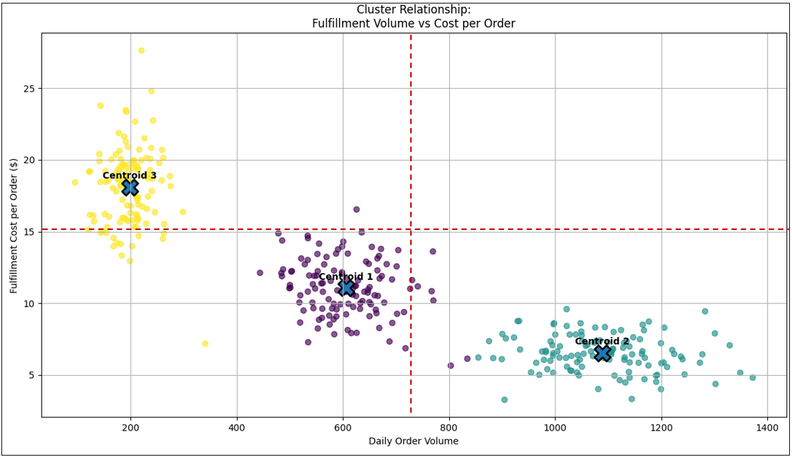
Note the horizontal and vertical red lines that divide the graph into four quadrants.
The thing about clustering is they are unsupervised machine learning tasks—the cluster algorithm automatically finds clusters based solely on the position of the plots. The fact that the plots form three clusters is new information.
As an example of an LLM’s role today, I asked ChatGPT to hypothesize on the three clusters, presenting in Figure 15. The prompt is (along with a snapshot of Figure 15):
Given this image, please offer hypotheses about the three clusters.
The full unedited response is in the file: cluster_hypotheses_by_ChatGPT.md. However, Table 10 summarizes the three clusters.
| Cluster Name | Operational Label | Centroid (Daily Orders) | Centroid (Cost / Order $) | Est. # of Locations / Points | Volume Range | Cost Range | Variability | Primary Interpretation |
|---|---|---|---|---|---|---|---|---|
| Cluster 1 Lower-Left | Mid-volume / Mid-cost | ~600 | ~$11.0 | ~110–130 | 450–800 | $8–$15 | Moderate | Balanced regional DCs; partial economies of scale |
| Cluster 2 Lower-Right | High-volume / Low-cost | ~1,050 | ~$6.5 | ~90–110 | 850–1,400 | $3.5–$9.5 | Low–Moderate | Highly automated hubs; scale-optimized fulfillment |
| Cluster 3 Upper-Left | Low-volume / High-cost | ~200 | ~$18.0 | ~80–100 | 100–350 | $13–$27 | High | Small spokes / rural nodes; sub-scale operations |
Examples of what could drive clustering include:
- Premium vs. standard customers
- Automated vs. manual processes
- Geographic operating regions
- Supplier tiers
- Product classes
- Risk segments
- Behavioral personas
In these cases, correlation analysis alone is insufficient because the relationship between X and Y differs by group membership rather than by magnitude along X.
Visually:
- Regime curves = One population, changing rules
- Clusters = Multiple populations, different identities
Analytically, clusters are expensive to compute compared to Pearson. Table 11 shows comparisons.
| Algorithm | Relative to Pearson | Intuition Framing | Notes on Practical Cost |
|---|---|---|---|
| Pearson Correlation | 1× (baseline) | “Do these move together?” | Single pass over data; assumes one global linear relationship |
| K-Means Clustering | ~10× – 50× | “Are there natural groupings?” | Multiple passes; depends on cluster count (k) and iterations |
| DBSCAN | ~20× – 100× | “Are there dense pockets separated by emptiness?” | Detects irregular clusters; sensitive to distance thresholds |
| Gaussian Mixtures (GMM / EM) | ~50× – 200× | “Are there overlapping probabilistic populations?” | Models soft membership; covariance estimation adds cost |
But they are powerful because they reveal segmentation opportunities that linear or nonlinear correlations cannot.
Within the Enterprise Intelligence stack, clusters align more naturally with the Insight Space Graph (ISG) than the TCW:
- TCW edges describe coupling between tuples
- ISG QueryDefs describe population segmentation
- Cluster models can generate new QueryDefs automatically
For example:
A scatter between Fulfillment Time and Order Volume might show two clusters:
- Automated warehouse nodes
- Manual fulfillment centers
Same metrics — different operational worlds. So cluster detection becomes a way to discover latent dimensions not explicitly modeled in BI schemas.
Simpson’s Paradox
Figure 16 is the same as Figure 15, but we’ve added a trend line presenting the Pearson correlation value for each cluster, and other across all points.
The main point is that even though Figures 15 and 16 are dominated by clusters and not some form of relationship line, they are actually both. In fact, if you consider the Pearson value across all plots (thick dashed black line with the value of -0.893), we see that they form a strong inverse correlation. It illustrates a multi-regime picture, just like Figure 14.
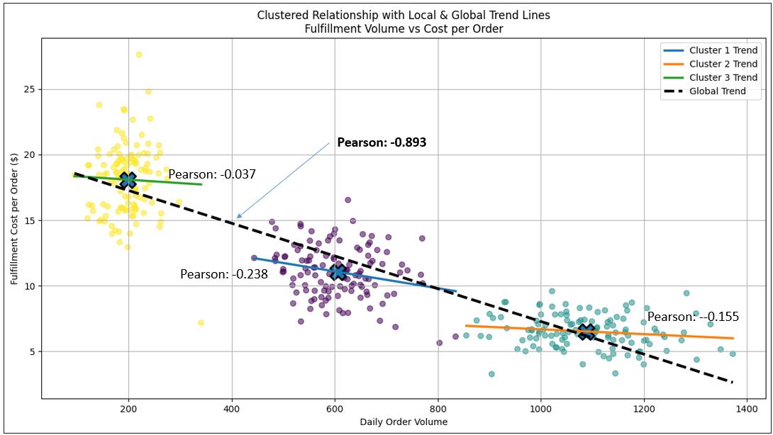
The difference is that the plots within each cluster (regime) of Figure 16 are chaotic, unlike the plots of Figure 14 which form an orderly line. The Pearson value of the individual clusters weak (near 0 for the yellow and teal clusters).
But … but … how could the overall Pearson value be strong, but the Pearson values of the individual clusters are weak or practically non-existent?! Well, Figure 16 introduces a statistical phenomenon known as Simpson’s Paradox (at least a form of it)—a situation where the correlation observed in an aggregated dataset reverses or contradicts the correlations observed within its constituent groups.
At first glance, the paradox feels mathematically impossible. If the clusters themselves show weak or near-zero Pearson correlations, how can the combined dataset produce a strong inverse correlation of -0.893? The answer lies in regime separation along the x-axis. Each cluster occupies a distinct operating band of order volume:
- Low volume → high cost
- Mid volume → moderate cost
- High volume → low cost
Within each regime, cost variation is driven by local noise—labor mix, shift timing, fulfillment friction—so the intra-cluster slope appears chaotic or flat.
But when all regimes are combined, the centroids themselves align along a downward structural gradient:
As fulfillment volume increases across regimes, systemic cost efficiency improves.
So the global Pearson isn’t measuring micro-behavior inside regimes—it’s measuring macro-transition between regimes. This is the essence of Simpson’s Paradox:
- Within-group correlations describe local mechanics.
- Between-group positioning defines systemic direction.
In other words, the strong inverse relationship does exist—it simply lives at a higher structural layer than the individual clusters. Figure 16 therefore reinforces a key analytic warning:
Correlation strength depends on the level of aggregation.
Blending regimes can create relationships that do not exist locally—yet are still operationally real.
So what is the culprit that causes that segmentation? It’s a confounding variable that shifts the joint distribution of X and Y across groups. When aggregated, this structural separation induces a strong Pearson correlation that does not exist within the individual regimes.
Upon detecting a Simpson’s pattern, an LLM can assist by hypothesizing candidate confounding regimes—such as geography, infrastructure tier, capacity utilization, or operating conditions—guiding analysts toward segmentation dimensions that may explain the induced global correlation. I asked ChatGPT 5.2 to offer a few hypotheses of what that confounding variable could be. It’s another great example of where LLMs can assist in BI processes. Table 12 lists the hypothesized confounders.
| Hypothesized Confounder | How It Segments the Data | How It Influences X | How It Influences Y | Why It Can Produce a Strong Global Pearson |
|---|---|---|---|---|
| Geographic Region / Corridor | Splits routes by terrain, infrastructure, and distance norms | Certain regions naturally involve longer or shorter distances | Terrain, congestion, and infrastructure affect duration | Regions occupy distinct X–Y bands that align diagonally when aggregated |
| Transportation Mode | Separates air, ground, sea, rail logistics | Air tends toward longer distances; ground toward shorter | Mode determines transit speed and variability | Mode-driven clustering induces covariance across the dataset |
| Infrastructure Capacity Tier | Divides facilities by throughput capability | High-capacity hubs handle larger distance flows | Capacity determines delay and processing time | Structural separation of performance regimes creates aggregate slope |
| Capacity Utilization Regime | Segments operations by load level | High utilization often coincides with longer routing paths | Delay escalation occurs near saturation thresholds | Different utilization regimes occupy different curve zones |
| Seasonal / Temporal Regime | Groups data by time-of-year conditions | Weather rerouting or demand cycles shift distance patterns | Seasonal congestion alters duration | Temporal clustering induces apparent correlation |
| Cargo / Product Class | Separates shipments by handling requirements | Certain goods travel farther (e.g., imports vs local goods) | Handling complexity affects dwell and processing time | Product distribution drives structural clustering |
| Priority / Service Tier | Divides shipments by SLA or urgency | Priority shipments may be routed longer distances | Expedited handling reduces duration | Priority tiers create artificial diagonal separation |
| Supply Chain Topology | Distinguishes direct vs multi-hop routing | Multi-hop paths increase effective miles | Transfer points increase duration variance | Routing architecture induces clustered regimes |
| Automation / Technology Level | Segments facilities by operational maturity | Advanced nodes may handle longer routes efficiently | Automation reduces delay variability | Technology tiers create performance stratification |
| Crisis vs Normal Operating State | Separates emergency vs steady-state operations | Crisis rerouting increases miles | Instability increases duration variance | Regime shift produces strong aggregate covariance |
Of course, this “human in the loop” example is just for demo purposes. My real intent is that if a multi-regime or cluster situation is encountered, and so there is a need to figure out what might be behind it (the confounding variable), this is an automated System ⅈ process:
- Query an LLM with the data, along with a prompt stating there are clusters and please hypothesize on what could be responsible for the clustering.
- Take the list of possibilities from the LLM. Assuming there is an enterprise-wide data catalog that is equipped with descriptive vector embeddings, we could find nodes of database tables and columns in the data catalog similar to the at least one of the hypothesized confounding variables.
- The System ⅈ process would try slicing the data by the hypothesized rows of the candidate confounding variables.
- If one is found that seems to match the clusters/regimes, System ⅈ records that information and fires it as a thought to System 2 which might help in current reasoning tasks.
And in enterprise systems, those regime transitions often matter more than the noise within them.
My Real Simpson’s Lesson
The reason I brought this up is because some insights within a data visualization can be unintuitive, even counter-intuitive, at least at first. When I began learning the math related to machine learning all those years ago, the value of Simpson’s Paradox clearly wasn’t nearly as intuitive as it was for shapes such as hockey stick curves. In fact, I hardly thought about Simpson’s Paradox until well into building Map Rock.
Back then I was still getting used to the math itself. Correlation coefficients, distributions, regression lines… I was learning the language before I could fully “see” what it was describing. And I wasn’t a college student, so I had to learn things limited to a need-to-know basis.
Hockey sticks, on the other hand, were visual and intuitive. You didn’t need a statistics background to feel the danger in that curve. Even though I intellectually knew the line wouldn’t rocket to infinity, my mental model didn’t always register the stabilization that usually follows. As I mentioned earlier in the blog, we rarely observe the full arc of a hockey stick curve anyway—either the system heals (by the hands of the maintenance crew), or it blows up before we can study the aftermath.
Following hockey sticks naturally led me to S-curves. And S-curves led me to multi-regime thinking—systems governed by different rule sets depending on where you stand along the x-axis.
That’s when clusters re-entered the picture for me. I had worked with clustering for years, but now I started seeing clusters differently—not just as population segmentation, but as regime segmentation. Distinct operating realities coexisting inside the same dataset. And that’s when Simpson’s Paradox truly clicked in my mental models.
Because once you see clusters as regimes, the paradox stops feeling paradoxical. Of course the global correlation can be strong while local correlations are weak—the global line is tracing the transition between regimes, not the behavior within them.
But I have a broader lesson here. When you work around experts long enough, you notice that experts sometimes (usually?) forget what isn’t obvious to non-experts. Conversely, people in the field often see things experts overlook because they live inside the operational texture of the system.
There is a corresponding dynamic between humans and AI.
Similarly, there will be patterns that feel obvious to AI because AI sees knowledge at scale (the corpus of humanity’s writings)—wide, broad, and amalgamated. Yet it remains unintuitive to humans because humans (most humans) don’t know a lot about a lot of things—individual humans haven’t assimilated the corpus of humanity’s writings).
Again, conversely, there will be lived, experiential signals humans grasp immediately that models struggle to weigh properly. Meaning, the corpus of humanity’s writings fail to capture details of experience that didn’t make it into an author’s writings. It’s not because it’s not essential, but there’s only so much time and paper. That’s why “a picture is worth a thousand words”, and video, maybe a thousand times more.
So, the System ⅈ process of building the TCW, a substrate of relationships from which humans and/or AI reason and invent, must be readily cognizant of the fact that our theories of mind about each other are always flawed. Each human mind, and each instance of AI are systems, which are recursive systems of systems, where components are coupled to varying stages of rigidity. A world as complex as ours abhors a purely monolithic system (i.e. a system where everything is tightly-coupled).
I’ll leave it at that for now.
Detection Strategy: From Cheap Signals to Deep Structure
Because cluster modeling is computationally heavier, even more so than multi-regime relationships, it benefits from upstream triage—similar to hockey stick detection. We’ll look deeper into this in a future blog. But for now, here is a very brief list of lightweight indicators that clustering may exist include:
- Weak Pearson despite visually tight groupings
- Multimodal density along either axis
- Large residual variance around trend lines
- High kurtosis or density discontinuities
- Gap detection along nearest-neighbor distances
These can serve as routing signals:
- Strong Pearson → store linear TCW edge
- Hockey stick detected → store elbow + segmented correlations
- Moderate Pearson + structural hints → route to regime segmentation
- Weak Pearson + density hints → route to clustering engine
This layered pipeline preserves compute efficiency while expanding structural awareness.
Structural Comparison
Lastly, here is a table summarizing the curves we looked in this blog.
| Relationship Type | Shape | Hidden Insight | TCW Handling |
|---|---|---|---|
| Linear | Straight trend | Stable proportional coupling | Single correlation edge |
| Hockey Stick | Threshold escalation | Fragility activation | Store elbow + segmented Pearsons |
| S-Curve (New Normal) | Growth + plateau | System adaptation | Segment pre/post transition |
| Multi-Regime | Directional shifts | Rule changes | Store multiple regimes |
| Clustered | Group islands | Hidden segmentation | Generate ISG QueryDefs |
Each structure represents a different kind of systemic intelligence.
Conclusion
In this blog, we drilled into a deeper part of the Tuple Correlation Web. It’s one of the System ⅈ substrates for generating “thoughts”, enriched packets of information passed to System 1 and System 2. One type of thought is chains of strong correlations. Another type of thought is when we notice, “Something just ain’t going right.” Meaning, we sense that a situation is about to detail, unravel, explode.
A big part of our human intelligence is to know how far we can push before things backfire on us:
- How close to the edge of the cliff can we go to see what’s below?
- How close can we let the deer get before its own senses detect us?
- How long can we walk without water before we collapse from dehydration?
Exploring past the borders of our safe zones—especially when there is not clear and present reason to do so—is more than a trick in humanity’s box of ingenuity tricks. In some ways, the relevance of running from safety (shout out to Richard Bach) might indeed be the reason for our enhanced intelligence (relative to the other creatures we share the Earth with). What purpose would our level of intelligence matter if we never exceeded the parameters of our programming?
Extending the TCW to note these structural signatures transforms it from a correlation catalog into a behavioral topology—a living map of how pressure, response, fragility, and adaptation propagate across the enterprise.
And that matters, because intelligence—whether human or artificial—does not come from merely noticing that two (or more) things move together. It comes from an understanding of why things move together, how they move together, when they stop moving together, and what happens when the rules governing that movement change. Noticing a correlation is just a thought, a seed, from which we can grow a story.
My Authentic Conclusion
And now for the real conclusion. In most of my blogs, my conclusions aren’t proper conclusions. You can ask ChatGPT or Grok to give you a better one than I can. My real conclusions are usually the real reason I write these blogs. That is to give you another way to see things—but still tied down into the mainstream, so you don’t need to toss everything out.
When I write about complexity in business, driven by competing goals (ex. in The Complex Game of Planning), I usually use profit and growth as prime examples. However, there is another that gets short-shrift or is even just symbolic. But without this third goal, what sense does “making a living” make. That is “Quality of Life”, referring to the lives of all the souls involved in the enterprise.
As AI speeds the swirls of the world, we will hit more of these lines we sometimes shouldn’t cross—at least not without more trepidation. For many of those lines, we historically didn’t need to worry about crossing them because there is a natural barrier of our human limitations. With today’s continued technological advancement we’re able to cross many more lines. But even though we can cross new frontiers and experience the effects we had hoped for, there is a good chance we can’t know the long-term outcome for sure, no matter how much we test … because we don’t know what the possible newly emergent features might be.
So the purpose of this blog is to highlight the non-linearity of relationships—which Nassim Taleb has already done so beautifully—but reassembled, enriched, and retrofitted for my BI audience and in relation to the System ⅈ process of building the TCW. The world is too complex for us to turn so many dials to 11 (even one dial to 11 is dangerous) and seriously think we can predict what will happen. I don’t mean predicting what is most likely to happen from a long list of possibilities, but the things we or even an artificial super intelligence never could have thought about. Remember, unless it’s some sort of inter-dimensional ASI, it still will not be anywhere near all-knowing—it doesn’t know about everything that’s happened, the relationships between everything happening now, nor what is yet to happen—so even an ASI is still going to make lots of mistakes taking what is just its best guess.
