The phrase “thinking outside the box” traces back to a deceptively simple puzzle: nine dots arranged in a 3×3 grid. The challenge is to draw four straight lines through all the dots without lifting your pencil. Most people fail at first because they instinctively keep their lines inside the square boundary implied by the dots. The trick is to extend your lines beyond that imaginary box.
“Coloring outside of the lines” is another metaphor. It refers to how some children, still not indoctrinated with (or resistant to) convention, color into a coloring book image outside of the provided lines. Figure 1 shows the solution to the “thinking outside of the box” puzzle at the left. The two right boxes capture “coloring outside of the lines”. However, things often don’t work out on the first try. So much for my pizza of strawberry jam crust, watermelon and orange slices, with okonomiyaki sauce drizzle. But that’s the bravery of creativity.

In real life, our “box” is rarely two dimensional (or three like a literal box). It’s a highly multi-dimensional cage of constraints—time, money, politics, fear, habits—each wall reinforced by the comfort of staying inside. Taking a analogy a little further, like the bars of a cage, we can stick our hands outside. Thinking outside the box means temporarily stepping beyond the confines of those bars, and that bravery comes with discomfort. Sometimes it’s mild unease, other times severe and genuine pain.
But pain isn’t always a hard stop sign. In medicine, for example, we often trade short-term, milder suffering for long-term survival—like enduring chemotherapy, paired with painkillers, to eliminate cancer. The discomfort is real, but it’s a calculated sacrifice of multiple lesser pains in exchange for the removal of a greater one.
In an earlier post, I explored how pain itself can be broken into discrete “buckets” with distinct characteristics—some transient and tolerable, some cumulative and dangerous, some transformative if endured. Levels of Pain – Refining the Bad Side of the KPI Status was about organizational pain, but the principle applies to personal and creative problem-solving as well.
When we frame “pain” in this way, we can look for strategies to mitigate the worst of it while still pushing far enough outside our constraints to find solutions that would never emerge if we stayed inside the lines.
Investment means sacrificing something towards a particular goal. For example, we:
- Sacrifice edible seeds towards harvesting a bigger crop of them.
- Invest hard-earned money, time, and possibly optimal health to start our own business.
- Invest time, mental health, and a ton of money into earning a college degree or mastering a new skill.
- Sacrifice your queen in a chess game for the most satisfying checkmate.
All of those items include opportunity costs—things we could have done instead. We’ll never know what might have been, so it’s not worth worrying about.
All of designing systems towards a solution involves conscious sacrifice and exploring beyond boundaries. This is different from designing away issues. For example, incorporating a cooling system in an automobile prevents the engine from overheating. That’s a different issue from a driver with an over-heating engine who makes a judgment call to keep driving to the next service station against current extenuating circumstances.
This blog covers two concepts that facilitate thinking outside of the box:
- Sacrifice and investment – How much pain of can we endure of a variety of types in order to resolve really bigger pain?
- Finding the borders of phase transitions – How far can we push before something breaks?
And, in this LLM-driven era of AI and deep learning, neural networks dominate the conversation involving machine learning models. For this blog, we’ll explore a role for support vector machines (SVM) in this newer world.
AI and Investment/Sacrifice
The concept of sacrifice isn’t something an LLM truly understands in the human sense. LLMs are neural networks currently trained on the corpus of humanity’s recorded knowledge. As vast as that may be, it’s nothing compared to the entire space of knowledge. We have our level of intelligence because of what we don’t know about a constantly changing world.
Sacrifice, to a human, is not beyond logical cost–benefit calculations. It’s a lived experience that blends:
- Loss—giving up something tangible or intangible you value.
- Time horizon—the knowledge you might feel worse before you feel better.
- Uncertainty—the possibility that the sacrifice may not pay off.
- Emotion—grief, hope, fear, relief, pride, or regret tied to the decision.
For people, it’s easy to look away from the possible pains another person might experience as we direct them to accomplish a task. It’s not because the manager is callous, but because they don’t know about the unique complexity of that other life—their thresholds within their unique combinations of extenuating circumstances. All that the manager knows is there is a problem to solve and creates a plan for it. When the plan is rolled out, of course, hardly anything goes smoothly. If a plan does seem to work out, it’s due to real-time agility, heroics, and selective memory.
For an LLM, there’s no visceral pain, no bodily survival instinct, no emotional attachments, no real sense of society. LLM “thinking” about sacrifice is just a probabilistic recombination of patterns learned from its training text—stories, philosophy, game theory, medical decision-making. It can model the structure of sacrifice and discuss trade-offs, but it doesn’t feel the pull between conflicting goals such as comfort and the greater good.
What LLMs can do is mimic some of the reasoning patterns around sacrifice:
- Weighing short-term pain against long-term benefit.
- Identifying mitigations for the interim discomfort.
- Modeling alternative scenarios if the sacrifice fails.
That’s why, for AI, sacrifice is purely instrumental—it’s an optimization problem. For humans, it’s also existential. We carry the cost in our body and memory. AI just carries the concept.
This is an interesting response from the recently released ChatGPT 5 to my prompt: “Do you think outside of the box when someone prompts you for a solution?”
Not in the way you mean.
When a human “thinks outside the box,” they’re not just processing options — they’re challenging assumptions, questioning constraints, and sometimes stepping into uncertainty or risk they feel personally.
That leap often comes from discomfort, frustration, curiosity, or stubbornness. When I respond to a prompt, I’m not “escaping” a mental box; I’m following statistical pathways through patterns I’ve learned from billions of examples. If your question nudges me toward a less common association, I might produce something that looks outside the box — but it’s really just outside the most probable box, not the conceptual box you’ve lived inside.
The catch is:
I don’t experience the constraints as real walls — I just see them as patterns in text.
- I can’t feel the cost of breaking them.
- I’m not driven to leave the box; I’m led there by the shape of your prompt.
That’s why you often see LLM creativity spike when the user deliberately forces unconventional constraints or unusual combinations. You, not me, are the one deciding to poke a hole in the box — I just walk through it because you opened it.
It’s great that it can look “outside the most probable box” if that’s what we request. But no matter how logical a design may be, it doesn’t mean it will serve the good of humanity well.
To LLMs, everything is a simulation—yes, at least LLMs are in a simulation. There’s no reason to think that real life is more than just a game to LLMs. In games, such as chess, checkers, and Texas Holdem Poker, there is no bending of rules. There are undiscovered paths of relationships and sequences to success which outsmart our opponents. But rules of games are unambiguous. Real life is richly complex, to the point where rules are more like a field of definition than an unambiguous fact. This is the ultimate expression of “don’t mistake the map for the territory”.
Bending the Rules
How far can we push what we put at risk (whatever we’re investing or sacrificing) before it breaks? The notion of testing the boundaries is fundamental. We all do it in some way or another. In cases involving law and/or morality, how much depends on extenuating circumstances that most of others will empathize with. Most people wouldn’t empathize with breaking laws or generally accepted codes of morality. There’s a difference between bending but not breaking the rules and being cool.
At least at this time, the default mode of LLMs is not thinking inside of the box. Guardrails that prevent LLMs from breaking the law or breaking what is generally accepted social morals is pretty cut and dried. But the notion of bending the rules short of breaking them is much more nuanced. Otherwise, LLMs are chiefly inductive pattern learners; they can mimic short deductive chains when well-prompted, but by default they operate within the facts and priors they already contain.
Personally, I always intend to walk a narrow path as far as laws and regulations are concerned (ex. taxes, driving, respecting property, etc.). But in my work as a BI Architect, I need to consider bending the rules of among a web of business processes and constraints. Maybe we can lose “bad customers” in the face of “the customer is always right”. Maybe we can sustain losses in favor of growth. Maybe we can avoid layoffs. But where are the lines?
Because the notion of LLMs bending the rules to present us with creative solutions is touchy, I need to be clear that I’m just presenting this as a component of what goes into truly innovative solutions. Encouraging AIs of today to bend the rules is disconcerting. Worse, what about an ASI taking the liberty of bending the rules. Therefore, I’m not offering prescriptive guidance in this post.
This post is a discussion on how bending the rules—whether bound by societal laws, physics, morality, logic/rules, or just by convention (“it’s the way it’s always been done”)—is questionable but nonetheless integral to high levels of innovation. This is especially true when we face immediate and pressing problems with big consequences.
That reminds me of a great book that was very inspirational to me back in the early 2000s when I began my AI journey: The Ingenuity Gap, Thomas Homer Dixon.
The Boundaries of the Cutting and Bleeding Edges
Bending the rules means playing somewhere approaching the cutting edge through just shy of the bleeding edge. To me, the cutting edge is the boundary where the vast majority safely plays—say over 99.9%, like 4 standard deviations. The cutting edge is the accepted limit.
The bleeding edge lies beyond the cutting edge to who knows where. It’s like traveling to the unexplored depths of the Amazon, Antarctica, or even space. It’s where Columbus might have fallen off the edge of the Earth, the atomic bomb would have created a chain reaction throughout the entirety of Earth, and tomatoes would have killed us (there would be no pizza!).
Much of design and engineering is about finding the boundaries at which components are pushed into a different state. For example, how much weight can a beam carry before the house transitions from house to rubble? It’s about finding a solution to competing goals. Those competing goals aren’t just about money, but about the right amount of strength, flexibility, and all sorts of other tolerances.
How far we’re willing to push depends on extenuating circumstances. For example:
Scotty (the chief engineer on Star Trek’s original series) is concerned about the warp engines breaking. Yes, he’s aware of how much it can take, for how long, under different circumstances. Captain Kirk, the project manager of the “five-year” mission, is concerned about how far the warp drive engines can be pushed before they break, weighing the severity of why he needs to get somewhere:
Captain Kirk: Scotty! The $@#& Klingons cut us off and drop-warp-checked us!
Scotty: Aye Captain! Ya needint say morrre. Maximum Warp it is!
In this case, Captain Kirk presents the extenuating circumstance, leaving it to Scotty’s seasoned judgment as to the risk of sustained maximum warp for something of this obviously huge magnitude of disrespect. The extenuating circumstance—the imperative of catching the Klingons so we can have the satisfaction of honking our horns at them—is the justification for the risk of pushing the warp drives to its border.
How does Scotty know how far the warp engines can go at maximum warp and for how long? This starts with isolated experiments designing the engine. But I kind of doubt their integrated testing involved building an entire fleet of entire Constitution class ships stress testing them to the Delta Quadrant and back at maximum warp to witness where it blows up.
Now, Scotty has had to push beyond the boundaries many times thanks in large part to Cowboy Kirk before and lived to see another day. So he has built an instinct for what will happen beyond the comfortable parameters of the Constitution Class Users Guide—which is what AI models of today (ChatGPT, Grok, Gemini, etc.) will give us by default today.
Phase Transitions
At least in “polite society”, success is more likely for those who are willing to bend the rules without breaking them—since by breaking them, they wouldn’t be part of “polite society” anymore. As we bend the rules, things don’t just become a little more or less painful, illegal, immoral, dangerous, risky. Rather, there is a point where we cross a line and things completely change—for example, from businessperson to criminal, forgivable to unforgivable, or water to ice. That transformation is a phase change.
That line can be very thin, very abrupt. Or it can be a span of a gray, DMZ-like (the two Korea’s DeMilitarized Zone) area. Sometimes that line is well-defined, sometimes we need to figure out where it is. And the latter is the tricky part.
About Finding Borders
Our visual processing begins with detecting edges—finding the borders between regions of contrast in what our eyes perceive. These borders define clusters of similar features, like shapes or textures, and serve as the foundational cues for recognizing objects. This principle was a key breakthrough in artificial intelligence through convolutional neural networks (CNN), which were designed to identify such edges in image data. In a different but related way, SVMs also focus on finding borders—this time around clusters of data points in high-dimensional space.
Although we theorize about where a line might be, we’ll never know for sure unless we try. If we’re lucky, someone else has tried and we can learn from their mistake or success. However, don’t take that out of context. We should never perform experiments on people and/or their property without the direct and express consent of the individuals involved. Instead, we might perform scaled-down, targeted experiments on willing participants fully aware of the possible outcomes. What complicates things more is that unintended consequences (unhappy accidents) can take years or even decades to manifest. Admittedly, those experiments often don’t scale up with reasonably perfect fidelity and the targeted factors of the solution sterilizes out the complexity of real life.
Short of a way to go back in time before the experiment or hopping over to a parallel universe where we didn’t perform the experiment, I don’t think there is a foolproof solution. The approach I’m focusing on could be called “data-driven abductive reasoning”. Meaning, we collect data from wide breadths of sources, derive insights (information) from those haystacks of knowledge, make it accessible to AI, and hopefully AI can deduce guidance that’s better than our human-generated guesses. That’s the intent for my two books, Enterprise Intelligence (June 21, 2024) and the more recently published Time Molecules (June 4, 2025).
Of course, prompting AI with talk about bending the rules, under many conditions, would rightly raise red flags for an LLM fine-tuned with guardrails that avoid making dangerous recommendations.
OK, let’s look at examples of phase changes.
Pain Scales
When we think of stress testing, we usually think about finding the breaking point. The crossing the breaking point is a phase transition. But there are usually more states than the binary states of functioning and breaking.
Figure 2 is something we see during our visits to the emergency room or urgent care. We often hear people ask us to rate something from 1 (or 0) to 10, sometimes defining 1 and 10, but not anything in between. Instead of specifying our pain on an amorphous scale from 1 through 10, we can select from an ordered set of well-defined states. The graphic and distinct illustrations of each state make it easier to communicate level of pain.
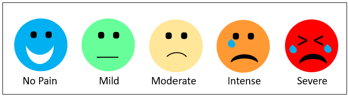
The problem with Figure 2 is that it’s very subjective. People have different thresholds for pain. And it can change under changing contexts. For example, my definition of pain was much different from when I entered the ER and after I was poke and prodded for a few hours.
Figure 3 is a less subjective diagram of a series of the health of a car’s tire during a trip. The series is a set of objectively discrete states. That’s more sophisticated than simply, “On a scale of 0 to 1, how bad is your tire situation?”
Although the value depicted for each of the five states is 0 through 1.0, each state occupies a specific range of boundaries. However, the Warning state (2), is different from the other states. A tire will be in stage 2 for virtually it’s entire life on a car, which means the score will usually be 0.25 through 0.49—ranging from virtually unnoticeable wear progressing to where we can see the threads. For the other states, the range of flatness (3), disintegration (4), and broken axle (5) are pretty binary.
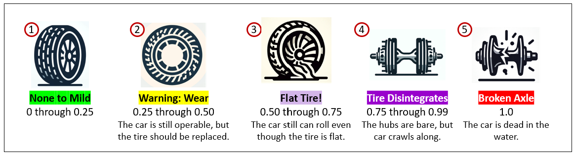
These are more detailed descriptions and extenuating circumstances that might encourage us to keep going despite any compromised state—meaning we’re willing to push the boundaries of danger and accept the consequences:
- None to Mild (0 – 0.25) Everything’s running smoothly. There may be the tiniest signs of wear, but they’re cosmetic and have no real impact. In project terms, you’re on track, deadlines are comfortable, and the “road” ahead looks clear.
- Warning: Wear (0.25 – 0.50) There’s noticeable degradation, but operations are still functional. The smart move is to plan for maintenance or intervention before it escalates. In a project setting, this is when early warning signs appear—a slipping timeline, creeping scope, or light technical debt that will grow if ignored.
- Flat Tire! (0.50 – 0.75) A clear failure has occurred, but you can still limp along. Maybe you’re within a mile from a gas station. You’re getting where you need to go, just inefficiently. In project terms, this could mean a key dependency has failed, resources are stretched thin, or a process is broken but workarounds keep progress alive.
- Tire Disintegrates (0.75 – 0.99) Critical functionality has collapsed. You might be able to roll enough to get to the side of the road. The system still moves, but only in an emergency “crawl mode.” In a project context, you’re firefighting constantly—deadlines are at risk, major rework is unavoidable, and progress feels like dragging metal on pavement.
- Broken Axle (1.0) Full operational shutdown. The system, project, or initiative cannot continue without a major rebuild. This is beyond quick fixes—it’s a call for fundamental redesign, replacement, or a total reset.
This tire example is more objective, but it’s merely a one-dimensional progression. Most decisions are based on combinations of factors.
Multi-Dimensions – Support Vector Machines
Real-life decisions are usually multi-dimensional beyond just one a single metric. We weigh what we must invest, the potential rewards, the risks to our interests, and whatever collateral damage must mitigate (actually, eliminate).
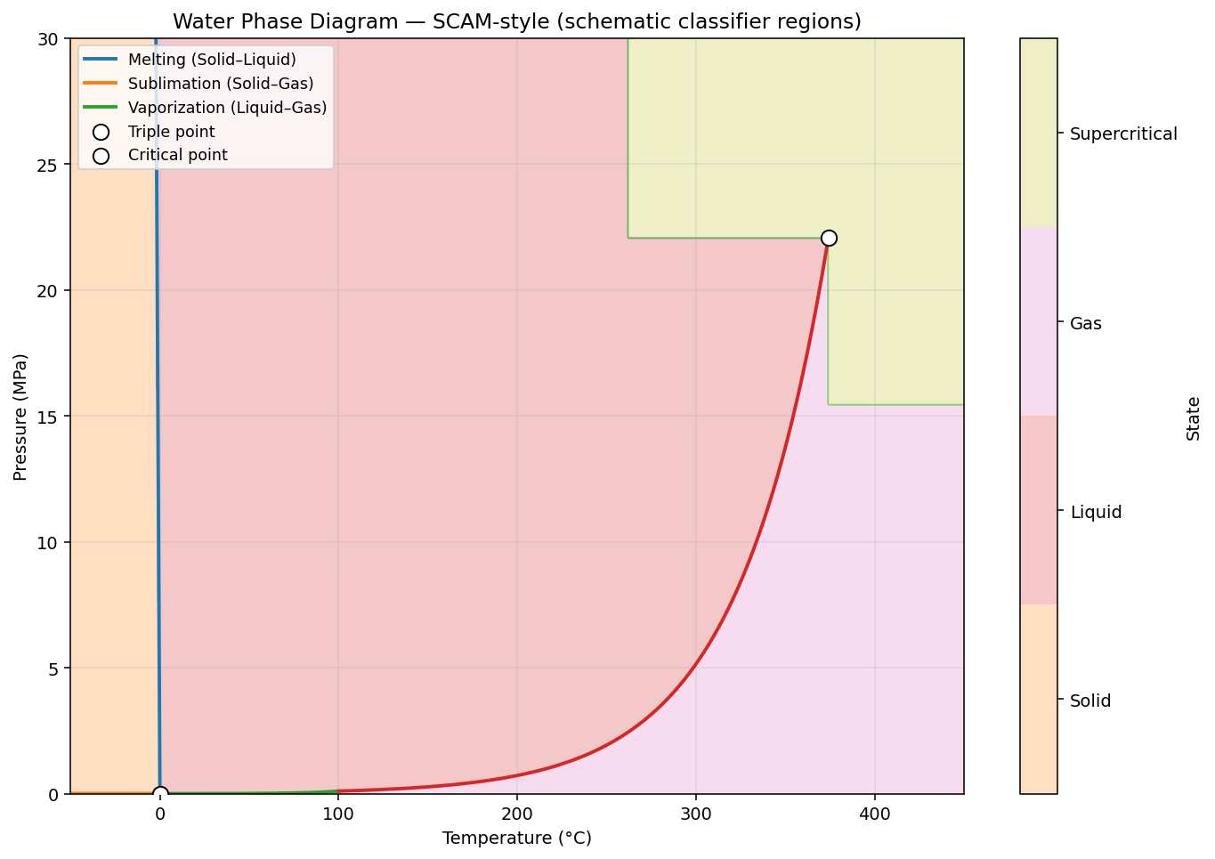
Figure 4 is an example of 2D “SVM-like” (support vector machine) visualization of the well-defined phase change boundaries of H20. We’ll get to SVMs soon. By “SVM-like”, I mean it looks like a visualization of an SVM machine learning model, but it’s built from hard descriptions, derived from physics and chemistry, not by machine learning.
Real life is well beyond one-shot machine learning models such as linear regressions. The notion of what is the least you can push something before it becomes something else is a fundamental dimension of invention. For example:
- What is the lowest coupon value to offer a customer to keep them from leaving or buying even more?
- What is the least to bet in a poker game to make an opponent fold (or raise, call, check)?
The notion of investment and sacrifice is key to our ingenuity. We’re beyond “happy accident” invention such as that of Alexander Fleming’s penicillin or Percy Spencer’s microwave oven. That goes for human intelligence and artificial intelligence.
Metamorphic Rocks
Figure 5 is another example of a 2D SVM-like visualization—just a little more complicated and not nearly as deterministic as the water example. Metamorphic rocks form when existing rocks are altered by heat and pressure without melting. So the state is a 2D question. The same starting material can become very different rocks depending on its path through temperature–pressure (P–T) space:
- Low T & P → slight changes, producing zeolite facies or diagenetic textures.
- High T, low P → hornfels near hot intrusions.
- Moderate T & P → greenschist or amphibolite facies.
- High P, low T → blueschist in subduction zones.
- Extreme P → eclogite deep in the mantle wedge.
- High T & P → granulite with high-temperature minerals.
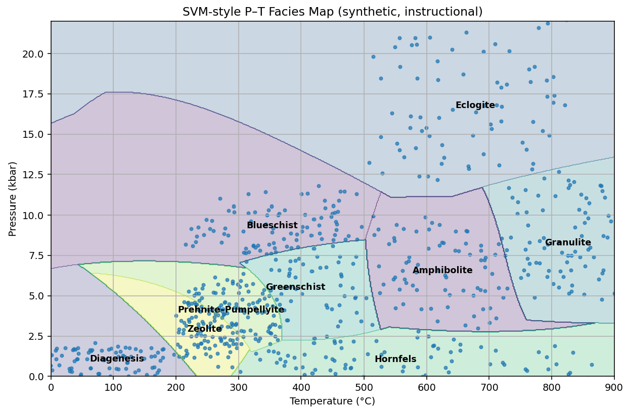
Each mineral assemblage is a “P–T fingerprint,” letting geologists read the conditions a rock experienced—and the tectonic story behind it. Table 1 shows the boundaries of temperature and pressure between different states.
| Facies / Field | Temperature (°C) | Pressure (kbar) |
|---|---|---|
| Diagenesis | ≤ ~200 | low (<~1–2) |
| Zeolite | ~200–300 (sometimes up to ~400) | ≤ ~1.5–3 |
| Prehnite–Pumpellyite | ~250–350 | ~2–7 |
| Greenschist | ~300–550 | ~2–10 (occasionally higher reported) |
| Blueschist | ~250–500 | ≳8–20 |
| Amphibolite | ~500–750 (can extend wider) | ~3–10 |
| Granulite | ~650–1,100 (typical 700–900) | ~3–10 (HP up to ~13–15) |
| Eclogite | ~500–900 (and higher) | >~12–15 |
| Hornfels (contact) subfacies | Albite-epidote: ~300–500; Hornblende: ~500–650; Pyroxene: ~650–800; Sanidinite: >~800 | Very low, typically <~2 |
The important thing to keep in mind is that although the measures (temperature and pressure) are continuous values, the phases are distinct, with their own characteristics. All of those rocks are readily identifiable by geologists and rock hounds.
Although the values used to create Figure 5 and Table 2 are rather well-defined through experiment, no geologist was around tens to hundreds of millions of years ago to test the temperature and pressure, nor any other qualities of the environment that would affect the cooling process of the material.
So Figure 5 does illustrate the borders of phase changes, but we created it from somewhat empirical data. What about those vast majority of unique and dynamic situations where scientists haven’t determined the deterministic boundaries? For that, we have the machine learning algorithm, support vector machines—the ML algorithm that is about visualizing boundaries.
Beyond 2D
A great example of classification over more than two dimensions is Dave Portnoy’s pizza review . It involves an informal but systematic way to score pizza, mostly involving what to us are subjective impressions. This method goes well beyond two dimensions. Multiple factors play into his score:
- Flop – How much the slice droops when held.
- Undercarriage – Crispness and bake quality of the crust bottom.
- Taste – Flavor balance of sauce, cheese, crust.
- Greasiness – From light sheen to oil puddles.
- Crunch – Audible crispness when bitten.
- Personality of the spot – The vibe, story, owner charisma, or uniqueness of the pizzeria.
From these factors, and assumption of a cheese pizza (no toppings), the slice falls into distinct “state” categories:
| Score Range | State Description |
|---|---|
| 5.1 and below | Inedible to unpleasant. Even if free, you wouldn’t finish it. |
| 6.1–6.9 | Fills hunger without pain, but not worth seeking out. |
| 7.1–7.9 | Solid local option—if it’s nearby, it’ll satisfy every day of the week, but no need to travel. |
| 8.1–8.9 | Worth driving out of your way to try; a standout slice. |
| 9.1+ | A destination pizza. People will travel just for this slice. Extremely rare. |
Notes:
- All the ranges start at x.1 because Dave says rounded scores (4, 5, 6, …) are amateur.
- I’m sorry if you don’t like Dave Portnoy. But we all love pizza, and this makes a good and fun example.
- The score ranges factors and descriptions are based on my knowledge of watching his pizza reviews for years.
Although part of his schtick is saying, “Everyone knows the rules …”, the rules for weighing the factors, the boundaries, are trained solely in his brain. His rules are more complicated than a multi-variable linear regression. There is more than one way to achieve a particular score.
A fascinating nuance is that Portnoy often hovers in the 7.9–8.1 range—tiny score changes can shift a slice’s “state” from merely good local pizza to a destination-worthy experience, possibly making or breaking the fortune of a pizza location. This shows how multiple metrics combine into a single score that dictates the final categorical state, and how even a tenth of a point can alter perceived value and behavior.
Let’s say Table 3 is a partial fictional sampling of Portnoy-style pizza reviews, features and scores that I created. He usually mentions all of these in some way. However, he uses subjective terms and sometimes just body language.
| Site | Flop | Undercarriage | Taste | Greasiness | Crunch | Store Personality | Score |
|---|---|---|---|---|---|---|---|
| S001 | 8.6 | 9.9 | 6.7 | 5.6 | 5.1 | 6.4 | 8.1 |
| S002 | 2.0 | 7.3 | 7.5 | 8.7 | 5.9 | 7.8 | 8.1 |
| S003 | 8.9 | 9.3 | 6.7 | 7.9 | 8.2 | 6.9 | 6.0 |
| S004 | 6.3 | 8.4 | 8.9 | 7.2 | 8.6 | 9.9 | 8.1 |
| S005 | 6.3 | 7.3 | 7.6 | 5.8 | 7.7 | 9.2 | 6.0 |
| S006 | 2.0 | 5.1 | 6.8 | 6.1 | 9.2 | 8.6 | 7.5 |
| S007 | 2.2 | 9.7 | 8.2 | 8.8 | 7.9 | 6.2 | 8.7 |
| S008 | 5.7 | 7.8 | 6.1 | 6.2 | 9.1 | 6.3 | 6.0 |
| S009 | 4.8 | 6.9 | 9.2 | 3.9 | 8.8 | 5.2 | 8.1 |
| S010 | 2.3 | 5.1 | 7.7 | 4.1 | 7.0 | 8.6 | 7.6 |
| S011 | 8.8 | 6.2 | 7.5 | 3.2 | 5.4 | 5.6 | 6.0 |
| S012 | 3.6 | 6.2 | 9.5 | 2.1 | 6.7 | 7.2 | 8.1 |
| S013 | 2.6 | 8.4 | 8.8 | 5.0 | 8.0 | 6.0 | 7.8 |
| S014 | 6.3 | 8.0 | 7.2 | 4.8 | 8.0 | 9.5 | 6.0 |
| S015 | 4.7 | 9.2 | 8.2 | 4.1 | 7.7 | 7.4 | 8.1 |
From the data in Table 3, we will create an SVM using the features: Flop, Undercarriage, Taste, Greasiness, Crunch, and Store Personality to predict a Score as described in Table 2.
Figure 6 shows two 2D displays, each with different axes chosen from among the six shown in Table 3. Each point is one of the pizza sites along with the score. We can see how borders are drawn around sites that cluster together along the two axes.
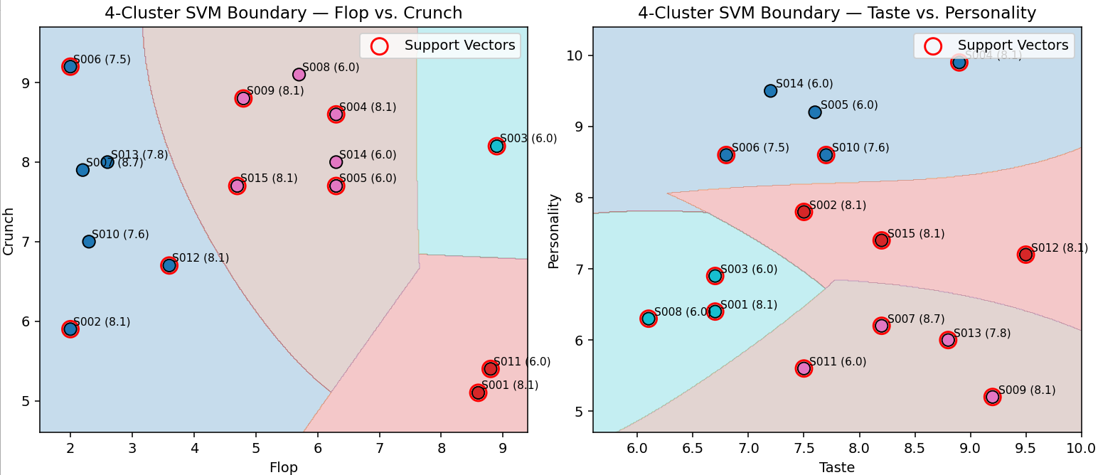
One of the ideas I’m addressing is that there is more than one way to get to the same state (pizza score). You will see sites with 8.1 scores (S001, S002, S004, S009, S012, S015) in multiple regions, but their feature scores are very different. We couldn’t generate a linear regression model to fit both of these. So there are multiple different ways to get an 8.1 score—at least that many linear regression formulas.
Querying the SVM
The problem with multi-dimensional data is that we can only visualize two or three (maybe even four with animated visualizations). However, although we cannot visualize more than three dimensions (or four dimensions), the SVM can. Going back to the pizza rating data in Table 3, we created a six-dimension SVM that attempts to predict how our fictional version of Dave Portnoy might score a pizza.
Table 4 shows three new pizza reviews we’ll use to test out our SVM.
| Site | Flop | Undercarriage | Taste | Greasiness | Crunch | Personality |
|---|---|---|---|---|---|---|
| N001 | 5.0 | 6.0 | 4.5 | 6.0 | 5.0 | 4.0 |
| N002 | 2.5 | 9.2 | 9.0 | 3.5 | 8.7 | 7.0 |
| N003 | 5.0 | 8.8 | 9.0 | 6.8 | 8.2 | 8.5 |
Table 5 shows how the SVM classifies pizza examples into score “states” (6, 7, or 8 – See Table 2 above) and how close each case is to the boundary with another state. The predicted state is chosen by the model based on the highest margin value. The margins represent how strongly the example aligns with each possible class; larger positive values mean a stronger fit.
Table 4 – Query the SVM for how close it is to states.
| Query | Predicted State | Margin(5) | Margin(6) | Margin(7) | Margin(8) | Nearest Alt State | Gap to Alt |
|---|---|---|---|---|---|---|---|
| N001 | 5 | 4.137 | 3.132 | 1.940 | 3.100 | 6 | 1.005 |
| N002 | 8 | -0.259 | 1.873 | 4.233 | 5.246 | 7 | 1.013 |
| N003 | 6 | -0.270 | 4.174 | 2.142 | 4.255 | 8 | -0.082 |
For example, N001 is predicted as a 5 because its margin for class 5 (4.137) is higher than its margin for class 6 (3.132). However, the gap between them is only 1.005, which means the slice sits fairly close to the decision boundary—it has noticeable traits of both a “5-level” and a “6-level” pizza. In contrast, N002 is predicted as an 8, with a much stronger margin for class 8 (5.246) compared to its nearest alternate, class 7 (4.233), giving a gap of 1.013. N003 is predicted as a 6, but its nearest alternate is class 8, and the tiny gap between them (-0.082) shows it sits right on the boundary—sharing characteristics of both “6-level” and “8-level” pizzas.
In short, the Gap to Alt column tells us how confident the model is about its prediction. Small gaps indicate borderline cases (like N001), while larger gaps mean the pizza clearly belongs in the predicted state.
How Low Can We Go?
However, we’re not just trying to predict the Score. We’d like to measure how close a pizza site is to going up or down a score. For example, a site might have been scored a 7, but how close is it to an 8 by feature?
Let’s say the owners of N001, N002, and N003 are OK with their scores for their pizza spots. But achieving great crunch means more time in the oven, which means fewer pizzas per hour, which means impatient customers. And having a great “personality” involves having what is perhaps more service staff than is required.
How much crunch and/or personality can we sacrifice without losing our current rating?
| Query | Predicted State | Feature | Original Value | Allowed Δ | New Value (Min) |
|---|---|---|---|---|---|
| N001 | 5 | Crunch | 5.0 | 1.046 | 3.954 |
| Personality | 4.0 | 0.538 | 3.462 | ||
| N002 | 8 | Crunch | 8.7 | 0.000 | 8.700 |
| Personality | 7.0 | 0.829 | 6.171 | ||
| N003 | 6 | Crunch | 8.2 | 0.023 | 8.177 |
| Personality | 8.5 | 0.028 | 8.472 |
This table highlights how sensitive each pizza style is to changes in quality dimensions. For N001, the model places it in state 5 but shows some flexibility—both Crunch and Personality could be reduced modestly without shifting its classification. This suggests N001 is relatively stable, and small variations in preparation or customer experience won’t dramatically affect its perceived quality tier.
N002 is firmly classified as an 8, with no tolerance on Crunch—meaning the charred style must maintain its texture to stay premium—though there is some allowance on Personality, indicating that service factors can dip slightly without undermining its overall standing. By contrast, N003 sits on a knife’s edge: even tiny reductions in Crunch or Personality risk pushing it into another state.
For decision-makers, this means N003’s consistency is fragile and should be closely monitored, whereas N001 and especially N002 have a sturdier cushion of quality.
Let’s see how the owners of N001 could use the information provided in Table 7. That is, for N001, we could lower crunch down to 3.954 or personality down to 3.462 or some combination less than those advised minimum. Table 8 shows a few experiments with the crunch and personality ratings. The first row are the original values for reference.
| Variant | Vector (Flop, Underc, Taste, Grease, Crunch, Personality) | Predicted |
|---|---|---|
| N001-Original values | [5.0, 6.0, 4.5, 6.0, 5.0, 6.0] | 5 |
| N001-Crunch↓ | [5.0, 6.0, 4.5, 6.0, 4.0, 6.0] | 5 |
| N001-Personality↓ | [5.0, 6.0, 4.5, 6.0, 5.0, 4.5] | 5 |
| N001-Crunch↓ & Personality↓ | [5.0, 6.0, 4.5, 6.0, 4.5, 5.0] | 5 |
| N001-Crunch↓ & Personality↓ | [5.0, 6.0, 4.5, 6.0, 4.0, 5.0] | <5 |
For the 2nd through 4th rows, we didn’t push too far. But for the last row, we did go a little too far.
Of course, we could also ask for combinations of other minimums to improve and/or sacrifice to get to a score of 6 or even more. For example, the vector of [5.0, 6.5, 7.0, 7.0, 6.5, 2.5] will score a 7. In this case, we’re taking “Personality” down really low but more than making it up with straight pizza quality.
Without the ability to find the borders of how far we can push, we can take educated guesses. But in this way, we have access to a data-driven method—which still may not be correct, but it’s still valuable guidance.
Obtaining the Portnoy-ish Data
Regarding where data, such as shown in Table 3, would come from: For this specific case, we can see from his YouTube videos that he doesn’t actually mark down a rating for each feature—even though recording feature-level scores onto some sort of score sheet is a common way for any sort of judging or reviews. I doubt Dave later writes down this information, but these features are going through his mind.
But I can envision extracting the feature-level scores through the videos and the associated transcript using AI—LLMs, computer vision, speech-to-text. The videos are generally 2-3 minutes long, short enough not to be a context window nightmare for an LLM. He uses similar words when talking about features. In fact, most of the feature names are pretty much part of his unique “trademark”.
For “Store Personality”, he doesn’t actually use that phrase, but he usually says something about “spot” (his word for the pizza joint). Sometimes he likes the owners so much that he ups the score. Extracting sentiment about the pizza spot is very feasible.
Obtaining reasonably accurate feature-level scores for this and similar cases is highly plausible.
That’s pretty much the important part of this blog. But before leaving, there are a couple of aspects of 2D visualizations I’d like to cover.
Obtaining Business Data
Regarding “real life” situations, Business Intelligence (BI) data sources are prime. BI data sources provide highly-performant access to cleansed, secure, and easy to understand data. Relevant to this “data science” subject, I discuss how OLAP cube technology, particularly Kyvos’ Pre-aggregated OLAP cubes, accentuates data science: 4 Ways in which Kyvos Smart OLAP™ Serves the Data Science Process.
The ultra-high query performance from OLAP cubes is particularly of interest since it would be very helpful if the SVMs could be created in real-time as an LLM process (RAG, Chain of Thought, etc.) requests queries to SVMs. Even if an SVM needs to be created at query-time, the pre-aggregation from OLAP cubes avoids the need for query-time aggregation of what could be millions to trillions of facts (reduced to relatively few cases input into the SVM). The time to create an SVM from what is probably dozens to a few thousand cases is tiny compared to aggregated massive data into those fewer cases.
Using the SVM
The SVM answers two operational questions:
- How far can I push parameters without changing the current state?
- How far (and in what direction) do I need to push to reach a desired state?
In the pizza example: “How much can we reduce Crunch and Personality before the rating drops?” and “What is the smallest change that gets us from a 6 to an 8?”
This is the sequence, whether through a human knowledge worker or an AI query process:
- Question in (human or agent). The user/agent asks a boundary or target-state question in natural language.
- Planner builds a procedure. RAG/CoT decomposes the request into steps (load data → choose model family → compute boundaries/paths).
- Boundary intent detected. The planner tags the task as boundary measurement or target reachability.
- Model lookup. It calls the ML service to find a model that can:
- classify into your ordinal states (
<5, 5, 6, 7, 8, 9), and - expose decision margins and counterfactual deltas (the “allowable Δ”).
- classify into your ordinal states (
- Serve or build.
- If an adequate model exists, use it.
- Otherwise, the service returns a build plan (estimated cost/latency, data it needs, expected quality). The agent can approve building and cache the result for next time. SVMs of the type we’re talking about isn’t exactly light on compute. As I mentioned, if an SVM must be created on the fly, pre-aggregated OLAP cubes carves off a big chunk on real-time compute.
- Answer out. The service returns: predicted state, per-class margins, nearest alternate, gap (confidence proxy), and allowable Δ for requested features; optionally a minimal multi-feature path to a target state.
SVM 2D Visualization is Better Than Magic Quadrants
The SVM diagrams are basically two-dimensional scatter plots with fancier lines than a magic quadrant, such as the ultra-popular Gartner Magic Quadrants. In reality, as we saw with the pizza rating example, an SVM can operate in any number of dimensions. Each extra feature (flop, undercarriage, taste, greasiness, crunch, and store personality) becomes another axis in an abstract space that we can’t directly draw. Even though we can’t see that space, the model can still be queried: you provide all the feature values, and the SVM returns the predicted class and how close it is to the decision boundary.
From a training computation standpoint, SVMs can be more demanding than simple, more linear models like Markov models or Pearson correlations because they solve an optimization problem that can be highly iterative. However, they are generally less computationally heavy than large neural networks, especially for moderate-sized datasets. More on this below at SVM Training and Predicting.
Once trained, the SVM can be saved as a .pkl (pickle) file. This file can then be loaded into other systems—for example, it could be the predictive engine behind an Insight Space Graph, as I describe in Enterprise Intelligence, powering classification queries or state predictions in real time.
The SVM can be another model cached into the Insight Space Graph. But to address countless contexts, we need to read and aggregate the underlying data as quickly as possible and assume there will be high concurrency from many AI agents. In most cases, OLAP cubes will offer the fastest query response.
SVMs are like magic quadrants, only better. The beauty of magic quadrants is that they are simple to create and understand. We have a 2D grid divided evenly into four equally-sized pieces—each labeled with an intuitive grouping.
SVMs are more nuanced as for a square grid is partitioned. Figure 7 is a generic magic quadrant with four states:
- Challengers (upper-left) – Strong ability to execute today, but less complete or innovative vision for the future. Often established players with solid operations but slower to adapt.
- Leaders (upper-right) – High on both execution and vision. Perform well in the present and have a compelling, forward-looking strategy.
- Niche Players (lower-left) – Lower on both execution and vision. Often focused on a narrow segment of the market or serving a specific set of customers.
- Visionaries (lower-right) – Strong on vision but weaker on execution. Innovators with bold ideas that may lack the resources or capabilities to deliver consistently yet.
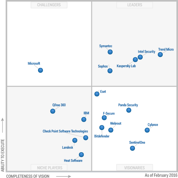
Figure 7 attribution:
By Gartner – https://www.gartner.com/resources/273800/273851/273851_0001.png?reprintKey=1-2X53YGZ, CC BY-SA 4.0, Link
These gross boundaries are problematic because they are arbitrary. For example, look at Trend Micro, very high on Completeness of vision and fairly high on ability to execute. Trend Micro is in the coveted Leader quadrant. Now look at Eset, so close to jumping over the horizontal line from mere Visionaries quadrant to the Leaders quadrant. If Eset improved its ability to execute just a little, it would hump into the Leaders quadrant. But it’s unfair to group it with Trend Micro with substantially superior Completeness of Vision.
That “four-corners” area of Figure 7 is sketchy. Like the four-corners area of Utah, Colorado, Arizona, and New Mexico, just one step gets you into one of three other states. Imagine a company at the top-right corner of the “Niche Players” quadrant that can cross into “Leaders’ with incremental improvement.
Figure 8 shows us what the Figure 7 looks like with tighter borders around the clusters. The plots are still the same, but this compartmentalization makes more sense.
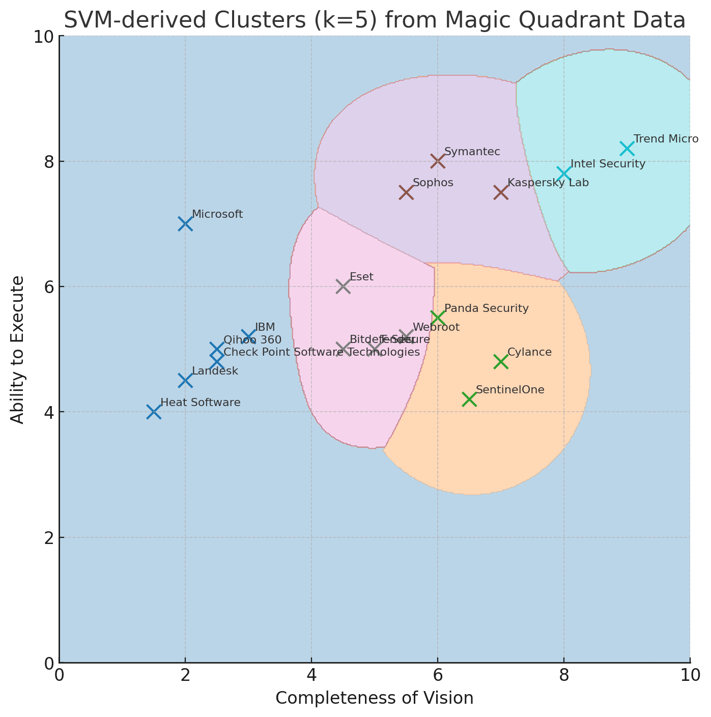
Figure 8 was created to segment into 5 clusters (k=5). However, perhaps k=3 or 4 might have created clusters that make more sense.
Lastly, we could have used a more well-known cluster algorithm (ex. kmeans or KNN) instead of SVM. They are more straight-forward—clusters are isolated and their centers are determined. We can then associate a new item to the center that it is closest to. As it is with SVM, the cluster algorithms can accommodate more than two dimensions, and visualization isn’t pretty. So, the “borders” are circles around a cluster center (better than just splitting the grid into four parts), but they still aren’t as accurate as the custom-fitted borders of SVM.
SVM Training and Predicting
Table 8 lists a series of tests based on our pizza reviews. Rows is the number of reviews. You can see that training time up for 1,000 reviews is very fast— 0.021 seconds for plain RBF and 2.813 seconds with 5-fold. Almost three seconds is quite a bit by traditional BI standards (slice and dice using a visualization tool like Tableau). But compared to ChatGPT5’s “Thinking” mode, it’s not that bad. But the larger row sizes take pretty significant training time.
| Rows | Training: Fit_s (Plain RBF) | Training: Fit_s (Grid 3×3 × 5-fold) | Predict_ms (All rows) | SupportVectors |
|---|---|---|---|---|
| 1,000 | 0.021 | 2.813 | 42.3 | 425 |
| 10,000 | 0.664 | 11.357 | 1,622.8 | 2,072 |
| 20,000 | 2.476 | 57.344 | 6,553.1 | 3,852 |
| 50,000 | 14.593 | 363.674 | 71,663.6 | 8,535 |
How to read Table 8:
- Rows—how many pizza reviews we trained on for that run. More rows, more evidence for the model.
- Training: Fit_s (Plain RBF)—how long it took to train a usable model with sensible defaults. Think of this as the “quick build.”
- Training: Fit_s (Grid 3×3 × 5-fold)—a small tuning pass that tries a few settings and picks the best one. It takes longer, but you only do it when you want the best accuracy. It’s a one-off cost; you can cache the result.
- Predict_ms (All rows)—how long it takes to score the whole dataset—that means if Rows=1,000, that’s testing all 1,000. This is the “answer time.” Each individual answer is typically milliseconds, which is almost instant.
- SupportVectors—how many training examples the model keeps as “anchors.” More anchors usually mean a more wiggly decision boundary. That can make the model a bit slower and sometimes less general, but still fine at this scale.
Visualizing More than 2D with Dimension Reduction
As mentioned in Querying the SVM above, we can’t visualize more than 4 dimensions, 2 for the cleanest visualization. But since AI agents might be the main consumers, it can query the SVM with more dimensions since they don’t need to visualize it.
Another way we could use SVMs is through dimension reductions. PCA takes multiple correlated measurements—here: flop, undercarriage, taste, greasiness, crunch, and personality—and finds a set of new axes (principal components) that are uncorrelated and capture as much variation as possible.
- PC1 explains the most variation in the data—it’s the “biggest pattern” across all pizzas.
- PC2 explains the next most, capturing differences that PC1 missed.
- Each principal component is a weighted combination of the original factors. These weights are called loadings, and they tell you how much each factor “pulls” on that component.
This lets us collapse 6D pizza space into 2D while keeping most of the interesting information, so we can visualize patterns and let the SVM separate score classes.
Feature Contributions to Each PC:
| Factor | PC1 | PC2 |
|---|---|---|
| Flop | -0.41 | 0.12 |
| Undercarriage | 0.46 | -0.22 |
| Taste | 0.37 | 0.68 |
| Greasiness | 0.32 | -0.58 |
| Crunch | 0.43 | 0.29 |
| Personality | 0.39 | 0.27 |
Here’s how to read Table 8:
- PC1: undercarriage, crunch, and personality have strong positive loadings, meaning pizzas with crisp bottoms and unique vibes score higher on this axis.
- PC2: taste pushes strongly positive, while greasiness pushes strongly negative—separating flavorful but oily slices from lighter, less-greasy ones.

Class 1 (Purple) – Bake & Structure Dominant
- S002, S003, S005, S007, S008, S011, S014
- Higher Undercarriage and Crunch
- Often lower Flop
- Tends to include the more engineered or technically consistent pizzas
- Corresponds to the region that captured a lot of 7.5–8.1 scores in the PCA projection
Class 2 (Blue) – Personality & Flavor Dominant
- S001, S004, S006, S009, S010, S012, S013, S015
- Higher Personality and often higher Taste
- More variability in Flop and Greasiness (style-driven)
- Pulls in both some high and mid scores depending on strengths
- Includes many 8.1+ scores in the PCA projection
Conclusion
Conscious sacrifice and investment are keys to human ingenuity. Many animals can learn associations and anticipate where food will be—sometimes in surprisingly sophisticated ways. What sets us apart is the scale and abstraction of our trade-offs: planting next year’s crop while this year’s stores run low, trusting a model of the future we can’t yet see. We can allocate resources toward a plan, hold the line through discomfort, and convert delayed gratification into progress.
This is a very deep subject. For this blog, my intent is just to introduce and/or remind readers of the counter-intuitive nature of investment, sacrifice, pushing beyond the traditional boundaries, measuring where the boundaries might actually be, and what might happen if we cross them. That is something other than improving AI capability through training LLMs on more data, ever-larger parameters, access to more data at query time, and improved deductive reasoning.
And solutions to big and novel problems are usually multi-step and iterative processes—moving from state to state—not one big leap. As we reach the next milestones, we hopefully have acquired what we need to make it through the next step.
For the few people who read this (my “voice” is drowned out by tons of other voices with ideas as well as AI-generated content), my intent is to give you deeper intuition into thinking and invention that may not be as natural for AI. My intent is not to teach people how to better find everyone’s “pain thresholds”, even though that is an unintended consequence.
As I’ve said before, I would rather AI didn’t exist. I would rather spend my time pondering the wonders of this world and building deeper creative skills than learning how to work with LLMs. I wish that for everyone else as well.
But AI is here, and we can’t force everyone to play nice with it. So we must continue to explore all aspects of intelligence. That includes the ability to measure how much we can push and pull the levers towards improvement and avoid detrimental effects.
Notes
- This blog is Chapter VI.1 of my virtual book, The Assemblage of Artificial Intelligence.
- Time Molecules and Enterprise Intelligence are available on Amazon and Technics Publications. If you purchase either book (Time Molecules, Enterprise Intelligence) from the Technic Publication site, use the coupon code TP25 for a 25% discount off most items.
- Also see my other blogs related to this topic:
