Squeezing More Value Out of SSAS
It’s been a bit over ten years since I began software development based on a set of ideas I eventually named Map Rock. Since it was such a big part of my life for a few years, I thought I’d commemorate its 10th anniversary with a blog. That is, even though Map Rock as a coherent product never did go anywhere.
I’m reminded of Map Rock lately because there is some vague resemblance to a current rising star in the analytics world that’s been on my mind, Data Mesh. The vague similarity is the approach of building a widely-encompassing, integrated picture of data from a set of domain-level data “objects” (cube, data mart, whatever). The difference is:
- Data Mesh decomposes a monolithic data analytics landscape (the monolithic IT that develops monolithic data lakes or monolithic “enterprise data warehouses”) into a distributed system of domain level “Data Products”. Then integrates them into an organized, loosely-coupled mesh.
- Map Rock integrates a set of independently built departmental (or subject-oriented) data marts into a loosely-coupled web linked via common dimensions. Map Rock addressed the difficulty in successfully building a bottom-up, Kimball-esque, all-encompassing enterprise data warehouse (EDW).
Map Rock was originally an effort to preserve my then 13-year-old livelihood around SQL Server Analysis Services (SSAS). SSAS appeared to be near the end of its reign as the go-to technology of the Business Intelligence world. Specifically, I’m referring to the original multi-dimensional SSAS before the arrival of its baby brother, SSAS Tabular. It was in that late July 2011 timeframe that I realized the single-server, scale-up SSAS would be overrun by the pre-configured, scale-out and/or in-memory likes of the DW appliances such as SQL Server PDW and Netezza, SAP HANA – and of course, Hadoop.
TL;DR
The TL;DR of Map Rock is to discover relationships between information locked up in disparate cubes. For example, what relationships are there between a Finance-Focused cube and a Customer Relationship-focused cube? Further what relationships are there between the Customer Relationship Cube and an Inventory cube – and between the Inventory cube and the Finance cube? It forms a web of relationships, in this case, a simple sort of love triangle between a Finance, Customer, and Inventory cubes.
But what is a relationship? Well, just about anything imaginable, maybe even not yet imaginable. And even if we knew of relationships between cubes, most cubes back then (and even today) lack common dimensions. Some sort of commonality is the basis of relationships. This was prior to Master Data Management becoming a household term.
There is, however, one common dimension, and it’s a biggy – Date. Although cubes aren’t required to have a date dimension, virtually all useful cubes do. Date is a biggy because all objects and events are a set of observations that happen together. As neurology folks say, “What fires together, wires together.” Surely, I had to do some translation between different date formats (ex: Jan-02-2011 vs 2011-01-01), but that’s easy.
With that as an initial type of relationship, I thought of an obscure MDX function I wrote about just a month before, CORRELATION. It’s the formula for the Pearson Correlation Coefficient. Simply put, a score of the similarity between two time series.
The next question was around how users would find these correlations. Aside from writing R code, I wasn’t aware of a user-friendly visualization tool that opened multiple connections to SSAS cubes. Yuck! That meant I needed to write one.
The First Wash
In hindsight, with all that has transpired since 2011 with Big Data, Cloud, Machine Learning, the eventual rise of Spark/Databricks and Snowflake, and all, my effort to save my livelihood does sound very quaint today. It was a tsunami that no one could even slow down.
This section is in part a little walk down memory lane, so please feel free to skip to the Business Problem Silo section.
Figure 1 is a snapshot from my first day of setting what I initially called “Edges” to code. Since my ideas are centered around relationships, “Edges” was a really good name. I was on an long travel gig in Indianapolis, so this work was done over the weekends from the Residence Inn I stayed at during the remaining year of that gig.
Figures 1 through 3 are snapshots I emailed to my wife that I took on three consecutive weekends I was away at Indianapolis. In the first email, I referred to Figure 1 as a “first wash” since she’s a watercolor artist. It does look like a watercolor.
By the first weekend, I was able to code the primary “Correlation Grid”. The row and columns are each an MDX query to two cubes. However, back then, the only public cube I had that provided decent data was Adventureworks. So both axes are from AdventureWorks.
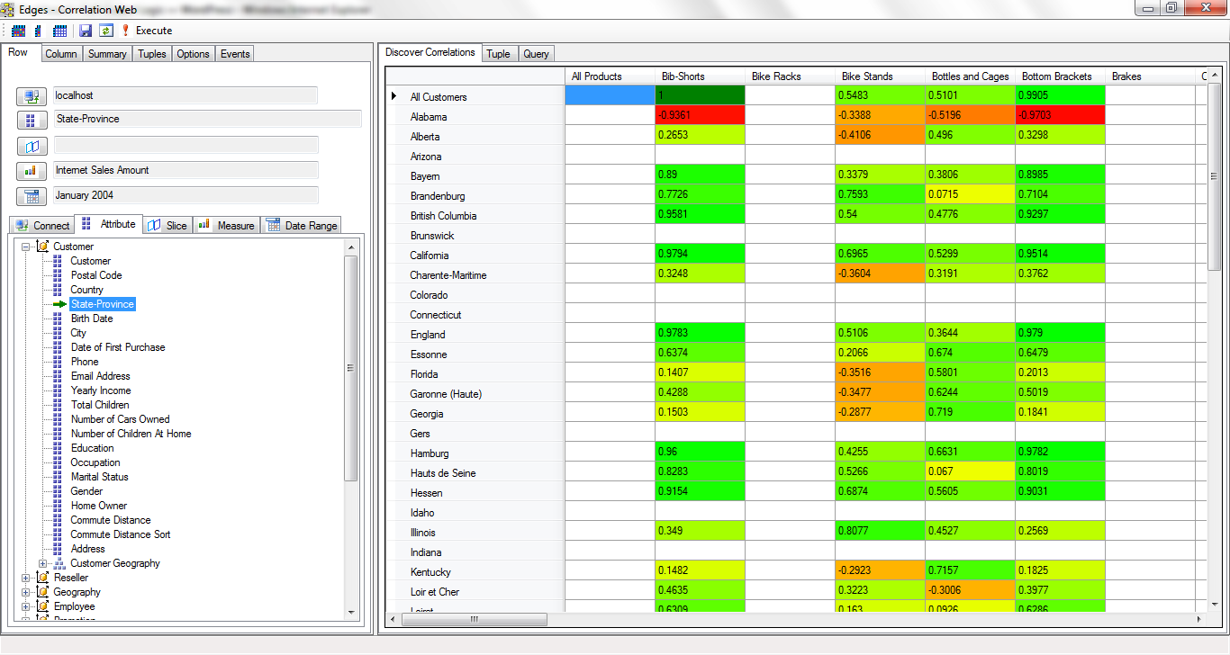
With the Correlation Grid, a user could “cast a wide net” for discovery of interesting correlations. As with other OLAP behavior, the user would slice and dice the views in quick succession with the expectation of snappy response times, so as to not lose their train of thought.
It wasn’t so much that the correlations in themselves are that powerful. What was more powerful is the en masse “casting a wide net” notion. Map Rock would save correlations that were clicked to view the correlation details, along with other unclicked correlations that seemed important. These correlations were then linked to each other via common elements into a web of correlations similar to Bayesian Networks of probability. Except these were “Pearson Networks of Correlation”.
The 2nd weekend, Figure 2, I mostly focused on the graph control on the lower-right. I realized I needed to write my own since I didn’t want to be constrained by the limitations of the packaged graph controls of the time. There are things I made that control do that were not features of those packaged controls.
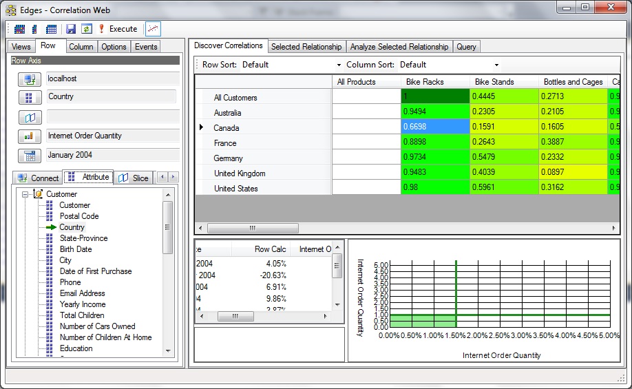
Figure 2 shows more of a closeup of how the axes of the Correlation Grid was set. Towards the top-left, we see a Row and Column tab. Each offers an array of tabs below for the selection of an OLAP cube connection, the attribute forming the row or column axis, members to slice and dice by, a measure, and most important, a date range.
In this case (still on Figure 2), the row axis is from the AdventureWorks cube on my laptop, the Country dimension, no slicers, the “Internet Order Quantity” measure, and the date range starting at January 2004. Although we can’t see the column selection in Figure 2, we can see from the Correlation Grid of Figure 2 that the column is Product Category and the measure is also “Internet Order Quantity”.
The selected blue cell with the value of .6698 means: There is a fairly good correlation between the overall internet order quantity of Bike Racks and the internet order quantities in Canada. The higher values of other countries under the Bike Racks column means the correlation is even stronger.
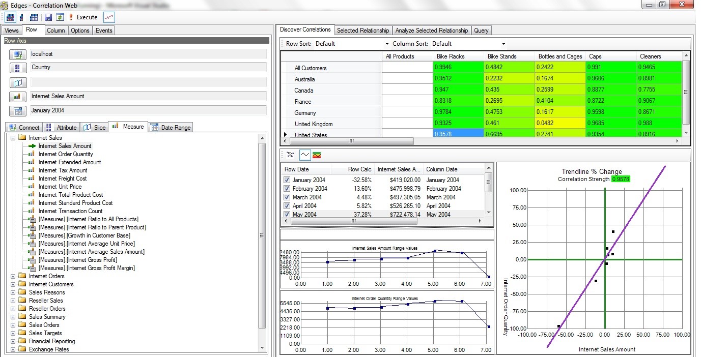
By the third weekend, Figure 3, the look and feel of the Correlation Grid was about 3/4 of the way baked. Thereafter, most of the work was on things such as other displays for navigating a web of relationships, dealing with outliers, lags, incorporating data mining relationships, semi-automation of casting the wide net, techniques for “stressing the correlation”, among many other key concepts that would literally take a book to get into.
Fast forward to about June 2021. As I installed the latest update for Visual Studio 2019, I wondered if Map Rock still works. I had not opened it since some time around 2015, I believe with Visual Studio 2013. To my surprise, it loaded and ran! Figure 4 shows a snapshot from that day, still able to read AdventureWorks, although I found many Kaggle datasets to play with.
Even though the snapshots shown above are of a UI based on the Pearson Product Moment Correlation, it’s just one tactic towards a bigger, more general strategic goal I had in mind for what would become Map Rock. And that bigger goal is to somehow tie many little, disparate nuggets of information into a highly-organized big picture. Those disparate nuggets of information are independently developed data marts scattered across a large enterprise, which I refer to as Business Problem Silos.
Business Problem Silos
Back around the 2011 timeframe, before I began developing Map Rock, I noticed that at the large enterprises I served, there would be SSAS cubes scattered all around at various departments. I wasn’t aware of those cubes upon my arrival. But when it was time to deploy my cube, I went to the DBA, and he’d ask if the deployment would be similar to “such and such cube”? What? I thought I was the only one working on cubes.
It turned out that there would be well more than a few SSAS (or Cognos, Hyperion, etc) projects going on throughout these large enterprises of 10,000+ employees. Mostly unknown to the business folks at departmental levels, but known to the enterprise-scoped DBAs. It would happen this way:
- Say the inventory manager was frustrated with the unpredictable flow of sales. She realizes, if I had insight into the sales channel, I could better predict inventory requirements.
- She visits the sales manager, with the idea. The Sales manager realizes that their customers are pretty angry when their products don’t show up quickly.
- They go to the IT manager with the idea. The IT manager says, “Sure, we’ll get to it around Q4 of next year.”
- They can’t wait that long for their turn to get through the bottleneck, so the Inventory and Sales manager agree on a project integrating inventory and sales data into a data mart.
- They hire a consultant to come in and build the cube. It’s fairly easy since there are only two data sources, a few users, and it’s not a great deal of data. The “tool” called SSAS, particularly its “Cube Design Wizard”, makes it very easy. “OLAP for the masses”, as Microsoft said back then. It was fast to develop, and it works! Business Problem solved!
- In the meantime, another sales manager realizes integration of sales data with marketing campaign data would provide great insight into how to engage customers.
- Go back to Step 3, but this time with a different sales manager and a marketing manager.
That process isn’t so bad in itself. In fact, the Kimball methodology expects this and offers techniques for integrating these data marts into “one version of the truth” enterprise-scoped data warehouse.
However, the notion of a Data Warehouse encompassing enterprise-wide needs back then wasn’t really feasible in practice since an enterprise is composed of many more than two or three departments. Really, integrating just two data sources can be challenging enough. And the level of difficulty rises in much more than a linear fashion with the addition of new sources! Those who tried and “succeeded”, either ended up in a years-long quagmire of a project, or ended up with something that was “Enterprise” only in name.
Although the Kimball Data Warehouse methodology is a bottom-up approach of integrating disparate data marts to a single data warehouse, the method for integration wasn’t quite there. The bus matrix is the right idea, but the reality of getting multiple departments to agree on mapping was not – for example, mapping what you call a “customer” and what we call a “lead”. It’s hard to adequately appreciate that difficulty without actually working with them to define something as mundane as “location”.
In fact, today, in light of the rise of Data Mesh (more on Data Mesh in a bit), a monolithic enterprise-wide DW goes against that grain. Instead, a loosely-coupled federation of independent “Data Products” is a more scalable approach towards obtaining the proverbial 50,000 foot view required for well-informed, system-wide decision making.
Through the daunting difficulty of integrating those data marts into an EDW, those data marts remained stranded on their own islands, “business problem silos”.
Figure 5 below is one of the primary slides for a Map Rock dog and pony show I delivered in 2013. Starting from the bottom:
- Application Layer, Data Silos (bottom) – Information problems begin with the fact that data is trapped in “data silos” backing software applications built for the unique needs of the various enterprise departments. Users are readily able to generate reports off those databases, but composing reports integrating information across departments is tedious to nearly impossible.
- Business Intelligence, Business Process Silos (middle) – Cubes integrating data from usually one or two, but hardly ever more than a few, data silos. These cubes are initiated by innovative managers who know that if they knew something about their neighbor, they could make better decisions. For example, the shipping manager could perform much more robust analytics merging with data from inventory. And vice-versa. It solves a suite of business problems stemming from the tunnel vision due to data silos.
- Business Problem Integration, Integration (top) – For a business serious about succeeding, your neighbors’ problems are your problems. In fact everyone’s problem since a business must work as a unified, coherent machine. Map Rock linked these cubes through common dimensions. As mentioned, back in 2011, Master Data Management was still mostly a dream. So the only common dimension was the date dimension. But time is so important that there was a lot that could be done with just date!
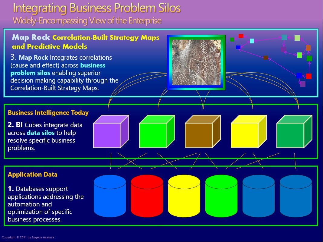
Figure 6 below is a more recent depiction of the Business Problem Silo illustrated in Figure 5. It conveys the same information, but in an “onion” layout instead of a “layered cake” layout.
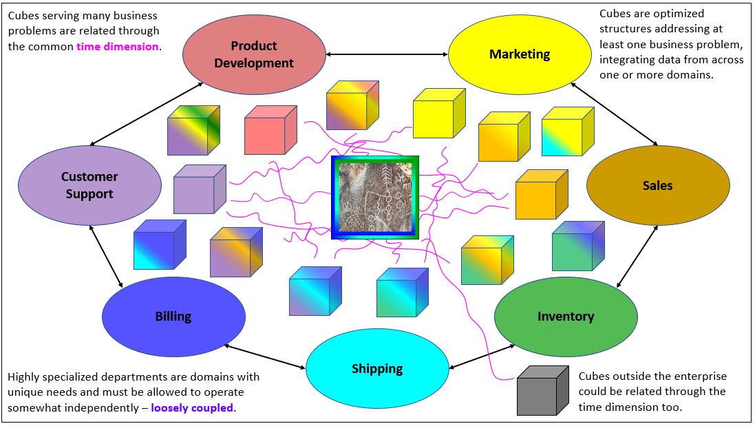
Each cube, represents a business problem that needed to be solved, and is color-coded to the stake-holders of the interested departments. Following are a few scenarios related to Figure 6:
- At about 3 o’clock of Customer Support is an all-purple cube. This cube consists of only customer support domain data. It’s probably an event log of customers accessing the online support site. A big, targeted cube.
- At about 2 o’clock of Customer Support is a cube that is color-coded by many departments. The business problem is that a customer support agent must have quick access to data across several departments touching the customer – marketing, to sales, to inventory, to billing, etc. But it’s primary component is it’s own customer support data.
- Just a little past 12 o’clock of Shipping is a cube integrating data from shipping, billing, and inventory. It’s easy to imagine that these three departments work tightly with each other. A thing can’t ship if it hasn’t been paid for, nor if it’s not in stock.
Why not just build one big cube? After all, it seems the colorful cube “about 2 o’clock of Customer Support” is almost there. It may have data from many departments, but just a small, targeted fraction of the data entities and/or columns available within each department. The approach of loosely-coupled integration of data marts is much more scalable than a monolithic approach.
Data Mesh
I’m a big fan of Zhamak Dehghani’s Data Mesh architecture. As I mentioned, there is vague common ground with Map Rock’s business problem silos. Map Rock is a concept and product addressing the problem of integrating disparate analytics data sources back in 2011, pre-mainstream data lake and MDM. Data Mesh is a new framework for addressing that same problem, but almost ten years later after very much has transpired in the analytics industry in that interim.
First, however, I need to make a little digression to set a stage that I hope helps to place the value of Data Mesh (and Map Rock) into perspective.
ETL, ELT and Data Lakes
Having gone back a long way to the bad ol’ days of BI, when I think of a monolithic analytics database, I think of a Jackson Pollack-like tangle of ETL packages painfully shoving disparate data marts into a one-size-fits-all, centralized, monolithic EDW, and held in place with the duct tape of technical debt.
On the other hand, I think people not as ancient as me think of a monolithic analytics database in the form of a Data Lake. It’s a place we dump our data into a single place where we at least have access to it – and we’ll figure out how to clean it up later. It is reflected by the newer Extract-Load-Transform (ELT) that superseded the old Extract-Load-Transform (ETL) of the pre-Data Lake days.
Figure 7 illustrates the classic ETL design versus the newer ELT.
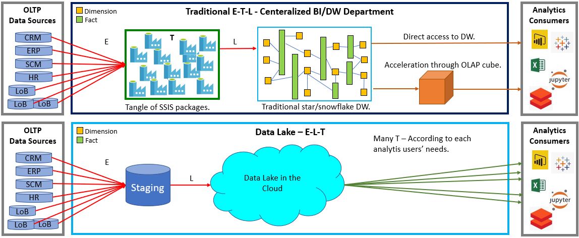
In the older ETL paradigm, data is read from many source systems and piped into a very large, complicated, monolithic Enterprise Data Warehouse. In the newer ELT paradigm, data is also extracted from many sources. But instead of performing all transformations (the “T” in ETL/ELT) upfront then piping it into the monolithic EDW, it’s merely dumped into a central data lake where interested parties could have at it. Yes, kind of like taking things to the junk yard and letting people scrounge whatever they may find.
In any case, Data Mesh or EDW, the E and L of ETL doesn’t disappear. For OLAP (analytical activity), we need to extract data from the OLTP sources or we severely burden those business-critical systems with unpredictable and massive queries. Further, if we extract data, well, we need to load it somewhere – EDW, Data Lake, or Data Product. In Data Mesh, the E and L have just been partitioned at the domain-level into domain-level Data Products (lots of little ETLs or ELTs).
More importantly, the EDW and the Data Lake are monolithic big-ball-of-mud messes, akin to the ball of Christmas lights Clark asked Rusty to untangle. The Data Lake solved the problem of the many very difficult aspects of moving, storing, and paying for massive volumes of data. But the problem of coaxing data into a coherent picture from across many disparate sources has simply been punted.
Back to the Data Mesh …
I already described how Map Rock addressed the issue of integrating disparate sources into a large view in the Business Problem Silo section above.
Figure 8 below shows my interpretation of Data Mesh. Three domains (Sales, Finance, and Inventory) manage their own set of Data Products available to an enterprise-wide audience. The data for each domain is added to a Data Vault, and a subset of data is extracted in a friendly, consistent manner for consumption by analysts, managers, data scientists, etc.
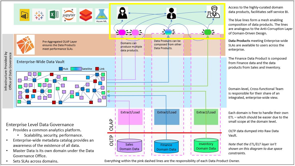
Within the yellow box are the Data Products, the hexagon-shaped items at the top of each domain. The Finance Data Product shows is composed of a Data Product from Sales, the one from Inventory, and Finance’s own data. That composition requires some sort of commonality – just like the Date dimension is the commonality between cubes for Map Rock. What is the link between Data Products made of? More on that soon.
Those Data Products highlighted within the yellow box is reminiscent of the Kimball-esque departmental/subject Data marts of the pre-data-lake era I discussed earlier.
The most important thing to keep in mind about Data Products is that they are products. They should be treated by its developers with the same level of care that vendors provide for their products. That means it comes with an expectations of service levels (it’s fast, trustworthy, secure), backwards compatibility (it won’t break anything in the current system), and support/maintenance.
Now, a Data Vault isn’t specifically called out in the Data Mesh world as a platform spanning domains at the time of this writing. In fact, the spirit of the Data Mesh is to recognize freedoms within domains.
However, a Data Vault is designed to address the complexity inherent with a monolithic EDW. It fits the Data Mesh spirit of abstracting complicated features that can be utilized by all – in a way that eases tedious burdens on the independent domains with very minimal sacrifice (if any) of their unique needs.
I’ve written about how Data Mesh and Data Vault can work in a complementary way in an earlier blog. I will discuss this in more detail soon.
Balance of Control
What Data Mesh, Domain-Driven Design, and Map Rock all have in common is that they are about how to organize a big and complex entity (an enterprise and it’s surrounding ecosystem) in such a way that promotes prosperity. The reality is that one-size-fits-all solutions come at the expense of freedoms/flexibility and the essential variety that fuels heathy evolution. Conforming every part of a system, forcing all square and triangle pegs into a round hole, creates a lot of friction and eliminates variance (the concept of squares and triangles are lost to the world). On the other hand, anarchy just decomposes everything to mud.
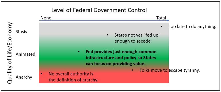
In business terms, grant the freedom for departments and/or lines of business do its job with the least friction – in the context of its respective profession and the local conditions in which it operates. But in return those independent domains must provide to those who need a clear vision of the big picture (the CXX folks) what they need in a consistent format.
In this way, those “business-problem silos”, those old data marts that pop, are an organic emergence of the Data Product notion of Data Mesh. Besides “doing the job” for the department or two that developed it:
- The developers have the freedom to develop it in a way comfortable/convenient to them.
- The developers aren’t hindered by the dependencies inherent with monolithic architectures (Enterprise Data Warehouse) that are of no interest to them.
However, the Data Products aren’t necessarily able to plug into a connected mesh. Map Rock’s initial resolution was to connect via the ubiquitous date dimension. So what has changed so that independently developed Data Products can mesh?
Master Data Management vs the Anti-Corruption Layer
A major reason for the feasibility of building a loosely-coupled mesh of Data Products is the maturity of Master Data Management (MDM). Back in 2011, when I was building Map Rock, MDM wasn’t even yet a “nice to have”, hardly anyone knew what it was. So I could only count on the time dimension. Today, with most large enterprises having golden records for major entities such as customers, products, and locations, there are many more ways to link Data Products into composite data products.
But the “master” in Master Data kind of reeks of another time. MDM is indeed the top-down, enterprise-wide proclamations of what is what. Profit, customer, location, will have one and only one meaning for analysis.
That was the fineprint of the Kimball DW approach. The bus-matrix, which was meant to map similar entities across business domains was rife with hand-waving. I’ve known it to take months for an enterprise to agree on the definition of a “location”.
A looser approach comes from the world of Domain-Driven Design (DDD). Data Mesh borrows heavily from Domain-Driven Design’s fundamental principle of decomposition of monolithic systems into a federation of loosely-coupled functional systems. Data Mesh is the OLAP counterpart of the OLTP-centric Domain-Driven Design. Data Mesh decomposes monolithic enterprise-wide Data Warehouses (or Data Lakes) into domain-level “Data Products”. This distributes responsibility for the development and maintenance of analytics data from a monolithic, IT-centric process, resulting in high scalability.

The “mesh” of the OLAP-side “Data Mesh” has an OLTP counterpart in DDD. It is a concept called the “Anti-Corruption Layer”. This is a translator between bounded contexts – no different than a translator between two people speaking different languages.
For the old BI folks used to ETL, the Anti-Corruption Layer is a query-time translator, performed each time a user requests data from more than one data product. Whereas Master Data and other transformations made during ETL is a “process-time translator”, done once before landing in the EDW.
So there are two major methods for understanding each other. We either make everyone speak English or we have translators. Which is easier? Which is more effective? What are the side-effects, the unintended consequences of either?
That isn’t quite the same issue as the formal lingo/jargon and nomenclatures of professions such math, law, and chemistry. The issue here relating to all the talk around master data and the Anti-Corruption Layer is that we’re talking about cross-domain communication. All chemists may be able to understand each other about chemistry, but that probably doesn’t hold for lawyers talking to chemists about law and vice versa.
Note that the Anti-Corruption Layer components are themselves a Data Product. Think about anything that bridges things. Aren’t they all products in their own rights? They could take forms such as a mapping table, Python function, or Data Vault Link table. Similarly, Master Data Management is too a Data Product.
Generally, the spirit of Data Mesh favors the Anti-Corruption Layer. However, a mature Master Data Management process eases the burden on the query-time Anti-Corruption Layer. For example, think of two physicists discussing physics. On one hand, they use official physics terminology, but physicist may speak French and the other Japanese. The latter could be solved with a translator, but it would be really tough if they each used different terminologies for physics phenomena. So both play a current part in the integration of Data Products.
Best of Two Extremes
The end result of the Data Mesh is the best two worlds – the best of the extremes of the anarchy of shadow IT and law and order of enterprise-wide data governance. This is achieved through thoughtful high-level partitioning of what tasks and things makes most sense to apply across the board versus freedoms that enable people to do their jobs crafted to the unique context of their domain.
Figure 10 below is from a recent presentation on one way I see OLAP cubes playing a very important role today. First, note the brick wall of OLAP cubes, which can correspond to the high-quality but independently produced Data Products of Data Mesh. Like Data Products, OLAP cubes are highly-curated, problem-focused, end-user-facing, easily accessible (by the right parties), and there is an expectation of high performance (in more ways than query speed).
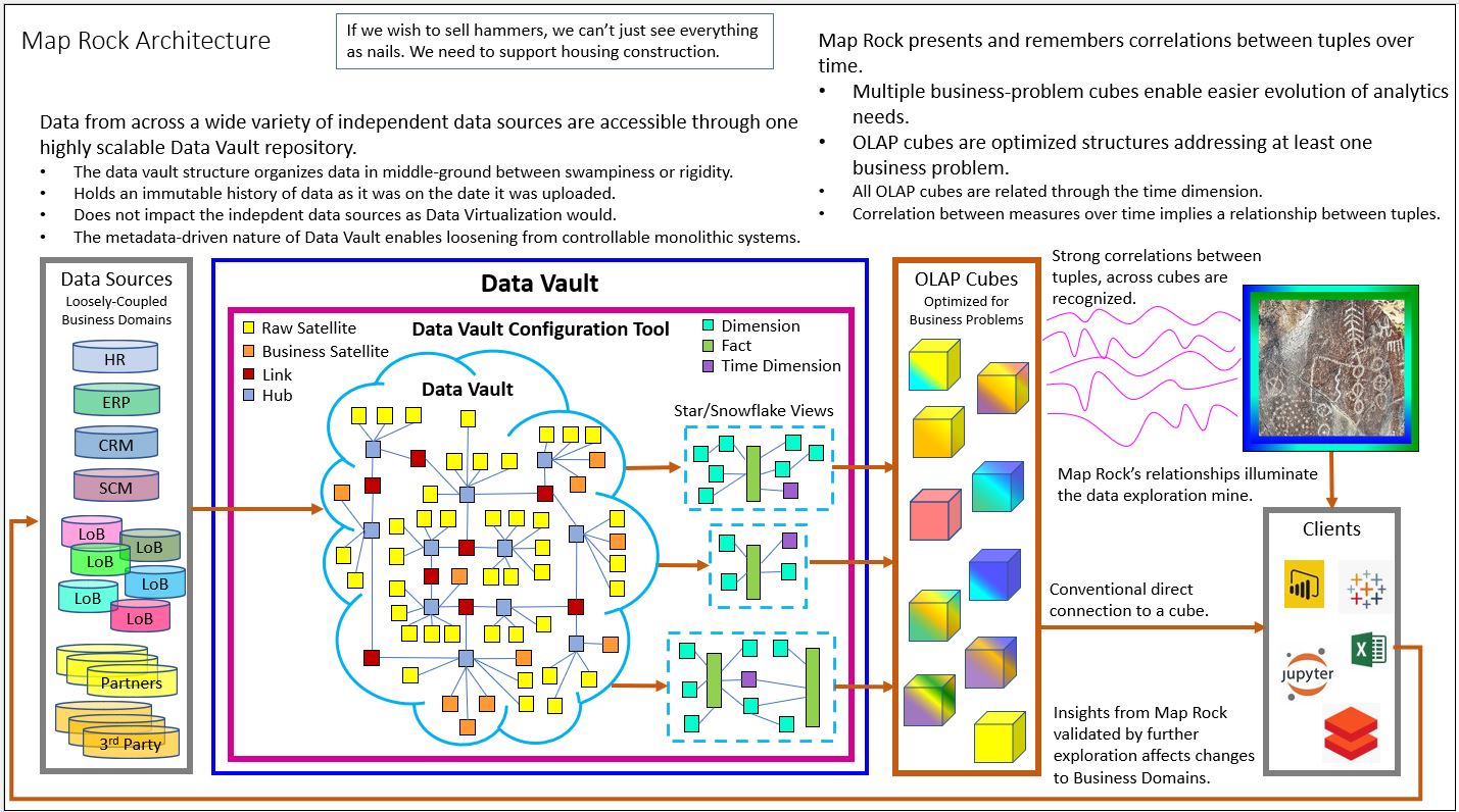
We can also see in Figure 10 how Map Rock (middle-right) integrates the brick wall of OLAP cubes through not only the time dimension, but now via newly mature Master Data Management efforts that are fairly mainstream these days. So, although Figure 10 depicts an architecture with Map Rock, it’s really one manifestation of a Data Mesh.
However, Figure 10 doesn’t make it crystal-clear about how it shares the Data Mesh aspect of domain-level decomposition of an enterprise. The answer to that question is embedded within the reason why I specify a Data Vault as the data source for the wall of OLAP cubes in Figure 10.
As my very lengthy blog, Data Vault Methodology Paired with Domain Driven Design, more than suggests, I’m also a big fan of Dan Linstedt’s Data Vault Methodology. I’ve also written about how pre-aggregated OLAP of Kyvos could work hand in hand with Data Vaults.
Update 3/17/2022: I’ve also written about Kyvos SmartOLAP cubes as the consumer-facing layer of a data mesh deisgn.
Each of those OLAP cubes were created in response to some information worker’s desire to solve and/or monitor a business problem they are suffering. All those efforts were at one time stymied by the bottleneck of an over-burdened, centralized IT and sank in the quicksand of monolithic complexity. Instead, a brick wall of OLAP cubes emerged in that bottom-up data mart phenomenon I described in the Business Problem Silos section.
The Data Vault, as shown above in Figure 10, is actually a centralized enterprise-wide data warehouse. However, it’s not like the star/snowflake schema types of your father’s EDWs I’ve been semi-roasting during this entire blog. The Data Vault Methodology is a data warehouse purposefully designed to accommodate the unique needs of disparate departments in a flexibly structured manner.
Figure 11 illustrates how the Data Vault schema sits between the extremes of a chaotic Data Lake and the rigid star/snowflake schema.

The beauty of the relationship between the Data Vault Methodology and pre-aggregated OLAP cubes is that the latter mitigates the trade-off of performance related to the many table joins with Data Vaults for flexibility and maintainability. Of course, the advantage of the ability for domains to independently add their data to a central data structure outweighs that performance hit.
Map Rock adds the loosely-coupled element to the wall of OLAP cubes – just as Data Mesh Data Products could be composed into compound data products. But in this day where Master Data Management is fairly well implemented, Map Rock has an opportunity to correlate across more than just the time dimension.
Post-Data-Product Self-Service
Lastly, regarding Data Vaults implemented as part of the Data Mesh platform, there is the matter of post-Data Product self-service. Meaning, users will consume one or more Data Products and will undoubtedly perform some sort of ad-hoc or even permanent transformations on the Data Product data they consume. This will result in the creation of a compost heap beyond the wall of the Data Products.
The ad-hoc transformations by Data Product consumers is more than fine. That’s what is expected of folks such as Data Scientists and strategists. However, when their insights gets traction, for example a machine-learning model that can predict next year’s big fad, it becomes a data product itself within some domain.
Where the Data Vault helps is that such transformations, by the likes of Data Scientists and Strategists who produce models (which produce new data), would utilize the Data Vault as well. That way, there is a mechanism for tracing that transformed data born outside the wall of the current Data Products.
Big Bang Not Necessary
It’s important to note that a Data Mesh doesn’t need to be implemented in a Big Bang. Domains can be “onboarded” onto the Dash Mesh sequentially – in a “flattening of the curve” approach which avoids overloading the resources doing the onboarding.
However, the sequence might be tough to organize. First, what is a “domain”, which provides Data Products to the enterprise? Domains and departments are roughly the same when we’re just trying to understand Dash Mesh. But thereafter, departments could be composed of sub-domains, or domains could span departments. Beyond identifying the domains, there are the flow of events which reveals the links between the domains.
Towards the goal of a somewhat workably clear picture of the enterprise, I suggest a Phase 1 of building a Domain Model – a map of the enterprise. A Domain Model is a Data Product itself, probably under the Data Governance domain, along with Master Data Management, Metadata Management, security, etc.
I provide an overview of Domain-Driven Design and the value of a well-maintained Domain Model in a recent (but very lengthy) blog. That blog in turn links to very many resources around the topics of Data Vault and Domain-Driven Design. Building a Domain Model is sort of a mini-big-bang, and a painful one that can leave you emotionally scarred for life 🙂 However, that up-front organization makes everything else possible – you must first clean your house before you can organize it.
Prediction Performance Cube
The Prediction Performance Cube (PPC) is an SSAS MOLAP cube model I developed around 2010. Its purpose is to integrate a diverse, enterprise-wide set of models into a single structure where they could be analyzed together.
I initially focused on the data mining models inherent with SSAS. The cornerstone of the PPC is a data warehouse structure known as the Prediction Performance Data Warehouse (PPDW), designed to provide a structured and comprehensive data source.
The PPC is a component of Map Rock. The “DM3” in the figure below stands for “Data Mining Model Management”.
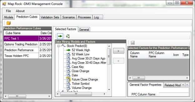
Core Components
The primary dimensions of the PPC include Models and the nodes that constitute each model. These nodes, which can range from a single unit in a neural network to a complex hierarchy in a decision tree, represent individual rules like “gender==1” or “glucose>125.”
The majority of the foundational work resides within the PPDW, which is currently implemented on SQL Server. It features numerous views facilitating simpler access to normalized tables, alongside a vast collection of stored procedures that perform ETL tasks and populate UI components with logic beyond that of a view.
Integration and Versatility
The essence of the PPC lies in its capability to integrate a vast array of models. These models, whether predicting the same outcome using different methodologies or covering entirely unrelated domains, are amassed from diverse enterprise areas. The PPC framework includes SWRL rules crafted by subject matter experts, merging knowledge graphs with the OLAP cube to define conditions or dictate actions. This system not only supports traditional predictive modeling but also enhances it with expert insights, making it possible to derive comprehensive, actionable predictions from a single query.
Analytical Depth
By retaining every model version, the PPC allows for a detailed analysis of how predictions were made. This historical insight enables the identification of models that may perform better under specific conditions, despite an overall less impressive performance. The integration of a massive variety of models and facts facilitates a large-scale analysis using classic BI approaches, showcasing the PPC’s strength in handling large data volumes effectively.
Metadata and Analysis
The PPC maintains metadata linking validation, training, and production data directly to model columns, a feature crucial for detailed analytics across different datasets. This metadata framework supports the analysis of predictions by value, allowing for a nuanced understanding of which predictions hold more significance and should be weighted accordingly.
Applications and Impact
My journey with the PPC began with aiding an ISV to cater to the diverse needs of small banks, showcasing its versatility in addressing customer attrition and fraud through multiple model iterations. Following this, I explored its application in analyzing Texas Holdem strategies, highlighting its ability to decipher player actions and strategies based on a comprehensive dataset of online poker hands.
The most potentially impactful application would have been within the healthcare sector, addressing the “Triple Aim” of improving patient care, health outcomes, and reducing costs. By integrating models and rules across the healthcare system, the PPC has demonstrated its capacity to contribute significantly to understanding and improving complex systems like healthcare.
How Map Rock Got Its Name

About 60 miles outside of Boise, right off the side of a lonely road along the Snake River, is a petroglyph named Map Rock. I believe it’s thought to be up to somewhere between 6,000 and 9,000 years old, even though some of the carvings may be newer than that – don’t quote me on any of that.
My wife and I visit Map Rock whenever we’re in the area for hiking. Around the time I was in the middle of the heavy development of my product, I needed a meaningful name.
On one of my visits home from my Indianapolis gig back in 2011, we visited Map Rock. I sat by it just thinking about my ideas. I thought to myself how those Native Americans were like me, in that we’re about efficiently encoding information. One had to be efficient when the medium is a rock pecking into another rock.
A few minutes after we left Map Rock, off to our hiking trailhead, I dawned on me that Map Rock is a great name. So I named my big product Map Rock in honor of my paleolithic colleagues.
Epilogue
It turned out SSAS MD didn’t die back in 2011 after all. It’s still out there, albeit with “Legacy” starkly stamped on its forehead – in neon and glitter. It ended up remaining my prime skill until about 2016. Back in 2013, I wrote a blog titled, Is OLAP Terminally Ill? I predicted that pre-aggregated OLAP in the style of SSAS MD would rise again someday when the volume of data again leaves the capacity of current hardware and software in the dust.
To be clear, I never did give up on pre-aggregated OLAP as it is beautifully captured in SSAS MD. But I did give up on SSAS MD as a product Microsoft would seriously maintain. I knew that even if hardware (the Cloud) can outrun our current definition of massive data in relation to current use cases, the lead will eventually change hands (again and again).
At this time when there are strong hints that analytical data volumes will make life hard for current compute technologies (some use cases, not all), there is the pre-aggregated OLAP of Kyvos Insights to the rescue. I introduced Kyvos in an earlier blog when I began working there last year. As SSAS MD ameliorated the limitations of the hardware from the decade or so following 1998, Kyvos SmartOLAP can do the same today for today’s Cloud scale.
Happy 10th Birthday to Map Rock, when it began life as an empty Visual Studio C# solution named CorrelationWeb.sln. I don’t know what the future holds for that work. My feeling is that there are better ways to implement the “Map Rock concepts” today than with my decade-old program. I’m thinking mostly about implementing the Map Rock concepts through serverless function capabilities such as Azure Functions and AWS Lambda.
I know, though, that all the effort was time well spent. It may not have yielded “success” in the manner of a Snowflake or Databricks. But it was like my home-grown masters thesis that founded my approach to data to this day.
© 2021 by Eugene Asahara. All rights reserved.
