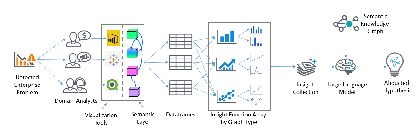
My 2024 book, Enterprise Intelligence, describes the Insight Space Graph (ISG), a graph database that records, maps, and connects the simple insights exposed through the everyday work of Business Intelligence (BI) analysts. Towards the goal of resolving business problems, analysts continually explore enterprise data through tools such as Tableau and Power BI, producing line graphs, bar charts, scatter plots, pie charts, and other familiar visualizations.
Within the ISG is a simple mechanism, called the Insight Function Array (IFA), that takes the table-like data that fills those visualizations, passes it through an array of functions, and retains “interesting” insights within that data. I have been meaning to describe the IFA more fully since publishing Enterprise Intelligence.
The individual functions are naturally simple. Each detects something a skilled analyst might notice while looking at common visualizations. For example, a strong trend, a sudden spike, a dominant category, an unusual distribution, a cluster, an outlier, an intersection between lines, or a strong correlation between two measures. Sophisticated information emerges from retaining and connecting those small insights across many queries by analysts, domains, data sources, and periods of time. It facilitates a Sherlock Holmes style of abductive reasoning, the form of reasoning beyond induction and deduction.
Another way to think about the IFA is as a kind of Complex Event Processing (CEP) for streams of BI queries rather than streams of events. CEP examines streams of lower-level events across segments of time and extracts higher-level patterns—something happened, a condition developed, or a meaningful sequence emerged. The IFA does something analogous with the continual stream of queries produced as analysts slice and dice enterprise data. Each query produces a temporary, compressed view of some portion of the enterprise. The IFA examines those views and extracts features such as trends, spikes, inflection points, clusters, correlations, and stability. In that sense, CEP turns streams of events into higher-level event information, while the IFA turns streams of BI queries into a stream of insights that the ISG can remember and connect.
The ISG sits adjacent to the enterprise “formal” ontology described in my new book, Semantic Webs of Meaning (illustrated later in Figure 1). The ISG is not itself a formal ontology. It records what analysts notice in ordinary BI work. Those recorded insights still have to point at formal resources—otherwise a cluster, a spike, or a dominant category remains a local finding and never becomes shareable meaning.
The Value of BI Visualizations
When an analyst performs her analytical work with a BI tool, the analyst selects dimensions and metrics, applies filters, and chooses a level of aggregation. In traditional BI terminology, the analyst is slicing and dicing an OLAP data source (today in a more mature form called a semantic layer).
The BI tool translates the analyst’s selections into a query, usually structurally similar to a SQL GROUP BY. For example, a query might return monthly sales and gross margin grouped by product category and region, filtered to a particular range of dates. For example, the SQL:
SELECT
Month, [Product Category], Region,
SUM(Sales) AS Sales,
SUM([Gross Margin]) AS [Gross Margin]
FROM viewFlattenedADWSales
WHERE
Month BETWEEN ‘2026-01’ AND ‘2026-06’
GROUP BY
Month, [Product Category], Region
Yields something like:
Month Product Category Region Sales Gross Margin2026-01 Bikes Northwest 845,230 291,4402026-01 Clothing Northwest 192,850 73,6102026-02 Bikes Northwest 901,120 308,905...
The result is a table/dataframe (I will use the Python term dataframe for that table). It’s important to note that a BI query result is generally a compression (aggregation) from what could be thousands to billions of rows of facts to a relative handful of rows.
That compression has to be fast. The IFA does not run once on a carefully prepared extract. It runs on the ordinary queries analysts already issue in Tableau and Power BI. If each slice takes seconds or minutes, the interesting features are noticed too late to retain, or they are never computed at all. In the architecture I have in mind, those tools do not query the lake or warehouse directly. They query a semantic layer such as Kyvos, which holds the governed dimensions and metrics and returns the aggregated dataframe quickly enough that feature detection can ride along with interactive analysis.
That dataframe is then rendered by the BI visualization tool as the user-selected visualization. If the dataframe includes a date column and one or more numeric metrics, it may be suitable for a line graph. A categorical column and a metric may work as a bar chart. Two numeric columns may be suitable for a scatter plot. A category and a metric may also be rendered as a pie chart or another composition-oriented view.
A dataframe rendering does not need to limit itself to the visualization the analyst happened to select. A dataframe may support multiple visualizations, each exposing different qualities of the same data. However, not every dataframe is appropriate for every visualization, but determining the sensible candidate visualizations is usually straightforward. The data types, number of columns, cardinality of categorical columns, presence of time, and number of numeric metrics provide most of what is needed.
Visualizations Are Ways of Seeing
Each visualization type is a device for making particular qualities of dataframes easier to perceive. For example:
- A line graph makes direction, acceleration, volatility, cycles, spikes, and reversals more visible.
- A scatter plot exposes correlation, clustering, separation, and outliers.
- A bar chart emphasizes ranking, relative magnitude, dominance, and dispersion.
- A pie chart emphasizes composition and concentration.
This is analogous to the many ways we enhance ordinary perception:
- Our brains transform signals from our eyes into the three-dimensional, shaded view of our surroundings that we experience.
- We move around an object to see it from another angle.
- We shine a flashlight into a dark corner.
- A rock hounder wets a weathered rock to make its colors, grains, and internal structure easier to see beneath its dry, sandblasted-looking surface.
- In a laboratory, gel electrophoresis transforms processed DNA fragments into a visible banding pattern that can be examined and compared.
In each case, the underlying object has not changed. We have changed the way it is presented so that particular qualities pop out. A BI visualization does the same thing for a dataframe.
The selected representation determines what becomes easy to notice and what remains hidden. Looking at the same dataframe through several compatible visualizations (we sometimes say “see through a different lens”) is analogous to changing the lighting, viewing angle, or analytical instrument.
Inspired by the Visual Cortex
The IFA is inspired by the brain’s primary visual cortex, or V1. Strictly speaking, V1 does not receive raw light. The retina and lateral geniculate nucleus have already selected, compressed, and recoded the signal before it reaches the cortex. V1 then makes certain local features more explicit. Different neurons respond preferentially to features such as edges at particular orientations, spatial frequencies, contrast, and directions of movement. V1 does not by itself recognize a chair, understand a face, or decide that an approaching object is dangerous. It produces an intermediate representation that later parts of the visual system can assemble into shapes, objects, scenes, and motions, then subsequently conclude meaning—the IFA, like VI, transforms raw data into something more digestible to a “reasoner”.
The dataframe entering the IFA is similarly not raw enterprise reality. A BI query is sourced from a curated semantic layer and represents the analyst’s selected, filtered, grouped, and aggregated choices. The IFA then recodes that dataframe into simple analytical features—a downward trend, a sudden breakpoint, an unusual spike, a dominant category, a stable metric, a cluster, or a strong correlation. It does not yet conclude that a new competitor has entered the market or that customer attrition threatens a strategic objective.
In that analogy, the IFA is not the whole “visual system of an enterprise” and certainly not analogous to the whole “brain” of an enterprise. It is closer to an early feature-extraction layer. The ISG preserves those detected data features with the properties of the BI query that gives them context. The EKG connects the query’s columns, values, entities, and events to enterprise meaning. An LLM or another reasoning mechanism can then integrate insights from many BI queries into a higher-level explanation, risk, opportunity, or recommended response.
Turning What Analysts See into Functions
For each visualization type (ex. bar chart, line graph, scatter plot), we can list the things a skilled analyst typically looks for and implement a simple function for each one. For example, Table 1 lists what we would see in a line chart.
| Insight function | What it detects | What it can reveal |
|---|---|---|
| Sustained trend | A consistent upward or downward movement over time | Growth, decline, recovery, deterioration, or gradual change |
| Sudden spike or drop | A sharp movement that differs substantially from surrounding values | An anomaly, exceptional event, reporting error, promotion, outage, or market shock |
| Step change or inflection point | A lasting shift in level or direction | A structural change associated with a policy, product release, competitor entry, process change, or external event |
| Line intersection | The point where one series crosses another | A change in ranking, relative performance, market position, cost advantage, or operating balance |
| Cycle or seasonality | A repeating pattern at regular intervals | Weekly, monthly, quarterly, annual, or other recurring behavior |
| Unusual volatility | A period in which the series becomes much more or less variable | Increasing instability, uncertainty, operational inconsistency, or a return to normal conditions |
Each row in Table 1 is a candidate for an insight function. The set of all functions is the insight function array.
Other types of visualizations include insights such as:
- A bar-chart analyzer might look for a dominant category, unusually large differences among categories, natural groupings, or a long tail.
- A histogram analyzer might look for skew, multiple peaks, unusual concentration, or a distribution that appears discrete rather than continuous.
- A scatter-plot analyzer might calculate correlation, look for clusters, detect outliers, or test whether the relationship appears nonlinear.
See Visualizations_and_Insights for a deeper list of visualizations and insights.
The dataframe is passed to every insight function associated with every visualization type for which it is deemed suitable. Each function applies an explicit test and calibrated threshold (set by another process, whether ML or explicit business rules) of its output value—usually a generous margin for error than necessary to mitigate false negatives. Findings that do not meet the threshold are discarded. Expiration parameters might also be set based on the context of the insight—event the ISG must forget things that turned out not to be of value.
The insight functions can be developed using common programming languages such as Python, Java, or C++. As mentioned, the functions are relatively simple and usually require no more than one to few passes through the dataframe to calculate.
Table 2 lists the visualizations I’ve prepared (just the common ones) and comments on the insights you may find in the analyzers folder on the GitHub repo.
| File | Brief description | Insights included |
|---|---|---|
bar.py (base class of analyzers) | Analyzes categorical values aggregated by one or more numeric measures and renders bar charts. | Dominant category; high dispersion across categories. |
histogram.py | Analyzes the distribution of individual numeric columns and renders histograms. | Skewed distribution; discrete or low-cardinality numeric distribution. |
line.py | Analyzes numeric measures over a detected time column and renders single-series or multi-series line graphs. | Sustained trend; sudden spikes or drops; inflection or step change; stable level; intersections between comparable lines. |
scatter.py | Analyzes relationships among pairs or groups of numeric columns and renders scatter plots. | Strong correlation; two-dimensional clusters; higher-dimensional clusters. |
Figure 1 illustrates the wider process in which the IFA sits. Steps 1-8 are the steps that reflect the focus of the IFA in this blog:
- A problem is detected. The CEO notices a sudden decline in sales and asks the CFO to investigate.
- Domain analysts begin investigating. The CFO and analysts from Finance, Marketing, and Customer Support examine the problem from their own perspectives.
- They use familiar BI tools connected to the semantic layer. The semantic layer provides governed, highly curated analytical data integrated from across the enterprise.
- Their BI queries return dataframes. Each dataframe is transformed into a visualization designed to make particular features of the data easier to see.
- The Insight Function Array examines the same dataframes. Human analysts view the visualizations, while the IFA applies the insight functions associated with each compatible graph type.
- Qualifying insights are collected. Insights that meet their configured thresholds are retained with the relevant query metadata.
- An LLM operating within a RAG process performs abductive reasoning. It receives the relevant insights together with relationships supplied by the semantic knowledge graph and data catalog, which is not shown in the figure. Note that the LLM/RAG process can request more information from the Insight Collection (6).
- A hypothesis is proposed. The result is presented as a cause-and-effect graph describing a plausible explanation for the enterprise problem.
- In a wider focus (outside the target scope of this blog) that includes the EKG described in Enterprise Intelligence, the insights are loaded into the ISG. Additionally, the LLM is able to access the EKG and Semantic Knowledge Graph for more information in a RAG process.
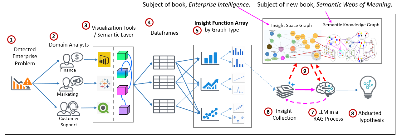
Remember, the purpose of the process in Figure 1 is to capture insights that escape the analysts attention. That can be for a variety of reasons. For example, the analyst may not have selected a scatter plot, but the dataframe may still contain two metrics with a strong relationship, which doesn’t escape the IFA. The analyst may be concentrating on sales and fail to notice a sharp change in gross margin. A dashboard may contain so much information that an important feature is hidden in a Where’s Waldo? sort of way. Both of these are like false negatives.
An analyst might notice a sharp change in gross margin but not care about that in her corner of the enterprise—which is like a false positive. However, someone else in the far reaches of the enterprise might care about that. The insight function array notices these things whether or not they are relevant to the analyst’s immediate purpose. Table 3 lists examples of results.
| Classification | What happens in the analyst’s investigation | ISG / IFA significance |
|---|---|---|
| True positive | The analyst sees the insight being sought and recognizes that it matters to the current question. | The insight directly supports the investigation—for example, sales and active customers both decline sharply. |
| False positive | The analyst sees a real insight but considers it irrelevant to the current task. It may nevertheless matter to someone elsewhere in the enterprise. | The IFA retains the insight so it can be connected with findings from other domains—for example, a marketing analyst notices an unfamiliar search term but does not consider it important. |
| False negative | A relevant insight is present, but the analyst does not notice it—the Where’s Waldo? problem. | The IFA can detect and retain the overlooked feature—for example, average revenue per remaining customer stays stable while the analyst focuses only on falling revenue. |
| True negative | The analyst correctly finds that an expected problem or change is absent. | This becomes negative evidence for abductive reasoning, helping eliminate hypotheses—for example, price, uptime, fulfillment, and support remain stable, arguing against an internal operational failure. |
Currently Implemented Insight Functions
Table 4 below dives a level deeper that Table 2, to the function level.
| Analyzer file | Visualization type | Function name | Description | Function output type |
|---|---|---|---|---|
bar.py | Bar Chart | _dominant_category | Detects whether the largest category accounts for at least the configured share of the aggregated metric. The current default threshold is 35%. | str | None — a ready-to-store finding message or no finding |
bar.py | Bar Chart | _high_dispersion | Detects large differences among category bars using coefficient of variation, with a secondary standard-deviation-to-maximum test. | str | None — a ready-to-store finding message or no finding |
histogram.py | Histogram | _skew_finding | Detects a substantially skewed numeric distribution. The current test is absolute skewness greater than 1. | str | None — a ready-to-store finding message or no finding |
histogram.py | Histogram | _discrete_finding | Detects a numeric column with relatively few distinct values. The current test is fewer than 10 distinct non-null values. | str | None — a ready-to-store finding message or no finding |
line.py | Line Chart | _detect_strong_trend | Detects a strong sustained direction by comparing the mean first difference with the baseline standard deviation. | bool — analyze() converts True into a finding message |
line.py | Line Chart | _detect_spikes | Detects sudden changes by applying a robust z-score to first differences. The current threshold is an absolute robust z-score of at least 3. | list[index value], normally list[pd.Timestamp] — analyze() reports the count and first date |
line.py | Line Chart | _detect_inflection | Detects a sustained level change around a possible breakpoint using before/after windows, baseline standard deviation, and a same-direction run. | Index value or None, normally pd.Timestamp | None — analyze() creates the finding message |
line.py | Line Chart | _stable_finding | Detects a numeric series that remains within a narrow band. It provides negative evidence that a suspected price, quality, service, or operating measure did not materially change. | str | None — a ready-to-store finding message or no finding |
line.py | Line Chart | _detect_intersections | Detects crossings between comparable wide-form numeric series, such as Sales_A and Sales_B. It avoids comparing unrelated measures by checking their name families. | list[tuple[str, str, int, index value]] — series names, crossing count, and first crossing time |
scatter.py | Scatter Plot | _correlation_finding | Detects a strong linear relationship between two numeric variables. The current threshold is absolute Pearson correlation greater than 0.7. | str | None — a ready-to-store finding message or no finding |
scatter.py | Scatter Plot | _cluster_finding | Detects distinct groups using K-means in either two-dimensional or higher-dimensional numeric space. It tries 2 through 5 clusters and retains a result only when the silhouette score meets the configured threshold. | str | None — a ready-to-store finding message or no finding |
pie.py | Pie Chart | — | The pie-chart analyzer currently determines applicability and renders the chart, but it contains no insight-detection function. | No insight output |
Please see: Examples of Insight Functions not Currently Implemented.
From a Transient Query to a Persisted QueryDef
Insights aren’t useful in isolation. “Strong upward trend” has a limited scope of meaning unless the system also knows what is trending, over what period, for which population, under other filters, using which aggregation, and from which source. In the ISG, that combined analytical definition of properties and insights is represented as a QueryDef. Table 5 lists the properties of QueryDefs.
| QueryDef component | What it records | Why it matters | Example |
|---|---|---|---|
| Dimensions | The descriptive fields used to organize or segment the result | Defines the population and analytical grain of the insight | Product category, region, customer segment, week |
| Metrics | The numeric measures selected or calculated by the query | Identifies what was measured and what the insight describes | Revenue, active customers, gross margin, cancellation count |
| Filters and filter values | Conditions restricting which records contribute to the result | Prevents an insight from being interpreted outside the population in which it was detected | Region = Northwest; Product = Core; Date ≥ 2026-01-01 |
| Grouping | The dimensions used to divide records into result rows | Determines the level at which values are compared or tracked | Group by week and region |
| Aggregation | The calculations used to summarize underlying rows | Distinguishes different meanings that can be attached to the same source column | SUM(Revenue), AVG(ResponseTime), COUNT(CustomerID) |
| Source tables and columns | The physical or semantic data objects from which the query result was derived | Supports lineage, verification, governance, and links to the data catalog | FactInternetSales.SalesAmount; governed measure Gross Margin |
| Time range | The dates or periods included in the query and the temporal grain of the result | Places the insight within a period and allows comparison with other events and insights | Weekly observations from January through May 2026 |
| Visualization compatibility | The graph types for which the dataframe is structurally suitable | Determines which groups of insight functions should examine the dataframe | Line graph, bar chart, histogram, scatter plot |
| Visualization selected by the analyst | The particular visualization the analyst chose to view | Provides evidence of the analyst’s intent, although the IFA may evaluate other compatible graph types | Analyst selected a line graph |
| Insight functions applied | The detection functions executed against the dataframe | Makes the analytical process explainable and reproducible | Spike detection, stability detection, correlation detection |
| Insights detected | The qualifying features found by those functions | Records the low-level observations contributed to the ISG | Revenue inflection; stable price; dominant cancellation reason |
| Thresholds | The criteria a result had to meet to be retained | Explains why one finding was considered significant while another was discarded | Absolute robust z-score ≥ 3; dominant share ≥ 35% |
| Scores and magnitudes | Numeric measures of the detected feature’s strength | Supports ranking, filtering, comparison, and confidence assessment | Correlation = 0.99; silhouette score = 0.78; dominant share = 61% |
| Affected dates or intervals | The point or period during which the feature occurred | Allows insights from different queries to be aligned over time | Spike on 2026-03-16; sustained change beginning 2026-03-23 |
| Affected values or members | The particular categories, entities, or values involved | Connects the insight to business objects represented elsewhere in the graph | Cancellation reason = “Switched to another provider” |
| Query and detection identity | Identifiers for the QueryDef, execution, function, and retained insight | Supports traceability, deduplication, history, and relationships among repeated analyses | QD-MKT-001; Insight-00482 |
A QueryDef therefore turns a temporary analytical result into a persistent, addressable observation. Instead of merely recording that “some metric increased”, the ISG can retain what increased, where, when, for whom, how it was calculated, which function detected it, and how strongly it met the qualifying threshold. And because a QueryDef is sourced from a semantic layer, it’s also linked back to the semantic layer.
As shown in Figure 2, the QueryDef is also linked to the data catalog, BI semantic layer, and enterprise knowledge graph:
- A QueryDef node, which represents a BI query. It is attached to properties of the query (filters, selected columns, data source, etc.) and insights.
- Member values of the QueryDef are linked to members in the data catalog.
- Insights associated with the QueryDef.
- Members of the data catalog link to nodes of the Domain Ontologies (KG).
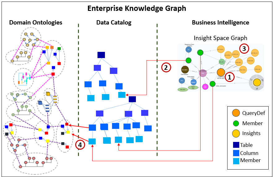
Those links provide the wider meaning of otherwise technical query components. A column called GrossMargin can be connected to a governed business measure. A product identifier can be connected to a product represented elsewhere in the knowledge graph. A regional filter can be connected to locations, organizations, markets, suppliers, and business processes.
Beyond the Analyst’s Immediate Question
The most important value of the IFA comes from the fact that the dataframes originate from analysts working across many domains and data sources throughout the enterprise, purposefully engaged in resolving a docket of problems. Large enterprises consist of dozens of domains using a few times as many systems (a domain usually implements more than one software system) capturing data—like thousands of senses.
Each analyst is performing analytical queries for their domain-level purpose, from their domain-oriented perspective. A sales analyst may not care about a pattern that matters to supply chain. A customer-service analyst may see only one side of a product-quality problem. A finance analyst may notice a small margin change but have no reason to connect it to increasing delivery variability discovered in another system.
The analyst who encounters an insight may not know who else would value it. Someone who needs it may not know whom to ask. We can’t expect analysts to remember all that another analyst needs to know. That’s a messy case of information overload, spending lots of effort on exploring countless fruitless clues. So instead, nothing is said of those clues and knowledge of it vaporizes when the visualization is closed.
As a reminder, the ISG is not intended to copy every underlying row of enterprise data into a knowledge graph. It retains a more compressed level of information: notable things detected within selected and aggregated views of that data, together with enough context to understand what those things refer to.
In that respect, the ISG resembles how we make sense of the world. We do not reason from every raw sensory signal we have ever received. We retain highlights, relationships, changes, exceptions, and structures that can later be combined with other experience.
What the EKG—and eventually an LLM working with relevant portions of that graph—can make of those highlights is the larger subject that we’ll see through the following example. The example starts with a problem that pops up, goes through what starts out as domain-independent efforts to investigate the problem, those efforts are collected across domains into a centralized, compact format, and finally a hypothesis of what’s happening is abducted from the scattered clues.
Example: The Competitor We Did Not See
Let’s walk through a very simple example. Here is the situation:
Weekly sales suddenly fall. Nothing obvious inside the company changed. Sales, marketing, customer success, and operations investigate independently, each using the data, tool, and visualizations natural to that domain.
The punchline is that a new, heavily funded competitor launched nearby. With that heavy funding, the competitor was able to get online so quickly that no one noticed its emergence. Therefore, no analysts are aware of it—no one is familiar with the brand, the name of the brand doesn’t readily indicate the nature of the business. But that competitor successfully burst onto the scene with a very expensive and aggressive marketing campaign.
The point of the example is not that any one simple IFA function discovers the cause. The functions capture small insights. The Insight Space Graph retains their query context, links the data components to enterprise meaning, and makes the collection available for wider interpretation.
This sample code is on the GitHub repo for Enterprise Intelligence.
Let’s look at independent BI activities of analysts from different domains who notice something isn’t right and investigates from the lens of their particular business processes, data sources, responsibilities, and expertise.
Sales Analyst’s Perspective
Because the problem is that sales has fallen, naturally, the sales analyst is purposefully investigating:
- Analyst question: Why did weekly revenue suddenly fall?
- What the analyst cares about: Revenue and active-customer decline, plus whether the decline is concentrated in new or existing customers.
- What may be ignored or missed locally: Average revenue per remaining customer is stable. By itself that is not the sales analyst’s main problem, but it argues against lower spending by retained customers.
Table 6 lists the data returned by the query.
| WeekStartDate | Revenue | ActiveCustomers | AvgRevenuePerCustomer | NewCustomers |
|---|---|---|---|---|
| 2026-01-05 | 250239 | 1002 | 249.63 | 93 |
| 2026-01-12 | 246570 | 992 | 248.64 | 92 |
| 2026-01-19 | 253961 | 1006 | 252.45 | 87 |
| 2026-01-26 | 251570 | 1008 | 249.69 | 91 |
| 2026-02-02 | 245255 | 984 | 249.14 | 90 |
| 2026-02-09 | 246699 | 990 | 249.3 | 91 |
| 2026-02-16 | 251321 | 1001 | 251.06 | 93 |
| 2026-02-23 | 250097 | 997 | 250.73 | 91 |
| 2026-03-02 | 250792 | 1000 | 250.83 | 93 |
| 2026-03-09 | 249150 | 993 | 250.86 | 90 |
| 2026-03-16 | 237825 | 935 | 254.28 | 56 |
| 2026-03-23 | 224185 | 900 | 249.19 | 55 |
| 2026-03-30 | 214218 | 860 | 248.98 | 47 |
| 2026-04-06 | 206587 | 832 | 248.37 | 48 |
| 2026-04-13 | 199178 | 793 | 251.23 | 46 |
| 2026-04-20 | 189154 | 750 | 252.26 | 43 |
| 2026-04-27 | 180389 | 722 | 249.77 | 42 |
| 2026-05-04 | 168670 | 679 | 248.32 | 45 |
| 2026-05-11 | 162737 | 655 | 248.35 | 36 |
| 2026-05-18 | 154475 | 615 | 251.3 | 40 |
Figure 3 yields the relevant information. Pretty much all key metrics, except for average revenue per customer have significantly dropped.
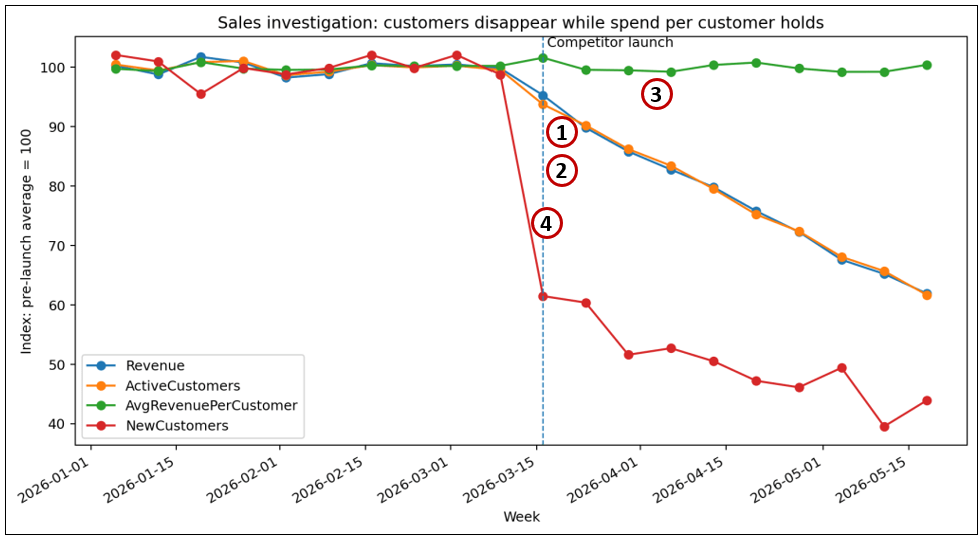
Table 7 lists insights captured by the IFA from Figure 3.
| Item # | chart | facet | message | tags | score | date_hint |
|---|---|---|---|---|---|---|
| 1 | Line Chart | Revenue | Inflection around 2026-03-23 (sustained change). | inflection | nan | 2026-03-23 |
| 2 | Line Chart | ActiveCustomers | Inflection around 2026-03-30 (sustained change). | inflection | nan | 2026-03-30 |
| 3 | Line Chart | AvgRevenuePerCustomer | Stable level detected in AvgRevenuePerCustomer (CV≈0.6%; start-to-end change≈0.7%). | stability | nan | |
| 4 | Line Chart | NewCustomers | 1 spike(s) detected on 2026-03-16. Inflection around 2026-03-09 (sustained change). | spikes,inflection | nan | 2026-03-16 |
Marketing Analyst’s Perspective
Marketing is unaware of the drop in sales as they are focused on currently deployed campaigns. As part of her normal tasks, a marketing analyst reviews a weekly external report of rapidly trending search terms within the company’s product category. Before March 16, the term ApexOne does not appear among the top five, but it abruptly enters at number five, then rises to number three, number two, and finally number one.
Key words come and go and ApexOne doesn’t sound any alarms, so the marketing person doesn’t really pick up its possible significance. She is currently unaware of Sales investigating a sudden drop in sales that happened around the same time ApexOne appeared on the Top 5 searches. Table 8 lists the top 5 search terms for a few weeks.
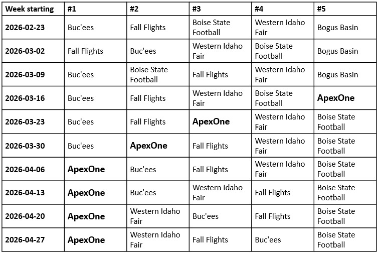
In hindsight, we could think that Marketing dropped the ball by not investigating this new search term that burst onto the scene. But they have campaigns to launch and monitor with little time to chase unknowns. The emergence of a new top search term is one of what could be thousands of false positives (in relation to a valuable insight) that requires effort to investigate.
Not to worry, this table of search terms is created from a BI data source containing key word counts. These insights could be captured by the IFA with an added ranking-oriented insight function, which can detect the entrance of a previously absent term, its rapid ascent through the rankings, and its persistence near the top.
Customer Success’ Perspective
From the Customer Success department’s point of view, they notice a large number of cancellations:
- Analyst question: Are service or support problems driving cancellations?
- What the analyst cares about: The cancellation reasons that customer-success and support teams can directly address.
- What may be ignored or missed locally: “Switched to another provider” is often treated as a vague, externally caused bucket rather than an operational finding owned by the team.
Figure 4 shows the bar chart presenting the rapid change of counts for “Switched to another provider”.
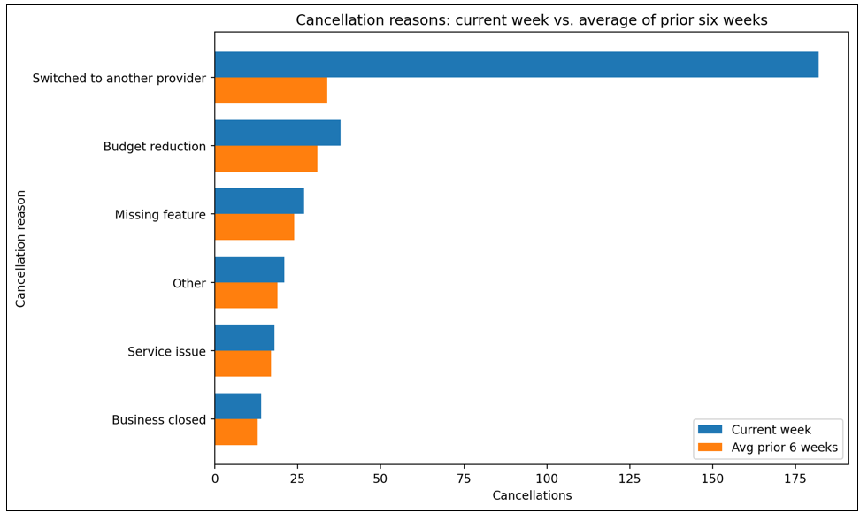
“Switched to another provider” is not merely the largest cancellation reason in the current week. It is also far above its recent six-week average. By contrast, the other cancellation reasons remain relatively close to their prior baseline levels. This suggests that the current rise in cancellations is not broad-based dissatisfaction across many familiar causes, but instead is concentrated in customers leaving for another provider.
Table 9 lists the insights retained for the chart in Figure 4.
| chart | facet | message | tags | score | date_hint |
|---|---|---|---|---|---|
| Bar Chart | CancellationReason | Switched to another provider dominates the Cancellations metric (61%). High dispersion in Cancellations across CancellationReason (CV≈130%; std≈65.20, mean≈50.00). | dominance,dispersion |
Operations Perspective
Operations isn’t directly concerned with sales figures, but they do notice swings in quantity shipped.
- Analyst question: Did reliability, service, or fulfillment deteriorate?
- What the analyst cares about: Whether an internal operating or product change coincided with the customer loss.
- What may be ignored or missed locally: The analyst finds no operational problem.
Table 10 lists the data from the operation analyst’s query.
| WeekStartDate | UptimePct | MedianResponseMs | FulfillmentDays | PriceIndex | SupportResolutionHours |
|---|---|---|---|---|---|
| 2026-01-05 | 99.944 | 219.4 | 2.07 | 100.26 | 10.23 |
| 2026-01-12 | 99.929 | 215.9 | 2.12 | 99.97 | 9.67 |
| 2026-01-19 | 99.96 | 213.3 | 2.08 | 99.94 | 10.01 |
| 2026-01-26 | 99.947 | 218.1 | 2.05 | 100.22 | 9.88 |
| 2026-02-02 | 99.928 | 219.8 | 2.05 | 99.83 | 9.92 |
| 2026-02-09 | 99.935 | 227.1 | 2.11 | 99.87 | 10.25 |
| 2026-02-16 | 99.955 | 220.5 | 2.16 | 100.1 | 10.13 |
| 2026-02-23 | 99.963 | 223.9 | 2.11 | 99.94 | 10.33 |
| 2026-03-02 | 99.98 | 218 | 2.1 | 100 | 9.96 |
| 2026-03-09 | 99.994 | 215.3 | 2.11 | 99.98 | 9.83 |
| 2026-03-16 | 99.956 | 216.1 | 2.15 | 100.05 | 9.94 |
| 2026-03-23 | 99.935 | 217.1 | 2.11 | 100.21 | 10.06 |
| 2026-03-30 | 99.918 | 228.5 | 2.08 | 100.01 | 10.04 |
| 2026-04-06 | 99.954 | 216.7 | 2.14 | 100.1 | 9.73 |
| 2026-04-13 | 99.938 | 223.4 | 2.12 | 99.69 | 10.02 |
| 2026-04-20 | 99.944 | 216.4 | 2.16 | 99.99 | 10.06 |
| 2026-04-27 | 99.941 | 223.7 | 2.11 | 99.87 | 10.63 |
| 2026-05-04 | 99.948 | 221.5 | 2.05 | 99.82 | 10.47 |
| 2026-05-11 | 99.966 | 219.4 | 2.05 | 99.87 | 9.79 |
| 2026-05-18 | 99.952 | 219.8 | 2.17 | 99.95 | 9.93 |
Figure 5 is a graph visualization of the data in Table 10. All metrics are within a narrow index band from 98 through 106. The variations are within acceptable ranges.
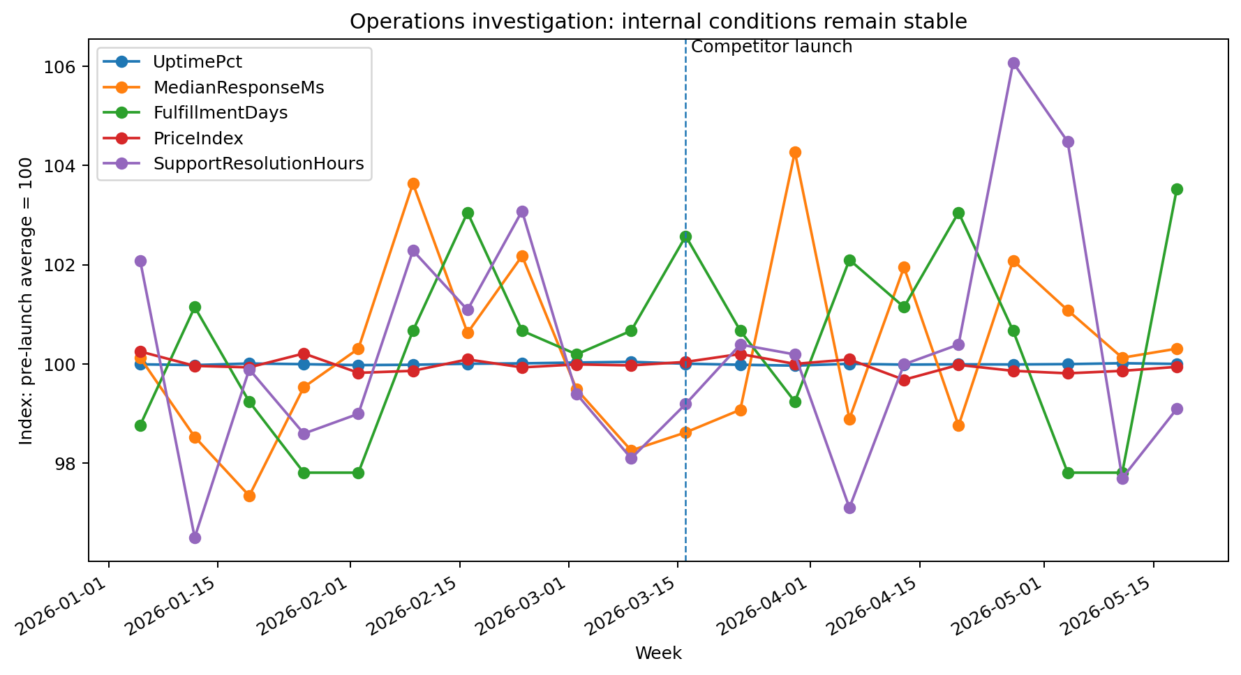
Table 11 lists what the operation analyst is looking for. All figures are judged to be “stable”.
| chart | facet | message | tags | score | date_hint |
|---|---|---|---|---|---|
| Line Chart | UptimePct | Stable level detected in UptimePct (CV≈0.0%; start-to-end change≈0.0%). | stability | nan | |
| Line Chart | MedianResponseMs | Stable level detected in MedianResponseMs (CV≈1.8%; start-to-end change≈0.2%). | stability | nan | |
| Line Chart | FulfillmentDays | Stable level detected in FulfillmentDays (CV≈1.8%; start-to-end change≈4.8%). | stability | nan | |
| Line Chart | PriceIndex | Stable level detected in PriceIndex (CV≈0.1%; start-to-end change≈0.3%). | stability | nan | |
| Line Chart | SupportResolutionHours | Stable level detected in SupportResolutionHours (CV≈2.4%; start-to-end change≈3.0%). | stability | nan |
The fact that operations metrics have been stable indicates that the sudden drop in sales is unrelated to timely delivery of products.
Evidence brought together in the ISG
The ISG gathers the qualifying insights from the different QueryDefs into a shared body of evidence. Each insight retains the context needed to understand what was measured, where it came from, when it occurred, and which entities or business concepts it concerns. An LLM can then examine the combined evidence, use relationships supplied by the knowledge graph, and perform abductive reasoning to propose the most plausible explanations.
Table 12 lists insights that are passed to a reasoning process, such as an LLM within a RAG process.
| Evidence | SourceQueryDef | LocalMeaning | WiderMeaning |
|---|---|---|---|
| Revenue and active customers change together | QD-SALES-001 | Sales has a serious decline. | The loss is primarily customer disappearance rather than smaller purchases. |
| Average revenue per remaining customer is stable | QD-SALES-001 | Not the primary sales concern. | Argues against a broad reduction in customer spending or an internal price change. |
| Searches for ApexOne rise abruptly | QD-MKT-001 | A small unfamiliar term within a much larger search dataset. | Provides a candidate external entity connected to the same change window. |
| Switched to another provider dominates cancellations | QD-CS-001 | Most cancellations are outside support’s direct control. | Strong evidence of competitive displacement rather than service failure. |
| Price, reliability, fulfillment, and support remain stable | QD-OPS-001 | Operations finds no incident to correct. | Negative evidence that removes several internal explanations. |
The first result does not have to be a final answer. The LLM may identify information gaps, clarifications, competing hypotheses, or additional questions that should be investigated. It can ask for another query, a different slice of the data, confirmation from another domain, or evidence that would distinguish among several possible causes. In this way, the ISG supports an iterative process of gathering clues, forming hypotheses, and seeking the evidence needed to strengthen or reject them.
Discovery of the False Negative
No individual query says, “ApexOne is taking our customers!”
- Sales doesn’t know about it because sales only knows about their sales.
- Marketing is aware of ApexOne, but wasn’t aware of its effect on the company.
- Customer Support knows they are losing customers to a new provider.
- Operations is stable.
The enterprise-level false negative was not the absence of the name ApexOne. Marketing had encountered the name. It was the failure to recognize ApexOne as the competitor connected to the simultaneous loss of customers, revenue, and market attention.
Taken together, the retained insights form a much stronger hypothesis:
- Customers and revenue begin disappearing in the same narrow period.
- Spending per remaining customer stays stable.
- Searches for the previously insignificant name ApexOne jump sharply.
- Customers increasingly report switching to another provider.
- Price, service, product performance, and fulfillment remain stable.
- The knowledge graph identifies ApexOne as a newly funded competitor whose launch date and target segment align with the observed changes.
This does not mathematically prove causation. It identifies a well-supported risk hypothesis that no one analyst was positioned to see: a heavily funded unknown competitor entered quickly and began taking customers before normal word of mouth and organizational reporting could catch up.
Connection to Time Molecules
The insights are also events, which is the primary connection between my first two books, Enterprise Intelligence (via the ISG) and Time Molecules.
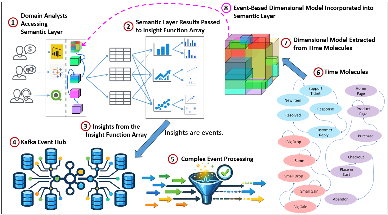
The IFA turns analytical findings into events. Kafka distributes them, CEP correlates them, and Time Molecules places them within the larger web of enterprise processes unfolding over time. Figure 6 illustrates the process.
- Analysts across the many domains of an enterprise access a semantic layer. In their respective corners of the enterprise, they independently address anomalies they are noticing. The anomalies are symptomatic representations unique to their domain.
- The Insight Function Array detects insights. Dataframes produced by analysts’ BI queries are evaluated by the insight functions associated with each compatible visualization type.
- The retained insights become events. Each qualifying insight can be emitted as a timestamped event containing the insight type, affected measures and dimensions, threshold or score, source query, and other
QueryDefmetadata. - The insight events are published to an event hub. A platform such as Kafka can collect insight events from many analysts, domains, BI tools, and data sources without tightly coupling those producers to downstream processing.
- Complex Event Processing correlates the events. CEP can look across streams and time windows for combinations such as simultaneous changes, recurring sequences, escalation patterns, or an insight in one domain followed by effects in another.
- Time Molecules analyzes how insight events relate over time. Insight events do not necessarily arrive with natural case identifiers. Where they share an entity, business context, or derived episode, they can form sequences suitable for Markov modeling. Where no defensible case exists, Time Molecules can examine time-windowed co-occurrence and conditional probabilities—for example, whether one kind of insight raises the probability of another occurring later.
- A dimensional model is derived from Time Molecules. The event and process structures modeled in Time Molecules can be transformed into facts, dimensions, measures, and hierarchies for conventional BI analysis. This allows insight events, process states, transitions, durations, frequencies, and outcomes to be analyzed even when they are not suitable for a single case-based Markov model.
- The event-based dimensional model is incorporated into the semantic layer. The resulting dimensional model is exposed through the enterprise semantic layer alongside other governed BI data. Analysts can then slice and dice insight and process measures using familiar tools, while the new model also becomes available as another source of dataframes for the Insight Function Array.
Conclusion
Every day, analysts across many domains issue queries, reshape data, and view the results through visualizations designed to make particular features stand out. Yet most of what those activities reveal is ephemeral. The visualization is closed, the analyst moves to another question, and potentially useful clues remain in one person’s memory—or disappear entirely.
The Insight Function Array converts selected features of those temporary dataframes into persistent, explainable observations attached to the QueryDef that gives them context. A spike, stable measure, dominant category, cluster, or correlation becomes more than something briefly visible on a screen. It becomes something the enterprise can retain, connect, and revisit.
No individual insight function is “intelligent”. A spike detector does not know that a competitor has entered the market. A stability detector does not know that it is helping eliminate an internal-failure hypothesis. The larger intelligence emerges when many such clues are brought together across analysts, domains, data sources, and periods of time.
That was the point of the competitor example. Sales, Marketing, Customer Success, and Operations each saw a different symptom. Some findings were central to the analyst’s question. Some were overlooked. Some seemed irrelevant locally. Others showed that an expected problem was not present. No single query said that ApexOne was taking customers. But the ISG retained the clues, and the knowledge graph supplied the identity and relationships needed to see them as parts of the same possible explanation.
This is where the knowledge graph becomes the core of meaning. It connects a dataframe column to a governed metric, a value to a business entity, an unfamiliar name to a competitor, and an insight to related processes, risks, opportunities, and events. An LLM or another reasoning mechanism can then perform abductive reasoning over semantically organized evidence rather than attempting to invent an explanation directly from raw tables. The result is not mathematical proof. It is a well-supported hypothesis that people can investigate, challenge, and act upon.


One thought on “Insight Function Array: How the Insight Space Graph Notices, Remembers, and Connects”